Home

 Creators
 Search
 Recent
 Random
 Posts
 DMs
 Tags
 Random
 Importer
 Import
 FAQ
 Account
 Register
 Login
 Favorites
 Keys
 Logout
 Telegram

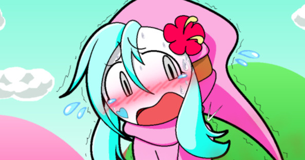
ポロミのおなら→失禁・脱糞おもらし差分 (Pixiv Fanbox)
Published:
2025-12-26 08:15:55
Imported:
2025-12
Content
これから公開する予定のポロミのおもらし差分です。
皆様にお伺いしてみたい要素として、
私はおしっこやうんちは食べ物同様にある程度のリアルさがポイントかと思っており、おしっこやうんちを描く時はきめ細かい凹凸とか透き通る感じや光沢などを私なりに拘って描いてるのですが、
今回の様に単調と言いますか、無理に透き通る感じや光の反射などを加えずに単色でおしっこやうんちを表現した方が良いのか、どちらが良いか皆様のお好みをお聞きしたいと思っております。
Files