Home Creators Posts Import Register Favorites Logout

Content

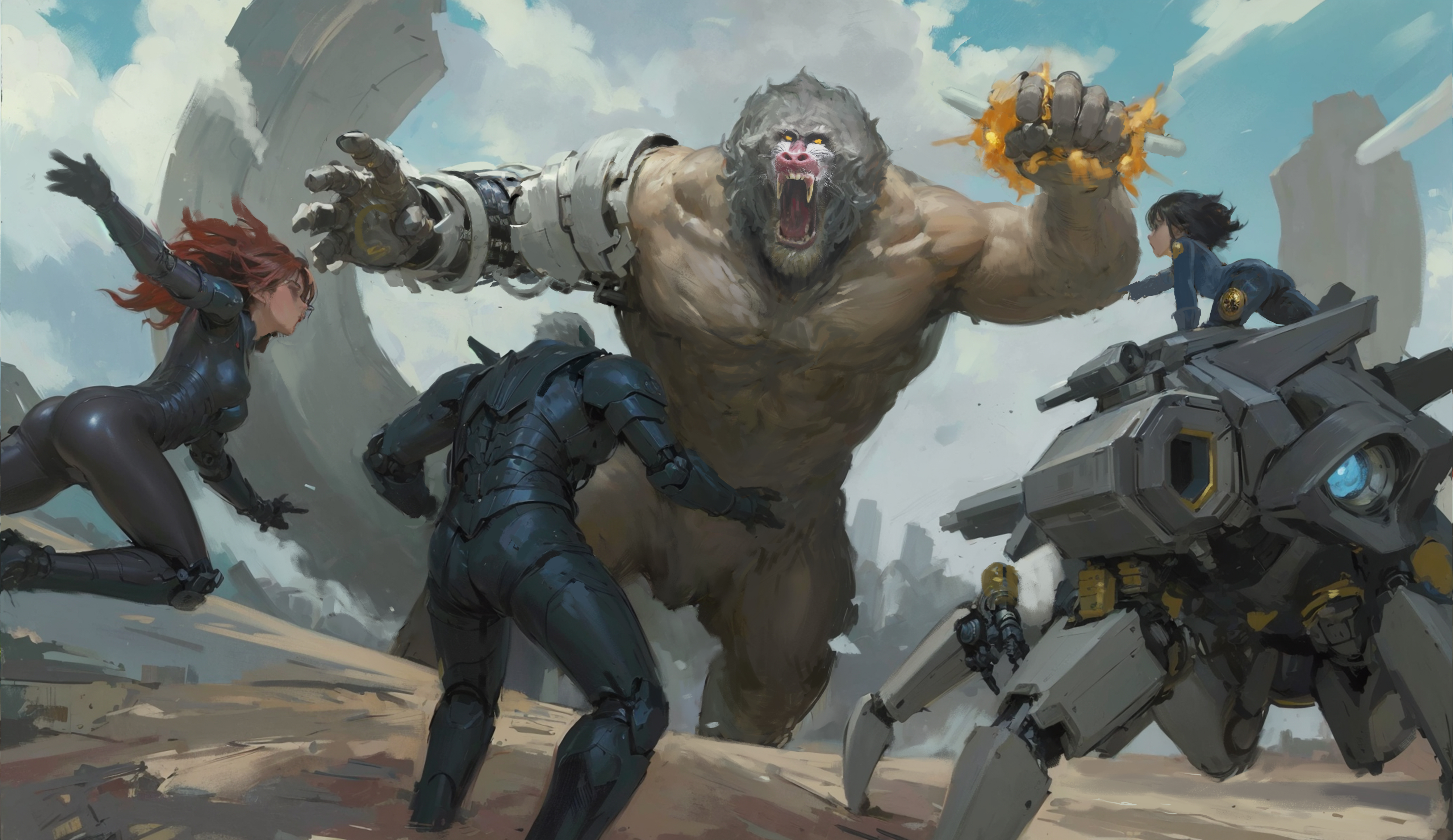
You may remember I posted a splash page art for ISM last month. here's the current iteration with rough color-work done.I know Nat is maybe a bit too small, but my editor can probably fix that in post rather than bother the original artist.I dunno if I like the mandrill nose colors or if we should go with something else.Most everything else is great. I know Boomer isn't exactly as described in the series, but honestly I'm concerned his look might not translate well to images, so I'll favor cool over accurate.Lemme know what you think.0.0 I love hyperweave...

Files
Comments

Nematrec

if the artist is working in layers, resizing a character is *usually* very easy. Like sometimes it's a 30 second fix. Sometimes takes more time to open and save than to actually resize

YhormElGigante

I agree with Nat looking a bit small otherwise looks pretty good 👍

Findell

the only obvious thing that is missing is the demonic symbols for gahkis or whatever that demon was called on his face

IntheRaccon

Unless I'm remembering wrong helmets but otherwise love it.

Infinate Fail

if boomer is big enough for a whole team to fit inside, i think nat actually is too big. boomer seemed to be about the size of a tank on legs, and considering that a tank can fit 4/5 people then that would be a good size comparison. so in this picture boomer and nat are both way too small if going off the story and not just rule of cool.

Apotheosis

Looks great! Some details others have mentioned like the demonic symbols and what have you, but in general it's a great image!

David Thill

Agreed - cool factor is high, verisimilitude on Boomer is maybe a little low. Would pick up book off shelf and look at the back, were we still living in 2002 when paper books were still a thing.

Bookwyrm

I think nat looks a little… childlike

Jackson Andrews

Nat being larger, same with boomer seem like a good idea. i would also want a bit more bulk in perrys suit. that and maybe trying to saturate the black more give it a deeper color. but i don’t think boomers floating legs would look weird. i think if the artist is willing then i would try it.

Aron Coxall

I have a lot to say, and feel free to disregard all of this, but I think Nat looks childish because her head is too big for her body, and Boomer looks like he is right next to Perry, making him look smaller. If Boomer was further away, it would make him and Nat seem bigger. Also Perry's suit is not as dark as I pictured it. Still looks fantastic as is, and the artist should be proud.