Home

 Creators
 Search
 Recent
 Random
 Posts
 DMs
 Tags
 Random
 Importer
 Import
 FAQ
 Account
 Register
 Login
 Favorites
 Keys
 Logout
 Telegram

Visual Update Phase 2 Progress Report (Patreon)
Content
(This post is going live here exclusively for paying members due to its risqué images, but it's available to everyone for free on Itch.io!)
Hello, everyone! dilukha, Art Director, here. It’s been a while, I know, but we’ve been working hard the entire time! It’s been pretty hectic, not only keeping up with development as planned, but also modifying that plan according to the feedback we’ve gotten and what we learned from the first phase, along with managing some new additions to the art team who’ve been helping us keep up the pace. But all in all, we’ve survived. Without further ado, let’s get to the beef!
Sprites
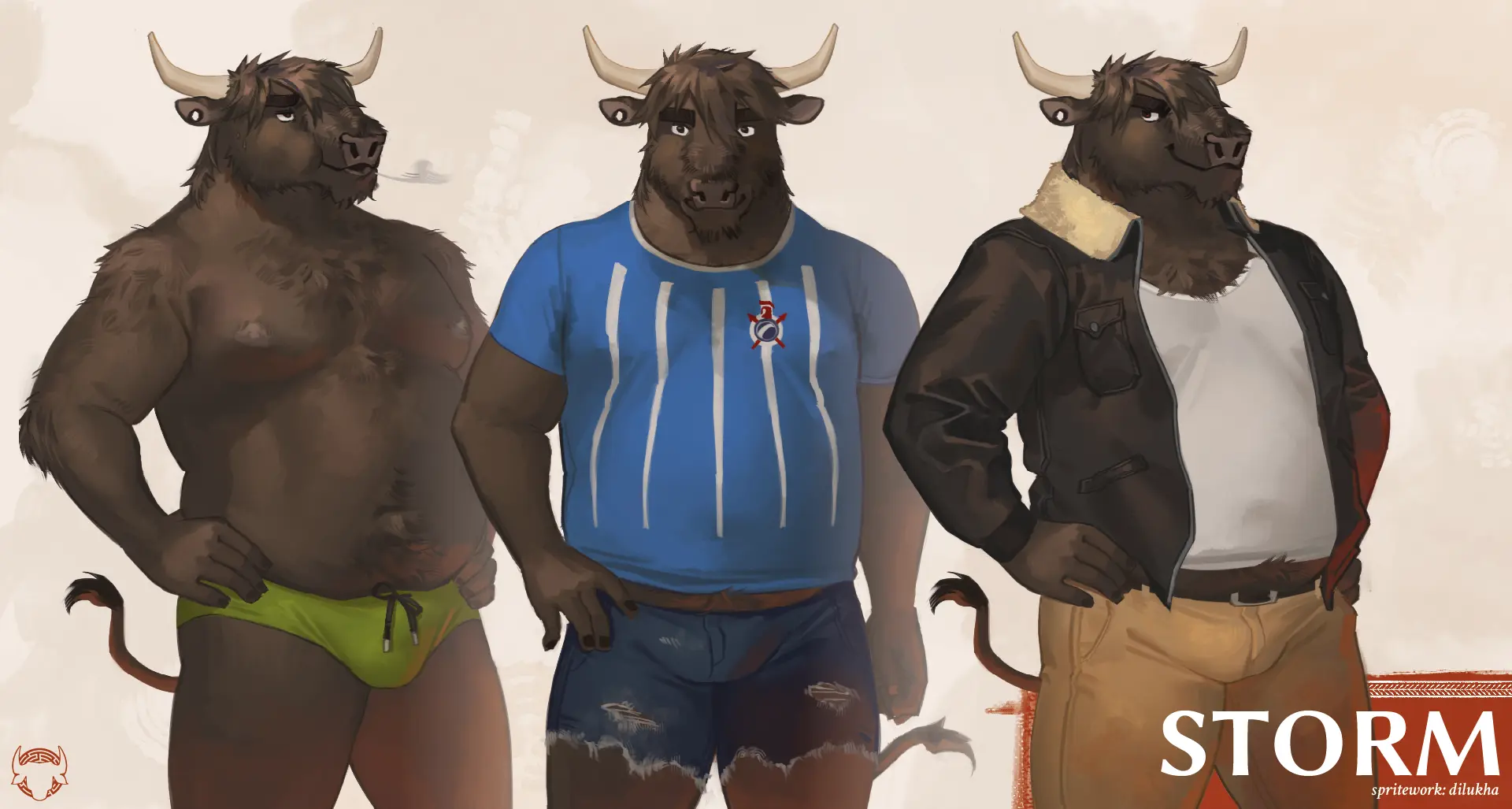
Here’s the beef: Storm!
As he’s one of what we could call the four core characters of the story (along with Asterion, Argos and P) he, too, falls under the art director’s loving purview. Isn’t he looking handsome!
Overall, he hasn’t changed too much! Aside from some small design surgeries (I gave him slightly bigger horns, a thinner nose to visually distinguish him from Asterion, and a mullet-like mane), he’s remained basically the same. Something that I’ve been saying for a while is that the current art direction focuses on making the characters feel very physical, focus on volume and texture to make the reader instinctively know how it’d feel if you touched them, and this is a thing that I had a lot of fun focusing on with Storm — I’m personally quite happy with how beefy and scruffy he looks.
Attentive, long-time readers might have noticed that I’ve made an effort to bring him closer to his older, original art direction, and that’s because I believe that approach made him look younger; that undercurrent of energy and naiveté under his rough presentation is very crucial to his character, it contrasts a lot with the rest of the cast being older in average, and I really wanted to make that nuance visible.
Of course, Storm is a combo deal! P is getting updated together with him! He, on the other hand, has received a pretty significant redesign, so let’s talk about that.
I both love P and was terrified of getting to his sprite, because he’s just a hard character to nail down for a couple reasons. First, he embodies a lot of contradicting traits (for instance, the fact that he’s a peacock, an animal that traditionally embodies beauty and flamboyance, plays against his more no-nonsense, jaded personality, and that’s without even getting into the actual meat of his character) and that puts him in a position where he relies a lot on nuance — plus, the fact that he’s also a POV character means that his visuals are more sensitive than those of a side character. Second, his original design took a lot of rather toony liberties, which worked perfectly before but are harder to make work with what we’re currently going for. A big part of what I’ve been working in lately has been the back and forth of addressing these points and listening to feedback from both the team and the readers, and this is what came of it:
The little bastard in all his feathery glory. The first thing you might notice is that his head has changed: while doing studies of peacocks to get ready to draw him, I realised that his anatomy used to be actually more corvid-like, and there was some value in bringing him closer to real peacock anatomy. The edgier shape and more defined facial markings lend him a sharper, more penetrating air, which works great for the kind of character that he ultimately is: a detective. He’s, of course, still not the cleanest around; behind his initial put-together image he’s still exhausted and depressed, and he’s not particularly attractive for in-universe peacock-people standards, so I made an effort to still have that aspect of him shine through. I also emphasized his longer neck and his chest feathers, simply because as a bird connoisseur I know the bird fans will love it just as much as me.
The other big change was his arms. His original feathery hands were troublesome back then, they are still troublesome with the game’s current grounded sensibilities, and, damn, they’re just hard to draw (not all of us can be the new Falco, I guess). So we settled for talon hands instead — which aside from making more physical sense, are cool in their own right — along with some brown winglets up to the elbows that also give him a more interesting silhouette. I haven’t gotten to his other arm and head poses yet, so this is sadly all I can show for now, but we’ve been really pleased with the way he’s looking and we hope you are, too!
(Note from Mino: I liked the "winglets" for thematic reasons as well, as they provide contrast between P and Luke, highlighting how "unlucky" the former is with his mythical gifts.)
Of course, I haven’t been the only one in the spritework department. Lappan (who previously worked on Kota and Robert) had a very special assignment on his end: the Cobalts!
Adorable, the bunch of them. They, too, look a little different this time around, but these new designs are simply emphasizing the traits that were already there. From left to right: Nono is blocky and strong, Zepito is sharp and curious, and Gruggy is round and shy. Since the little gremlins always show up as a group and don’t have a lot of actual dialogue, making them easily distinguishable from one another and giving them clear personalities visually is essential, and Lappan has done an excellent job there.
And, for our last sprite reveal of the day, everyone’s favorite financial advisor!
Our patrons who watched Minoanon's Dev Talk events had already seen a couple sneak peeks of Themba, being worked on by Rayan (who was responsible for Luke last update). He is, along with Robert, the largest of the entire cast, and oh lord does he look massive here. Downright towering. Themba is a design that didn’t actually have a lot to address, the only actual change here is that his body hair is now coiled (he is South African and Zulu, after all!). Rayan did take the artistic liberty of keeping his mouth completely covered by his trunk and tusks at all times, which in turn moves the weight of his emoting to his eyes and ears instead, and that simple “acting” decision contributes to informing his character (who we’re hopefully going to learn more about soon…).
Just like with P, Themba here is earlier along the process, so you’ll have to wait a bit to see his clothes and other poses. We can’t wait for you to see the other version of Themba, too.
This is all we’re showing sprite-wise for now, but keep in mind that we’re not showing our full hand here. On top of an update for Asterion in his second stage of healing, which is still pending for me, there are a couple more sprites coming with this phase that we haven’t revealed yet, so stay tuned for that! In the meanwhile, let’s check in on…
Backgrounds
A thing that wasn’t actually brought up as often in the feedback to the VU1, but that was extremely evident, was that the hand-painted backgrounds drastically altered the game’s atmosphere, in a good way. My initial plan wasn’t to put too many resources into the backgrounds, simply because this VN has a ton of them, but we decided that what they add to the game is well worth the expense. It’s for that reason that, as some of you may have seen, we opened applications for new background artists a couple months ago, and I’m proud to say we have some new additions to the Art Team that’ll be helping us make the world of Minotaur Hotel feel unique and lived in.
For starters, we have Nolan, whose expressive, dreamlike paintings immediately made an impression. To show you what I mean, here’s the new art he made for the café in the introduction of the game:
Even if it only shows up briefly, it’s (inconspicuously) of such importance to the story that it really deserved custom artwork, and Nolan’s work speaks for itself here. Its vague, undefined quality and the way the light is almost devouring the space makes everything feel like a distant memory, which is perfect for this moment of the game. Hope you look forward to seeing more of his art in the game!
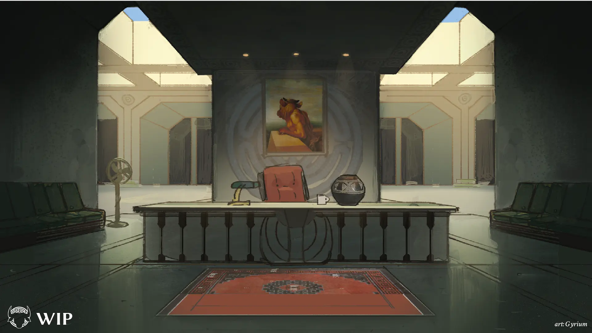
We also have Gyrium, who some of you might know as the writer and artist of the duo dev team Don Attico, the team behind some of the most impressive and conceptually fresh FVNs of the current wave: Ediction and WHODUNNIT, among others. If you haven’t read them, please, do yourself a favor and check them out. On our side of things, Gyrium has a couple of very special assignments, the first being the new Reception.
Now, I initially didn’t intend to replace backgrounds that already had custom artwork. GigaSaddle (who also did all the beautiful new backgrounds for Chapter 20) had already done a lot of backgrounds for the game years ago, including the Hotel’s facade, the master’s quarters and the office. I have the impression that the style of those backgrounds has started to look a little too clean compared to the current direction, but that’s something that’s economically solved with some color correction and paintovers. That’s a bit different for the reception though, which does have some weaknesses that we could address. Over the years, I’ve heard both online and from the mouths of friends that the reception looked a bit underwhelming, compared to how unique and impressive the Hotel’s facade is, and I’m inclined to agree. While it does show Asterion’s minimalist inclinations and a little of the hotel’s magic in the infinite hallway, it doesn’t say too much about Asterion’s character or feel like the first impression of the one and only Minotaur Hotel. Gyrium, who has a lot of experience creating unique spaces charged with meaning, was perfect for this job:
This new reception closely matches Giga’s original design for the Hotel — colossal, monolithic and with both ancient and brutalist inspirations. The actual reception, the place where Asterion would sit, looks sort of dark and humble compared to the massive expanse behind it, which both supports Asterion’s goals and personality and makes evident the magical nature of the hotel. The modularity of the open air space behind it suggests a Library-of-Babel-like infinity, and the darkness beyond hints to the mysteries of deeper layers… Of course, with comforting warm light and some fairly mundane objects thrown around to remind you that this place is still lived in. Gyrium did an amazing job designing a space that pulls all the nuances of the hotel together, and we hope you enjoy spending time here.
Nolan and Gyrium are not the only artists working on backgrounds, but let’s save the rest for later, because there’s still more on the horizon!
CGs
As you might already know, when asked about what you’d prefer to see the Patreon’s budget being used for, most readers were overwhelmingly biased towards new CGs for key moments in the story, and we hear you. Along with the writing team, we’ve been discussing which moments of the game would be elevated by illustrations to go along with them, and we already have a list of CGs that we’re hoping to add. For starters, we thought it’d be great to continue a pattern that is established in the early game that sort of dies out later, which is that important characters are introduced with CGs; this is true for Asterion, Kota, Luke and Storm, and it’d be really fun to keep it going. And what other place to start but the only character in the first act of the game who didn’t have an introduction CG?
Argos’ introduction might just be one of the coolest in the story (a snake person menacingly slithering around the shoulders of Athena’s statue? what a visual!) and it was just begging for a CG. This wonderful illustration was made by the last of our new additions to the team, Rub, who is not only an impressive illustrator on his own right, but whose experience in animation brings some knowledge in cinematography and composition that is extremely enriching for CGs in particular, so give him a warm welcome! (As a fun fact, I had actually intended to do this one myself and sneak it in as part of VU1, but I ran out of time, and alas, I can’t do everything on my own. Bless the team.)
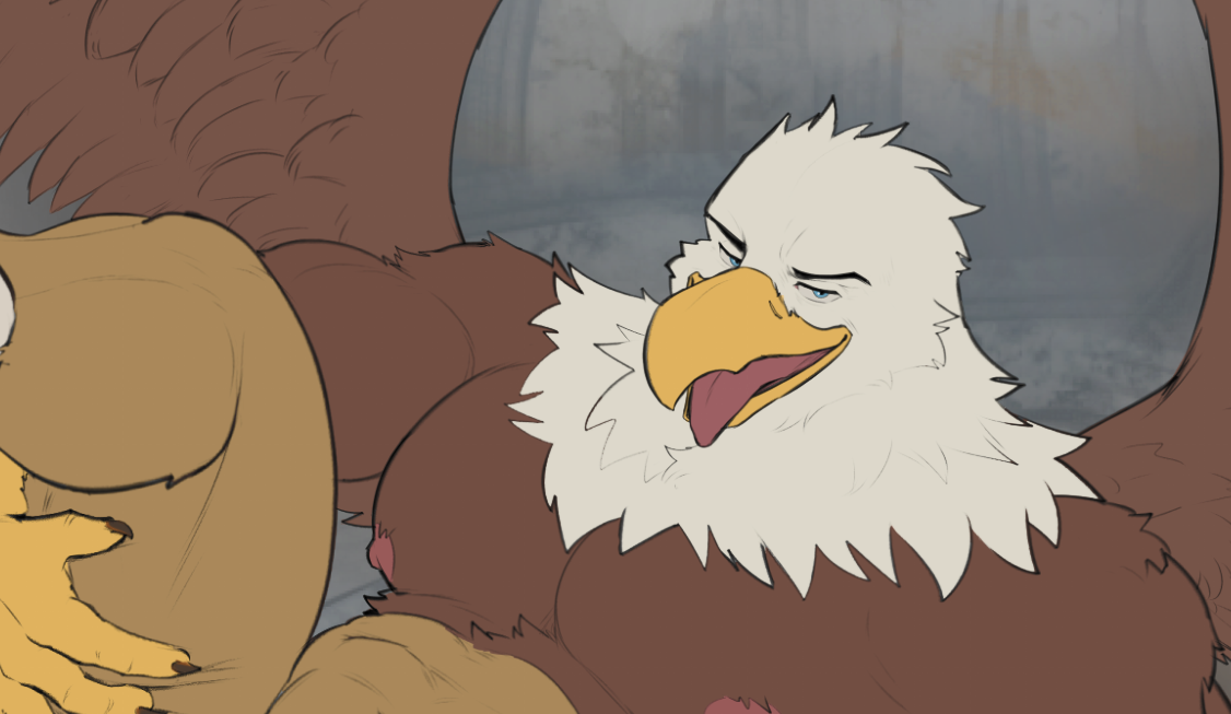
On the side of old CGs that are getting a rehaul, Luke’s sex scene from his introduction will be the handiwork of ToraGoru, who gave us the lyre CG from chapter 20 (along with a lot of juicy Asterion fanart over the years), and let me tell you, this has everything. Not only did we put a lot of thought into reconsidering what we wanted this scene to be about and how we wanted to show it, putting some more conceptual depth into it (Tora is making a lot of new additions that will really elevate the scene), but Luke also just looks really fucking hot and that’s just delicious. Just look at him. Oh god.
And I’ll leave you with that final image! As always, I have to thank the art team who has been putting the work into making all this real, the writing team for keeping us on track, our beloved Patreons whose support makes the game’s development possible, and all of our readers, for whom we toil all day every day. Thank you and look forward to what we’ve got in store!
As a final gift secret, I'm leaving you with a little foreshadowing: Mino plans on announcing the release date for Build 14 this week! Stay tuned!
— dilukha
Files