Home Creators Posts Import Register Favorites Logout

Content

Hi all!

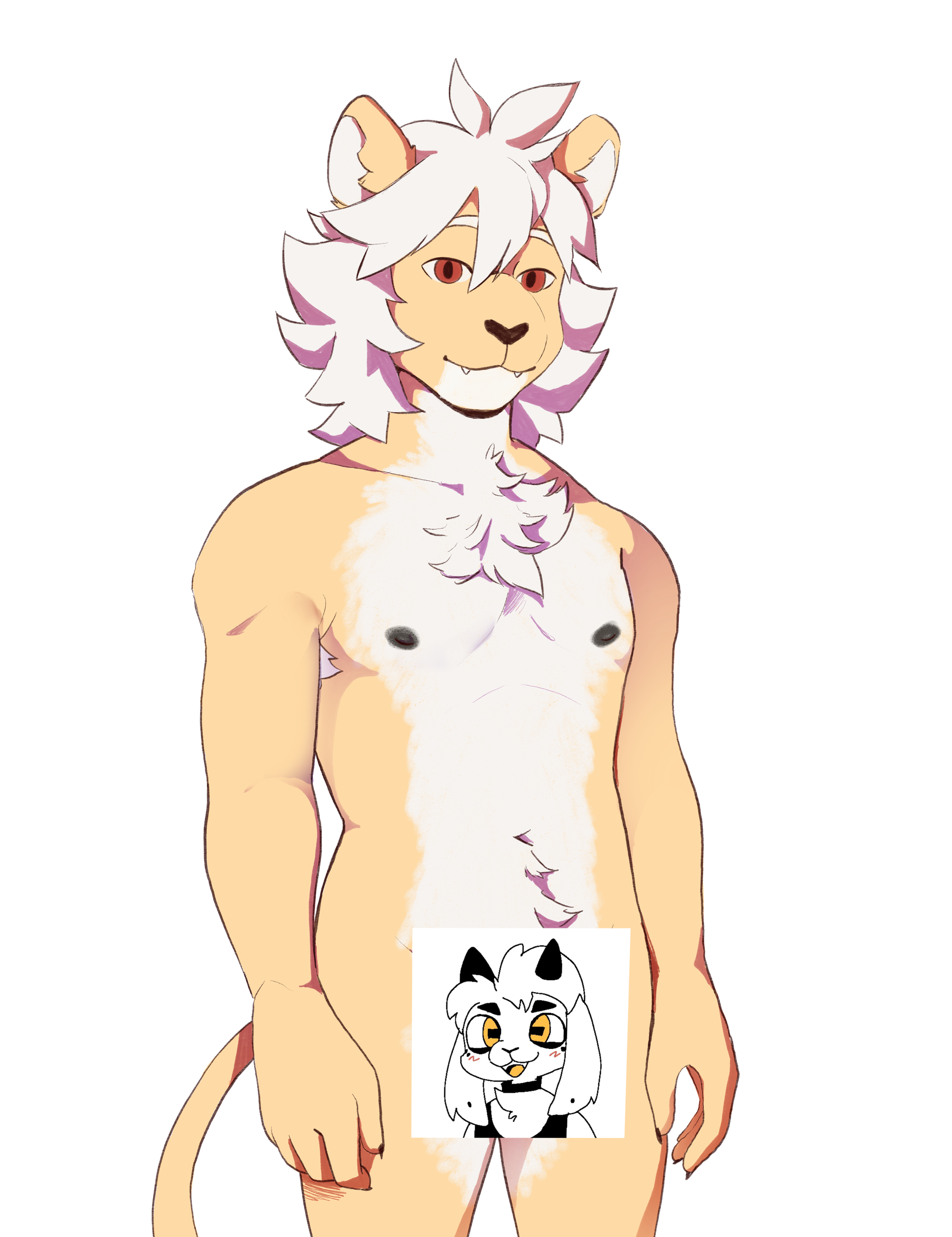
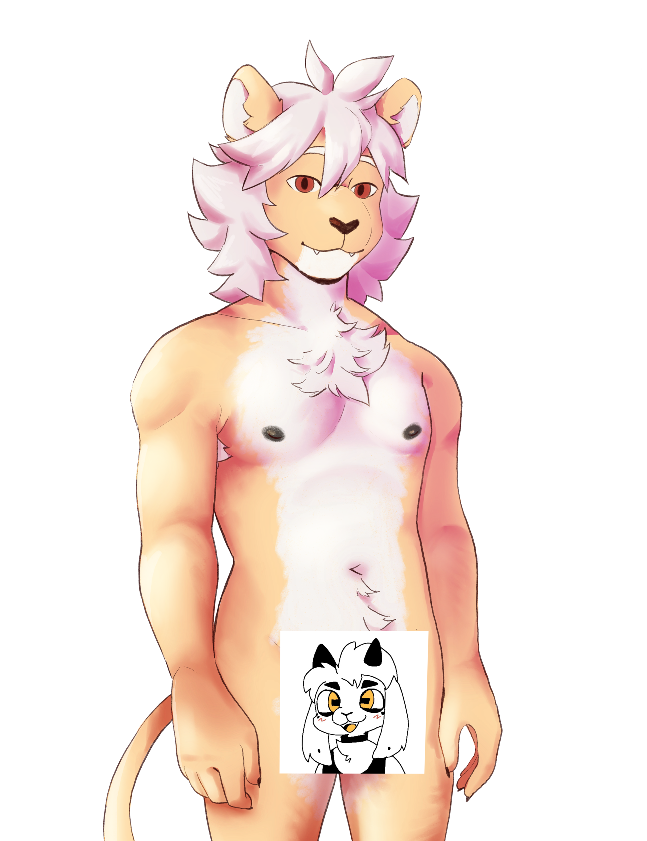
Haku has been working on a pretty substantial sprite rework, starting with Lake. In addition to the redrawn sprite, they're trying a different styles of shading too: simpler in the 1st image and more realistic in the 2nd. 

I'd like to ask you about your opinions regarding the rework. I see it as a huge step up personally, though I'm torn between shading styles. There might be a poll about that in the future, but for now, I'd like to know what do you think.

Files
Comments

Dr. WD Gaster

I really really like this design, I think it looks awesome!

Otter

stunning ✨

Gamerwolfsix

I like all Lake designs. >_<'

Tofu

this is amazing i love them so muchhh both versions look so good but i really like the additional details in the shading of the 2nd one but the lighter colors of the first one fit lake so well💭 both are amazing tbh

tay

First the updated sprites look really fantastic. I think while the detailed shading looks awesome, the simplified version works better for the purpose of a sprite.

SonataFrost

I feel like the simpler cell shading preserves the vibe of DC better since it feels like a nod to the old sprites, but the complex shading looks suuuuper good in its own right. I think if the plan is to release the sprite reworks one by one, you could release them with the cell shading to match the old sprites until all of the old sprites have been remade, then all of them could be upgraded to the more realistic shading style :3

Onadri

I love himmmm but, I'll miss the old sprite

Onadri

I do like the simple shading tho

Mia Eaves

I really like it :D. Prolly just me hating change but I feel like it misses a certain vibe the old sprite had. And I prefer the simple sharing one it fits the vibe of dc better I think

Xas47

I love them both but i prefer the new than the old

Trip Fox

I like the simple shading, feel like it fits the overall vibe of the VN better even though the detailed shading is done well

Roca

The second sprite fits the tone of the VN much more and looks more serious. The first strikes me as a little cartoonish, which is fine and looks great, but I could see it clash with Roborak's lovely backgrounds since it's so stark in comparison. Exemplary work as always, hq!

Fable91

Part of my likes the old sprites, of course, but the noises I'm currently making would seem to indicate that I like the new ones. I know this is the less popular opinion, but I think I like the rendered one better? I get where people are coming from with the simple one matching the style better, but if all of the sprites are getting reworked, then that won't matter as much, and I really like the realistic render.

Brigantine Westmoor Productions

I prefer the second one. It shows a lot more dimension, and is more realistic while still retaining that drawn art quality.

The Smoke House

Greatly prefer the 2nd version, on the right. The one on the left is still cute tho

Aster

i vote for the second version. much like the writing that explores complex themes, the blended art invites more depth and nuance than the cel-shaded version, and thus feels like it more harmoniously expresses the intended artistic whole.

grey

i actually prefer the flatter shading. but they both look fantastic! 🥹

Erchon Yeen

I love the new version. It has a lot of depth that I quite enjoy

Xan_Khajiit

I like the original species better but if I had to choose, it would be the first one on the left

Detective Catboy

I do mean this nicely but I do think I prefer the older sprites right now. It might be the face and hair. They feel quite flat. The face especially, and I miss the sharp black outlines in his strands of hair. Out of the two here I prefer the second tho. I do hope this doesn’t come off as rude! I’ve loved yalls work on this game

Carly

I feel like the shading on the first is a bit too sharp and striking which feels a bit off in comparison to the warmer tones of all the bgs. I prefer 2 a lot more

Victor Unbox

Really liking the shading on the second/right one. Keep up the good work as always!

Reedeer

I think like the first one better - but I'm a little thrown by the flat eyes I think, maybe a small highlight, or some slight color variation would liven them up?

Carter PM

I think the second one really fits the games vibe more, the coloring on the shading makes it seem dreamlike. The only thing I would change is their hair, I think it pointing downward really adds a messy look to them that adds to that doofus charm Lake exudes.

Lyk

I think the 2nd version goes along better with the overall vibe and feel of the VN, with the softer Shading it makes it feel...dunno warmer? more fuzzy? xD

Andy

i would keep the current sprites i love them too much, however if i had to choose, the first one!

Eriko

For now I prefer the older sprites but I think that with a few adjustments the new one could be even better. In my personal opinion the body itself looks great but what I'd still try to improve is the face. I'd say that it lacks the certain charm the original has for now. Imo the snout is a bit too round and the eyes lack... Volume? Personality? They're too plain I think? I think if the eyes popped a little bit more and maybe were at a slightly bigger angle like lake's eyes in most other artworks it would look way better. Brow placement matters a lot too and now that lake's eyebrows are higher the face expression looks quite different and I myself really grew to love Lake's goofy <:3 expression. I'm also gonna miss Lake's mop like hairstyle but I think that's something that qill grow on me lmao. As for the shading I think I slightly prefer the second one but I also think it would be harder to pull of for every single character so I'd stay with the first one or maybe even a middle ground between the two. And that's all! Regardless I can't wait to see more! :3

Justin

It's still Lake, just in more detail. I'm happy with the direction. Erikoo has a point though. You shouldn't sacrifice his goofiness for "attractiveness".