Home Creators Posts Import Register Favorites Logout

Content

Hi folks,

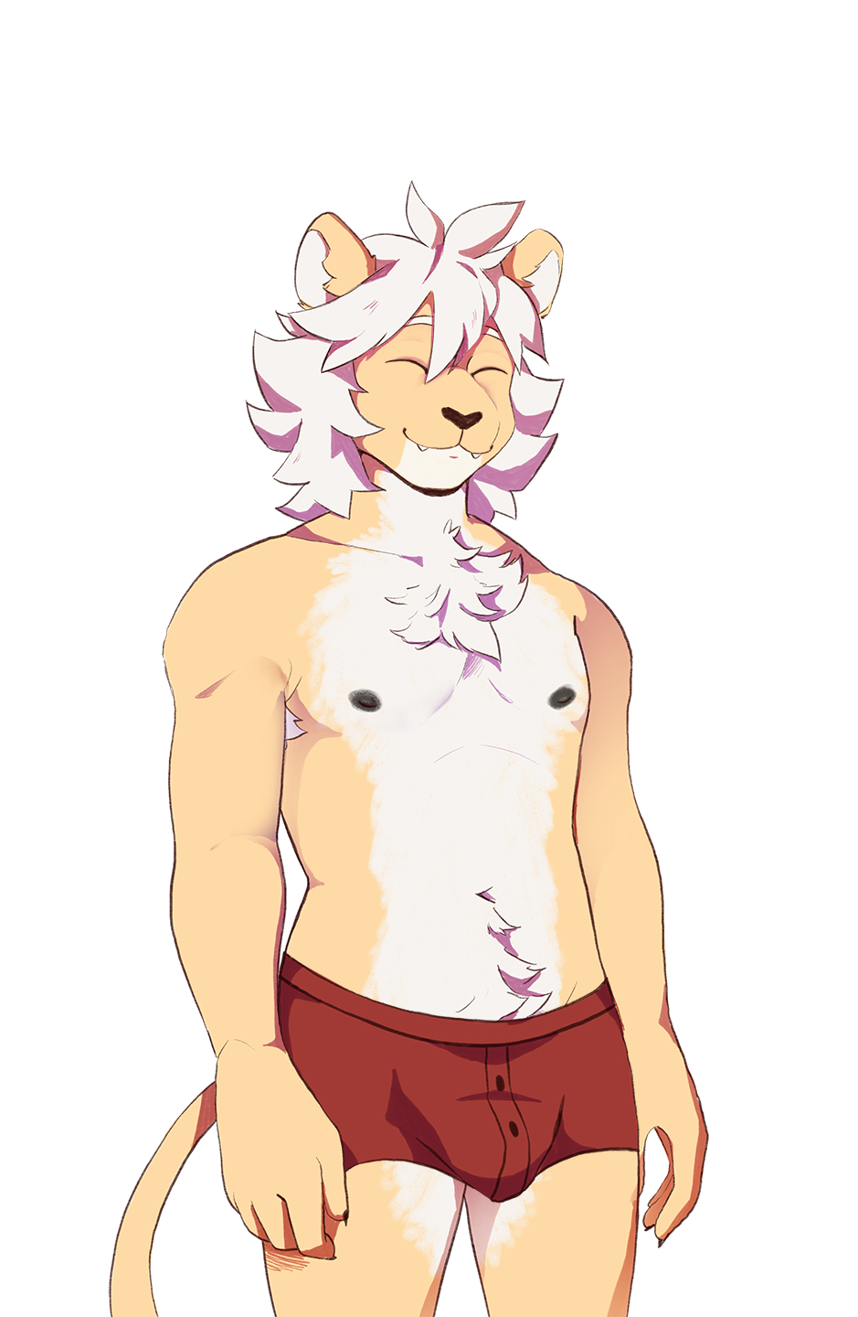
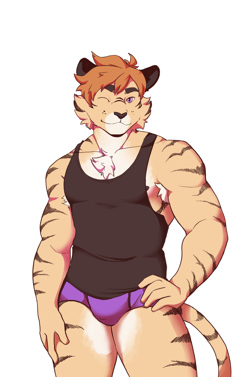
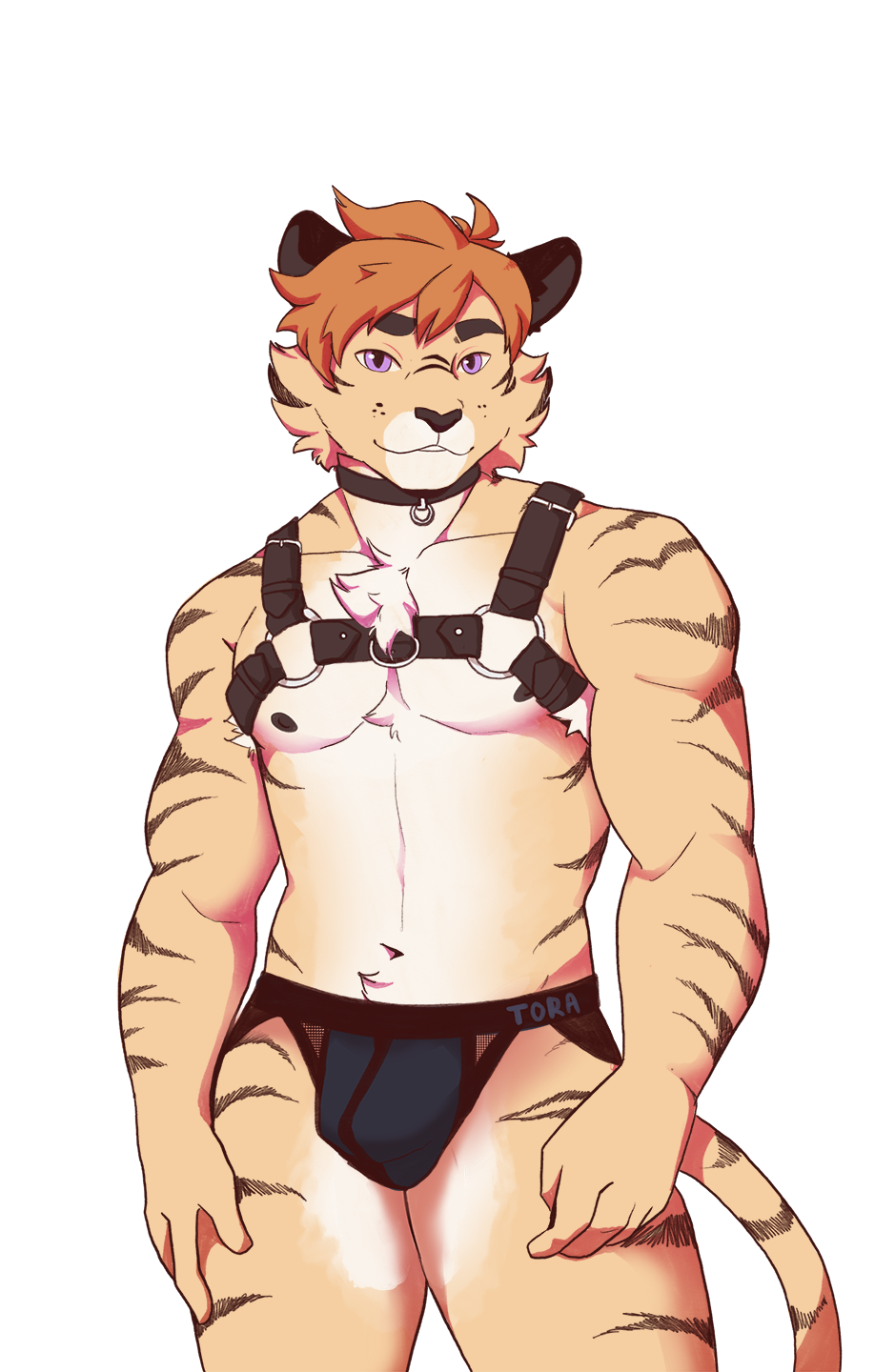
I'm coming back to you with the promised preview of the new sprites! Haku has decided that the sprites need a complete rework and they've been working on the task hard the last few weeks.

And here they are! 6 finished sprites and 3 WIPs. We hope you like them and we hope to share the rest with you soon!

Files

Comments

Skye

They're even more attractive!!!! Like what!?

Skye

Love the new look for Klaus, I haven't tried him yet, but might once these go live!

Crewdogsy

I’m not sure about rune I like his slimmer happier appearance

Ly Lycanroc

Torulf harness 👀❤️

Addiebear

Yessssss so hottt

billie

oh man... is it bad that i kind of prefer the old sprites? especially for rune...

Tetraphobe49

I like the new looks except for Rune, in his casual outfit his muscles are too prominent and his face is too angular for me. He looks like the typical sports guy in every other visual novel. The old design was slimmer and rounder but still slightly muscularwhich made him special. Now he just looks like a generic sport type which doesn't suit him in my opinion. Which is a shame because Rune is my favorite character

Max Jacobsen

I much prefer the old sprites. These are all way more buff and muscular. Its heading much more towards a bara visual novel. If these are going to be kept in as is, then I truly hope theres a setting to switch between these or the older sprites.

✨Demi✨

Yassica slay queen 💅💅💅💅

Eriko

I think some of the designs stray too far away from how the community sees these characters. Everyone picks their favourite based on their preferences so there will obviously be some discord when changing something people are already familiar with, Rune's redesign being the proof of it. I think that the best executed redesign is Bjorn's, he has the same features, the same shape and feeling to him. Klaus and Jorgen look great too! Lake looks better now that they have these white dots (i forgot what they're called) in their eyes although I still think there's room for improvement with their sprite, it still gives of a bit of a different vibe than their current in-game sprite. I've seen a few people say that the new redesigns start feeling a bit bara, I agree to a certain point with that. There's obviously personal preference involved too, I myself dislike bara-like content so some of the redesigns are not up to my liking or even off-putting. Absolutely no hate to the artist because Bjorn's redesign alone showcases that they can and did a really good job, I just think some if it was kind of... Misdirected? How the characters are portrait both through art and through text changes a lot how we perceive them and also sets in stone our expectations towards these characters, it's hard to change these expectations and I think that maybe in this case they shouldn't really be changed.

KittyMagePaige

I never really comment on posts, but I just have to step out of the shadows to express how lovely these new sprites look! Thank you so much for all the hard work you've put into creating dawn chorus,and thank you for all the time you've taken to compile all this lovely art for us to enjoy. every content/visual and cg update have been a treat ,and I'm so excited to see whats in store in the future! I'll continue to support you in the shadows ,so please continue to do your best! -- ᓚᘏᗢ

Xan_Khajiit

Awww. Rune isn't as cute:( the other models are great though! The Klaus one is my favorite

Jake Northcote

I do like the new sprites, except Rune and Lake. They both looked very cute, but the new sprites are too…generic and different? As someone already mentioned, a lot of players already had a favorite character based on their looks. Mine was Lake. Was, because now he doesn’t look as cute anymore :(

Rahul

Oh my god, Klaus! He is soooo hot. I enjoy the new sprites, even if I find it a bit different. I really liked the whole aesthetic of the old ones, more rustic and woody somehow? However, great work!

Xas47

I dig the changes

Moonglommery

I absolutely love the new sprites besides Rune and Lake unfortunately :c They look a bit stiff to me, especially Rune. He looks a bit tired, way older and stiff like a laquered armorie. I'd love for him to get a biiiit reworked for his face to look either cuter or more handsome, cuz now he's not giving...

Azzy

Ymmm i rly hope there will be an option to change spirits to old ones

codemx

i’m a bit disappointed with Rune and Torulf. It completely changes their character and how they are perceived. Rune used to have the cute shy nerdy look, and that’s totally gone. 😢

YeahBoi2

I think all the sprites look great and are a big step up. Only complaint i have i guess, and others have as well from what ive seen, is that rune looks less "cute" in the face now. I think the old rune has a contrast between his manly body and cute face that works really well and fits his character perfect. His new body is perfect, but the face i think should be a bit more like the old one. Just my opinion tho.

Marhaaq

Love Devon's new look, it almost feels a bit more grounded in reality and captures a kind of softness that I think was missing before.

Xavi EC

I think it kinda works, it suits Torulf the most, cause he ain't cute, he is a muscular fukboi that takes advantage of younger people, the change suits him.... Haven't seen mAh boi Mikko tho. So for me, the success of this changes depends on Mikko.

Xavi EC

Also ... The rework seems to help that Tanuki boy that everyone ignores. I Hope more updates for him after this.

Sovereigndust

I really wish VNs would stop feeling the need to bulk up all of their characters. It alienates individuals who aren't attracted to thick muscle-bound body-builders.