Home

 Creators
 Search
 Recent
 Random
 Posts
 DMs
 Tags
 Random
 Importer
 Import
 FAQ
 Account
 Register
 Login
 Favorites
 Keys
 Logout
 Telegram

January Updates (Patreon)
Content
Another month down, many more to go!
Path of the Paladin Update
Book 2 is nearly done and should be ready for publishing submission in March. The final polish is going well, and I'm really happy with how the back-half is shaping up.
On the publishing front: Book 1 should be available in late spring to early summer. I know some of you have been asking about this, so I'm thrilled it's finally coming together. Book will hopefully follow a few months after that. They're all simultaneous releases, so the audiobooks will launch with the books themselves.
As for what's next: Book 3 has been fully outlined and I can't wait to dice in. After a short breather once Book 2 is submitted, I'll be ready to start posting new chapters here on Patreon. Stay tuned for more details on that timeline soon.
Rivera's Repairs Update
Hey all! I know a week off can feel like forever when you're deep in a story, but I come bearing good news.
First, Rivera's Repairs 3 is coming along great. I really appreciate having this time to polish the opening chapters. Getting the foundation right matters a ton, and I think you'll appreciate the difference. The story is taking off in directions I'm genuinely excited about, and I can't wait for you to see what's in store.
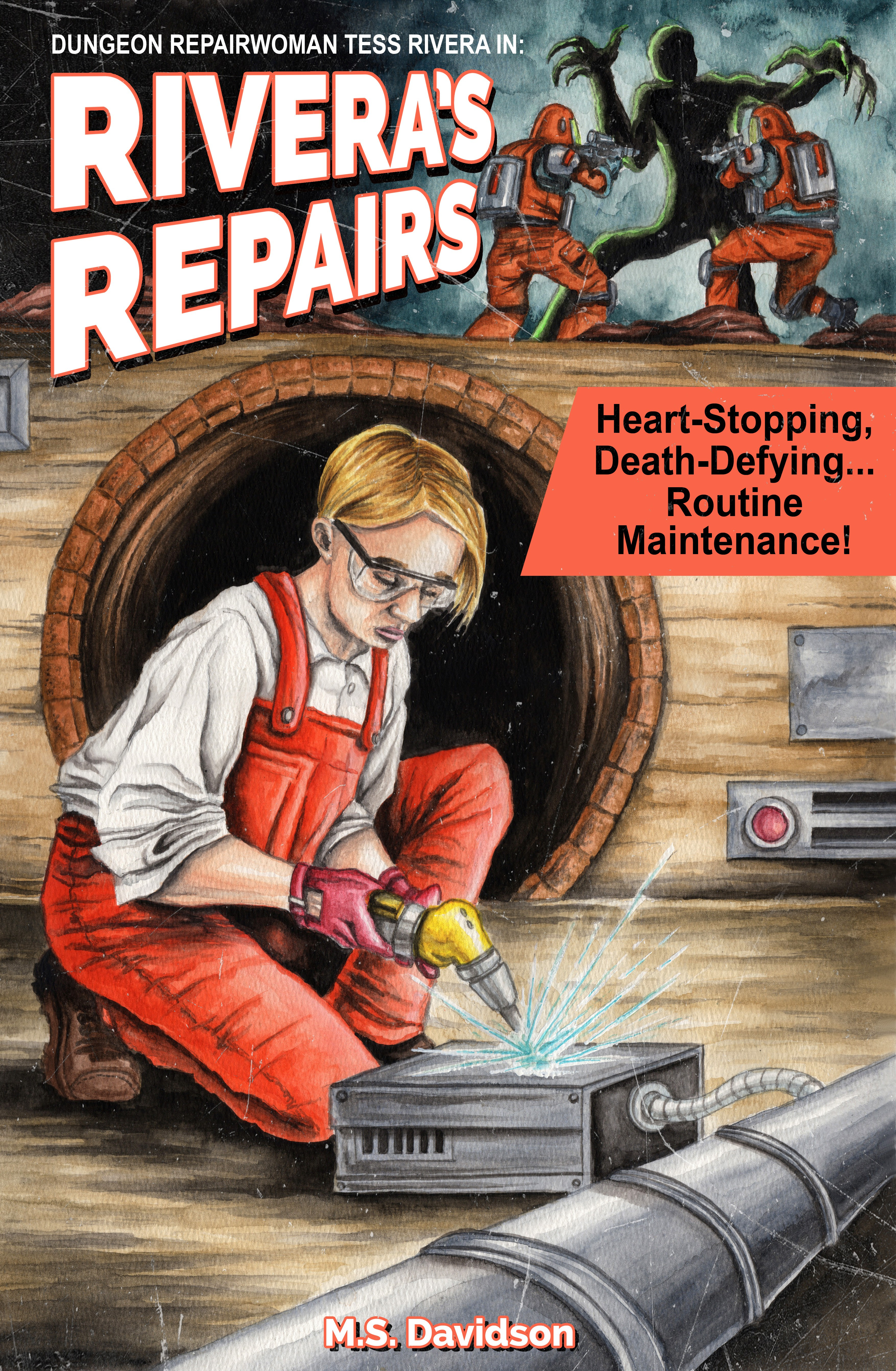
Second, to tide you over until Tuesday: the new cover is done!
Hand drawn by Shawn Decker - we did a pulp-style look this time, and I thought you'd enjoy an early peek. Check it out below:
I'd love to hear what you think.
See you Tuesday!
M.S. Davidson
UPDATE: It seems like the general feedback around this particular cover is "no thanks!" and that's totally fine! I appreciate the feedback and love supporting other artists in our space. I'll put it in the 'no' pile and look for another artist that might be able to capture Tess more accurately :)
Files