Home

 Creators
 Search
 Recent
 Random
 Posts
 DMs
 Tags
 Random
 Importer
 Import
 FAQ
 Account
 Register
 Login
 Favorites
 Keys
 Logout
 Telegram

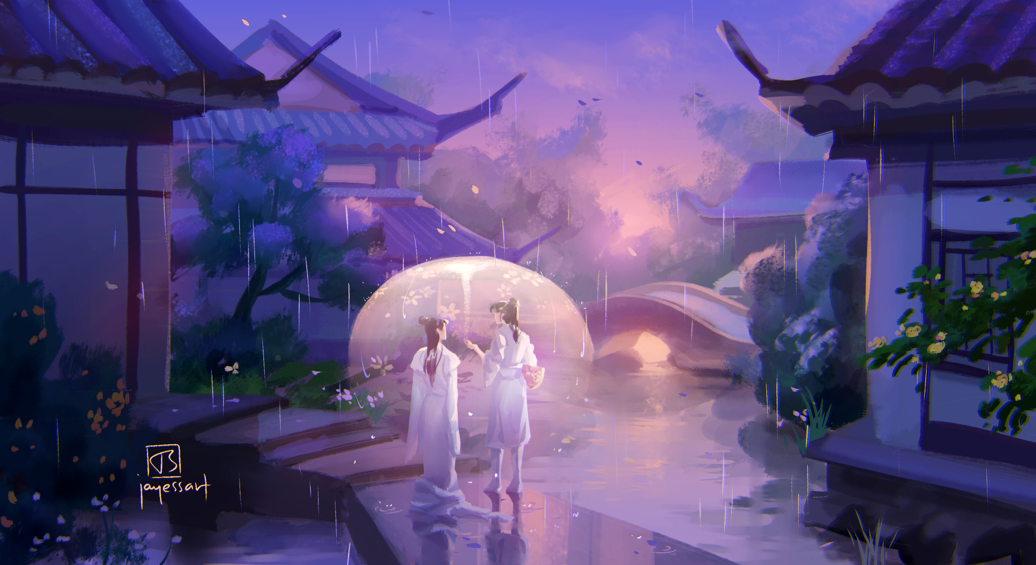
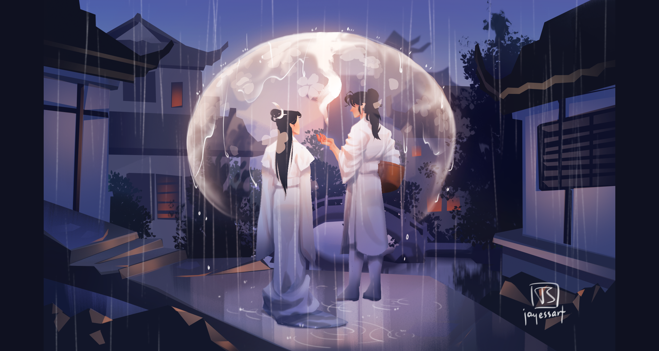
full res 2ha redraw study comparison! (Patreon)
Published:
2021-08-13 18:00:04
Imported:
2026-06
Content
changes:
- fixed perspective- the lighting makes more sense- better control of values- atmosphere creates depth
There's also a bit of a stylistic change in that I was a lot more "graphic" before. But the graphic style wasn't actually intentional, so it looks very uncontrolled.
The one upside to the older painting (2020 June) is that it's a lot more eye catching, at least to me. It's because I used pure black and white in the painting, which is generally a no-no (this is because in real life, almost nothing is pure black, or pure white. It's always tinted with another colour, light reflected from the environment). If you look closely, the 2020 version looks very flat, and as an illustration as a whole, it looks fairly immature.
Files