Home

 Creators
 Search
 Recent
 Random
 Posts
 DMs
 Tags
 Random
 Importer
 Import
 FAQ
 Account
 Register
 Login
 Favorites
 Keys
 Logout
 Telegram

Promotional Recreations (Patreon)
Published:
2017-05-28
Imported:
2026-06
haven't archived this post yet. have a subscription? use the importer!
Content
Back in July when we were first seeing the production of Wonder Woman's film coming to life the promotional art began to take swing, with teaser posters and the like.
I was almost taken back at how vivid some of these new images where despite the overall DCEU tone with the “dark and gritty” cliché they'd adapted since Man of Steel kicked off in 2013!
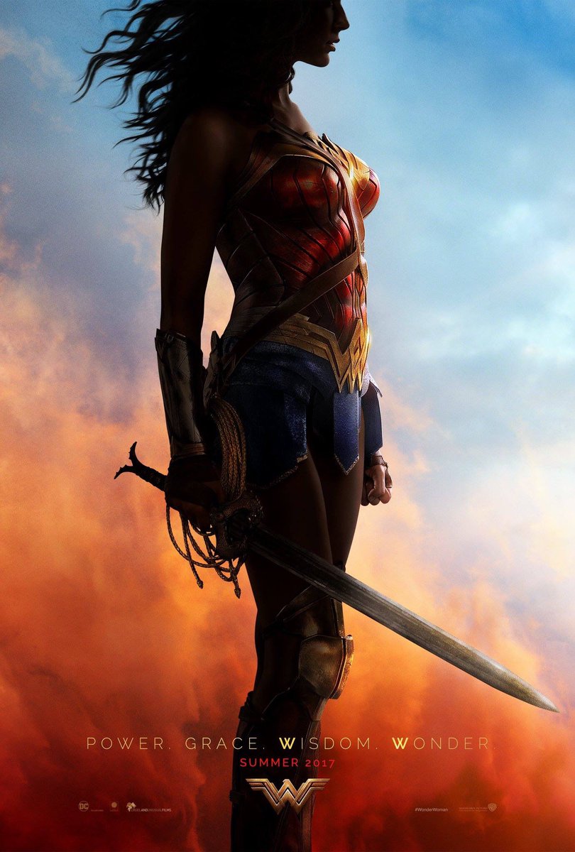
I was particularly fond of this poster: https://pbs.twimg.com/media/Cn-zZtuXYAAwZgD.jpg
The silhouette and the hard lighting and contrast paired with the saturated and prominent primary colors! I saw it the first time and it blew my mind! Partially because Wonder Woman was finally getting a movie, but also The WB's Art Department's tonal change! It was a slap-in-the-face overhaul from the previous promotional content, completely different from Suicide Squad and BvS!
These few images were my attempt at first replicating the original Poster, then further trying to expand on the feelings that poster gave me. In layman's terms, a departure from my normal lighting, color palette, framing, etc.
The top image (Image 1) is spot on to the source and I'm proud of that, but 2 and 3 (most specifically the center image) I find more visually appealing. Partially because the long and slender silhouette of a human is quite different from that of a Minifigure, so the recreation isn't quite what I want (despite it being almost identical to the source). That's not a bad thing, just interesting that the, quote-on-quote “feeling”, is stronger with the center image despite that being nothing near the original intention!
...Weird :P
Files
Previews only