Home

 Creators
 Search
 Recent
 Random
 Posts
 DMs
 Tags
 Random
 Importer
 Import
 FAQ
 Account
 Register
 Login
 Favorites
 Keys
 Logout
 Telegram

MFJ - TDKR Superman + Variant (Patreon)
Content
It’s funny how long it took someone to make a decent Frank Miller Superman! And even funnier how long it took for me to review it!
We took a look at the OG Hades/MrJ TDKR Batman about four years ago now, but only recently (late 2023) do we finally have a good Supes to rival him!
I think MFJ really made an honorable attempt here at recreating Frank Miller’s wide thumb-headed Superman design without losing the Lego look in the process! Dare I say the emblem could have been warped even wider still to get that bulky look (perhaps even some thicker linework too), but what we got here is still really good!
I’m not sure why the underoos don’t also have a black outline like the emblem/belt/boots. Feels like an oversight in the design. However, if it was intentional, perhaps the boots could have looked better without the linework?
idk I find it odd that two of the three areas have it, and one does not... But outside of that, the design work is again quite competent coming from MFJ!
One thing I really enjoy about this fig’s design are the little “stretched” areas of his costume just all over this superdude. Those horizontal nonsymmetrical lines around the abs and the sleeves and such are subtle, but a nice touch!
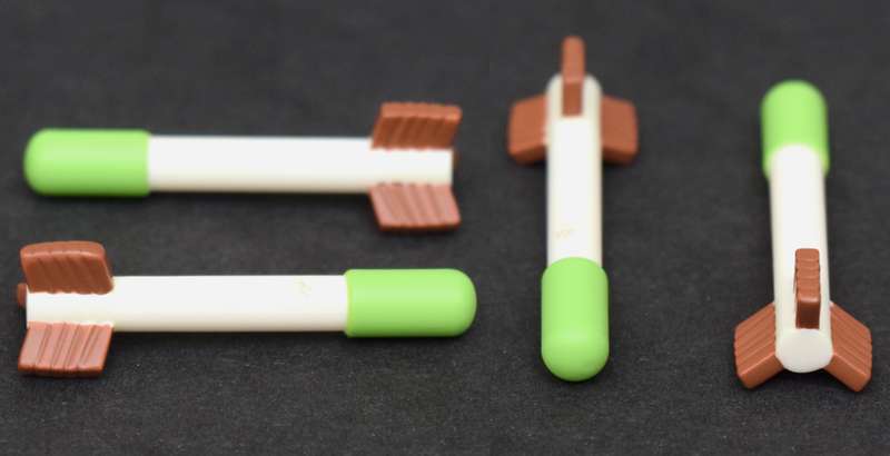
And those facial designs are great! I absolutely love the “allergic reaction” to the kryptonite arrow!
That arrow looks more like a nerf gun bullet if you ask me. Maybe if they would have stuck with a darker color like grey or black it would be a bit better? I mean it’s still quite accurate to the comic, just not as slender. Which I think is what’s messing with my brain.
Still not a bad design given it’s an adaptation to the Lego medium, but it’s chonky.
Speaking of that arrow, why didn’t MFJ make a TDKR Oliver Queen, eh?! Weird that he got skipped, but his arrows did not.
But tangent’s aside, let’s keep going!
As far as other custom parts are concerned, those capes are fine. They're shaping is a bit simple though... The print of the yellow emblem is a bit faint, almost like it needed a second layer of white or maybe yellow to brighten it up a little.
I want to like those capes more than I do... but part of me wishes the two blank ones would have been replaced with two flowing/flying capes instead. Ya know, for more action poses and such! Because as per usual when I get a custom fig with a hard cape, it almost always ends up getting swapped for a fabric one for the final shots 🤷🏻♂️
The hair is also just plain goofy in the most perfect way possible! It is probably a bit too textured. It's not as bad as our last spaghetti haired Superman, but still notable. Ironically, I think hair volume could have been even bigger. But the shaping is still great, and that wispy quaff jutting out is just *chefs kiss*
I think if I could change anything, I would have liked if MFJ committed a little harder to the black & red look for the variant fig.
In the books, Frank drew him in solid black, with just the red cape and the yellow accents. This fig is kinda similar in a sense, but it’s not a one-to-one. I would have loved to have seen more of an adaptation of that concept I guess you could say...
But even with that said! $85 and $95 were the respective prices for each (so $90 of you spit the difference) and they’re pretty good Superfigs! 👍🏻
Files
Previews only