Home

 Creators
 Search
 Recent
 Random
 Posts
 DMs
 Tags
 Random
 Importer
 Import
 FAQ
 Account
 Register
 Login
 Favorites
 Keys
 Logout
 Telegram

Official Doors Twilight Poster [Process] (Patreon)
Content
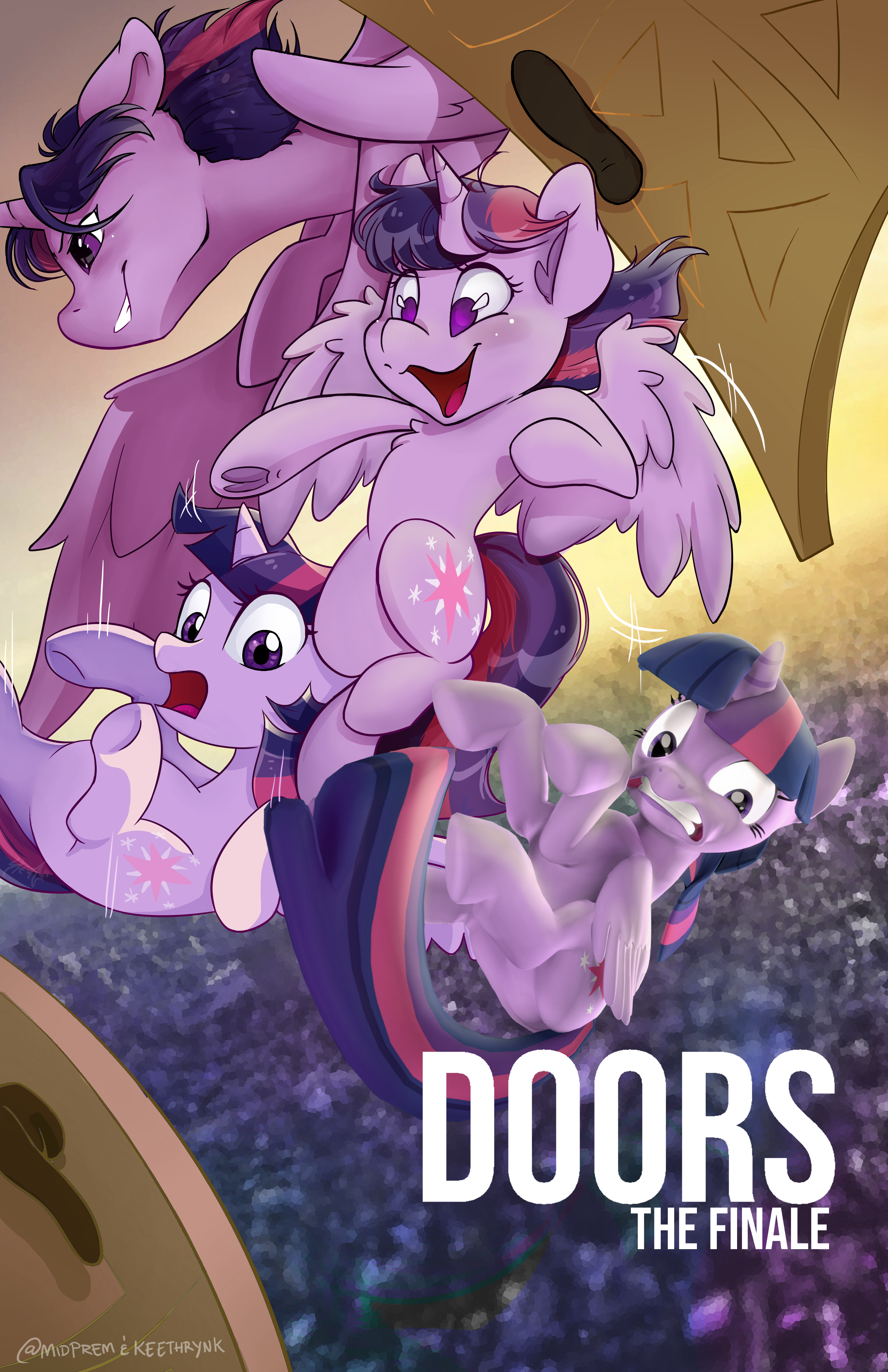
Hey everyone! For Bronycon this year I got to work with Yaasho, host of the final installment of Doors, to create an exclusive poster.
> Doors is a collaborative animation series where people animate Princess Twilight running from door to door (which makes it easy to transition scene to scene, animator to animator!). It was based off of a stick figure series of the same name.
Here is the entire series of process photos and work behind the scenes!!
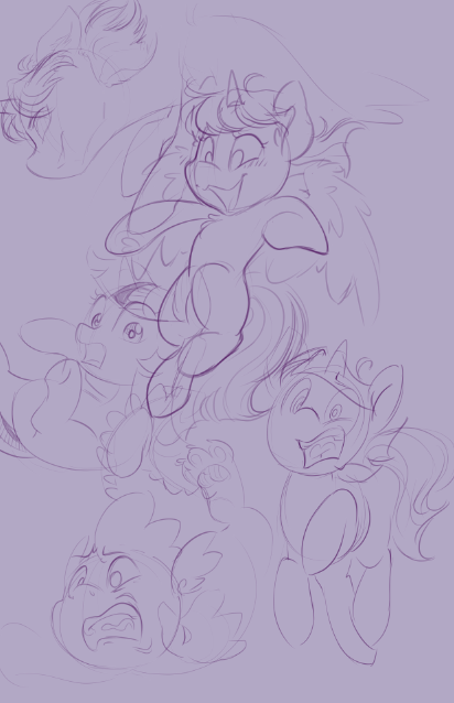
First step! Preliminary sketches. I doodled quite a few Twilights in different styles (as a nod to the different animators etc), and then picked my favorites. Spike isn't part of the series so I removed him in the end, but I'm really fond of that expression! The plan is to leave space near the bottom right area for an SFM (Source Filmmaker) model of Twilight, and for the "Doors" title.
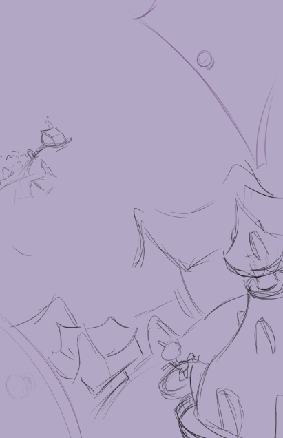
Laying out a simple (very rough!) background. Original idea was Ponyville, but Yaasho was feeling a city vibe.
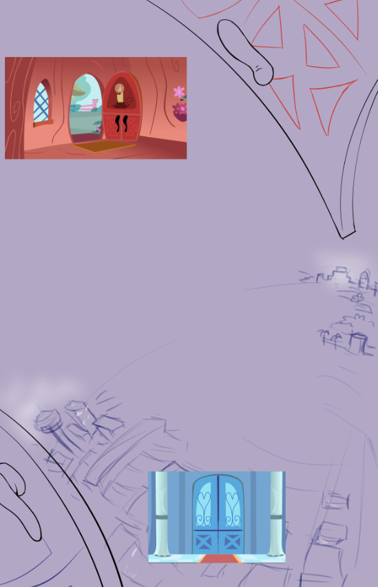
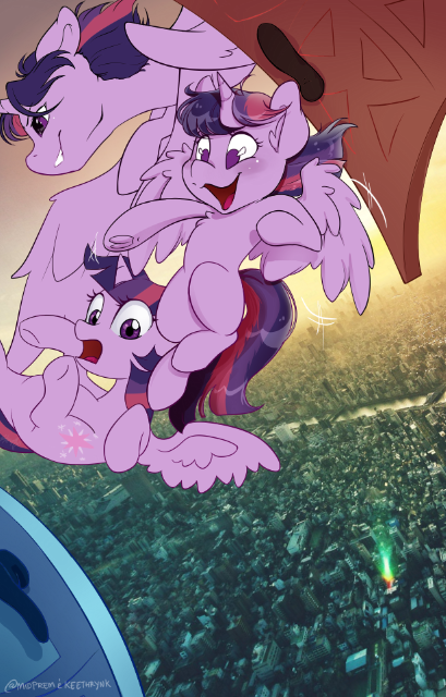
City vibe! Again very rough; my vision was to have a very impressionistic background laid out in an almost painterly style, so as not to distract from all the crazy Twilights in front. Used some MLP doors as reference for the doors on the side.
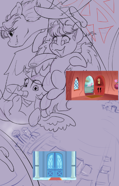
Everything is coming into place. Look at how messy that is. At the time this project was in the works, I was swamped with several other tasks and did not have the time I hoped to work on this. So the files were briefly passed onto artist KeethrynK (https://keethrynk.tumblr.com/). She laid in the flat colors and some shading, and then the baton was returned to me for detailed shading + touch ups.
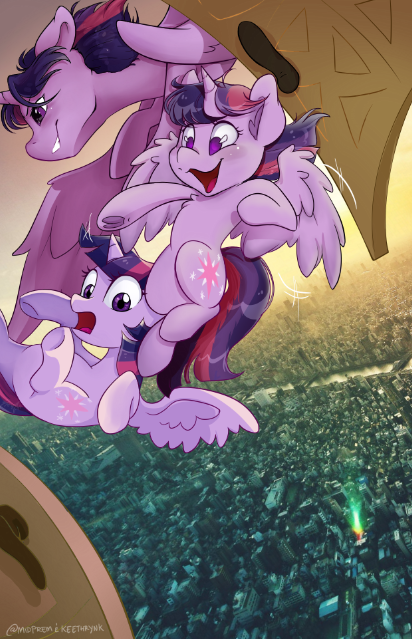
Flat colors. While I do love the door colors, they detracted too much from the rest of the color scheme, so I changed them to brown. Keethryn found the cityscape from a royalty-free image stock site. It looks great, but needs to be worked on. Too distracting.
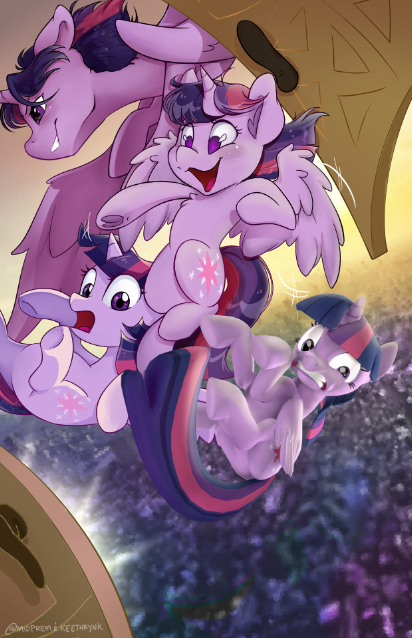
Progress on shading. Keethryn added in the yellow highlights, which were absolutely perfect, and I went in and added darker, rougher lighting for "Edgy Twi" (top left) and soft airbrush shading for "Cartoon Twi" (middle). "Show Twi" (bottom left) was bare-bones shading.
Worked on the background here. Changed the color and went in a few times with different filters to almost blur it; it ended up with a slight "crystal-y" effect that I really like. Adding effects and a neat glow lighting.
Adding more consistent lighting layers to the Twilights to keep the purples from blending into the background, and added a simple overlay of the Doors series text. And there you have it! This was a really interesting poster to work on; I loved experimenting with different styles.
I hope you guys enjoyed the process! Go see Doors 3 if you haven't already!!
Files