Home

 Creators
 Search
 Recent
 Random
 Posts
 DMs
 Tags
 Random
 Importer
 Import
 FAQ
 Account
 Register
 Login
 Favorites
 Keys
 Logout
 Telegram

Belles at the Ball [Process] (Patreon)
Content
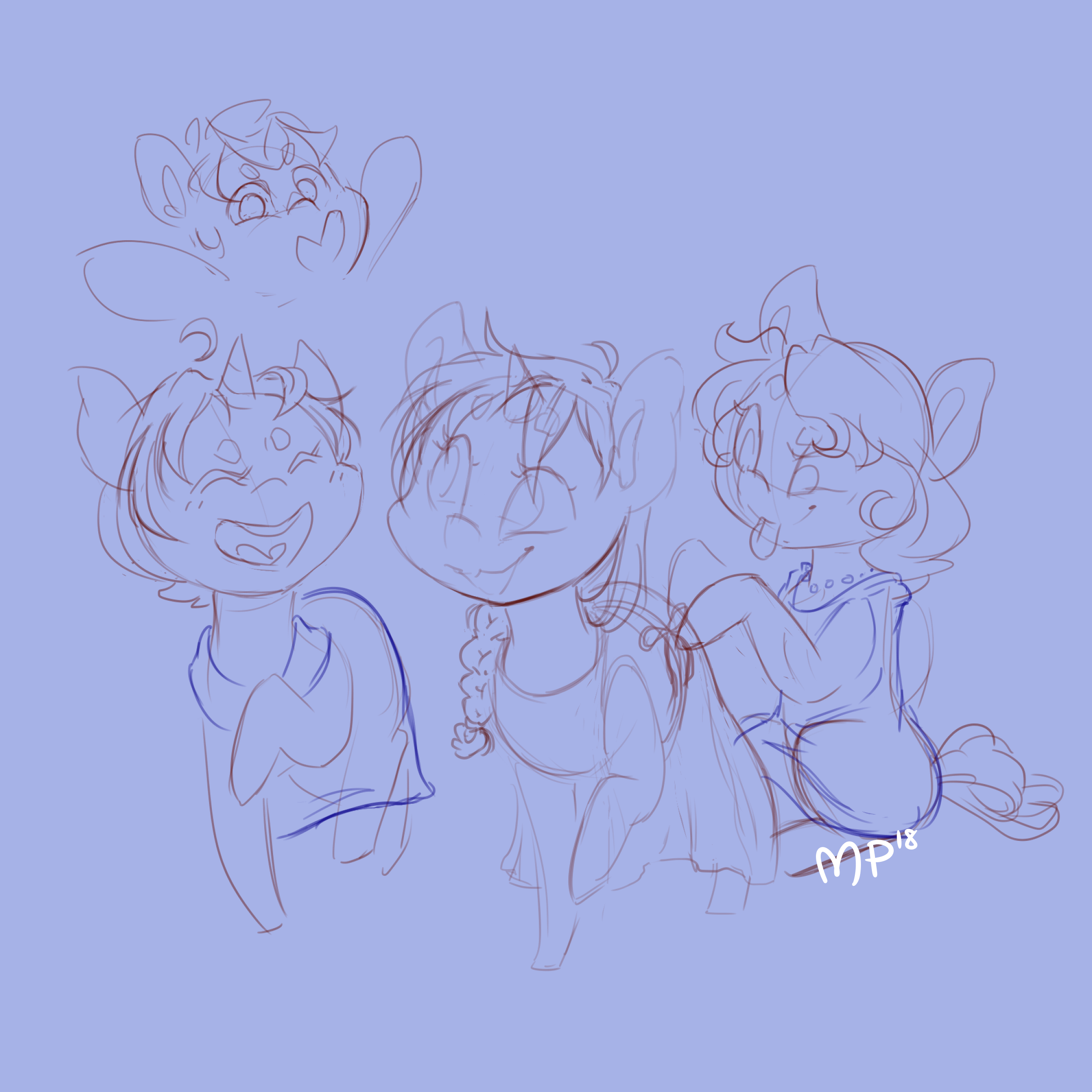
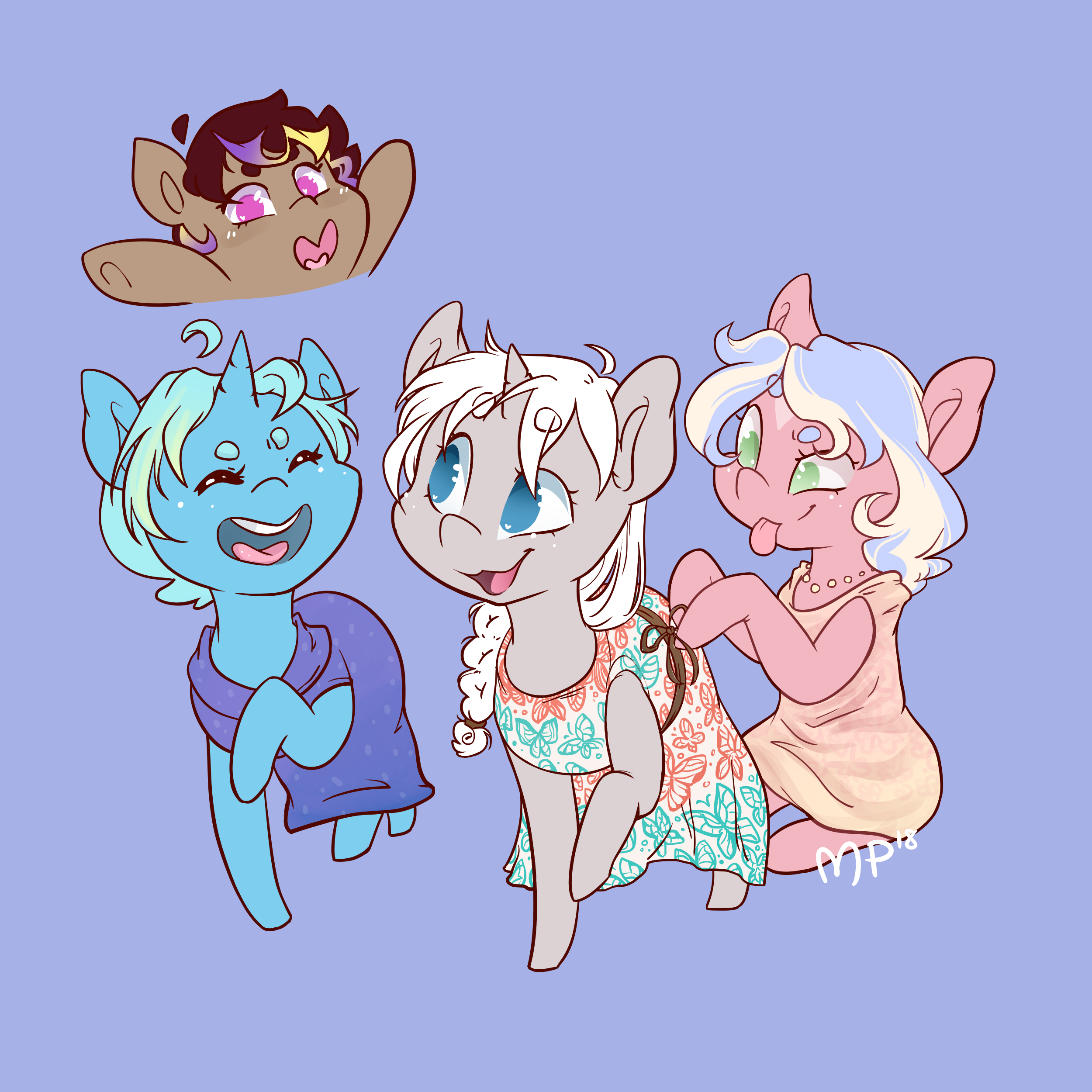
Process piece for a fun memory I had with some friends at High Roller Pony Con c: Thought the color combination came out nicely, so here is the layout and thought process behind this!
First off, a sketch! I wanted the style to be very lighthearted, so I went with something similar to Bronycon's 2018 art style: pointy feet and simple eyes. It was also a bit of a personal time crunch too, so I didn't want to get too caught up in a new style. I already had all these crazy dresses to do!
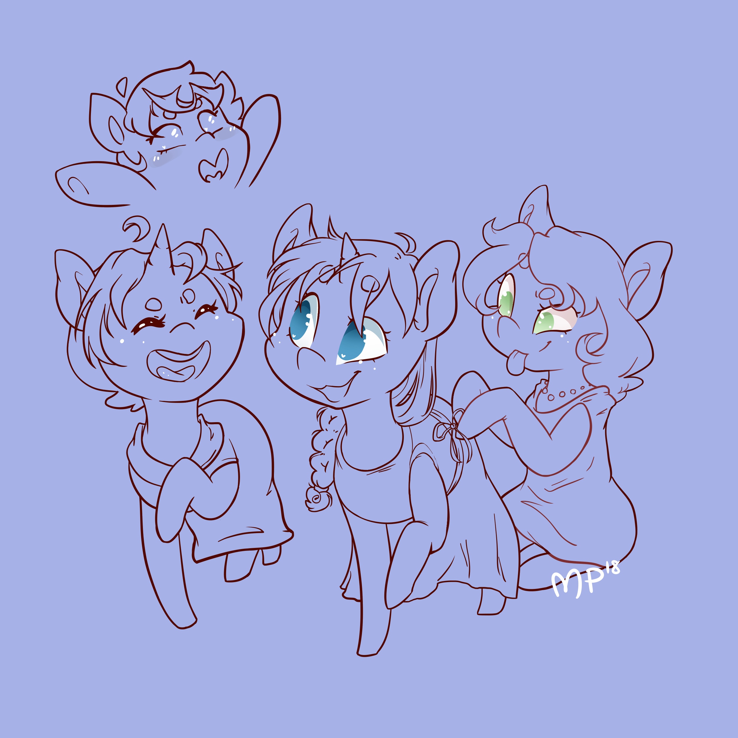
Linework. Hors (top left) was actually added in at the very end, to fit over some text I added in. Rose's (bottom right) tail was removed to be hidden under the dress, and I colored in some of the lines to make them more cohesive and soft.
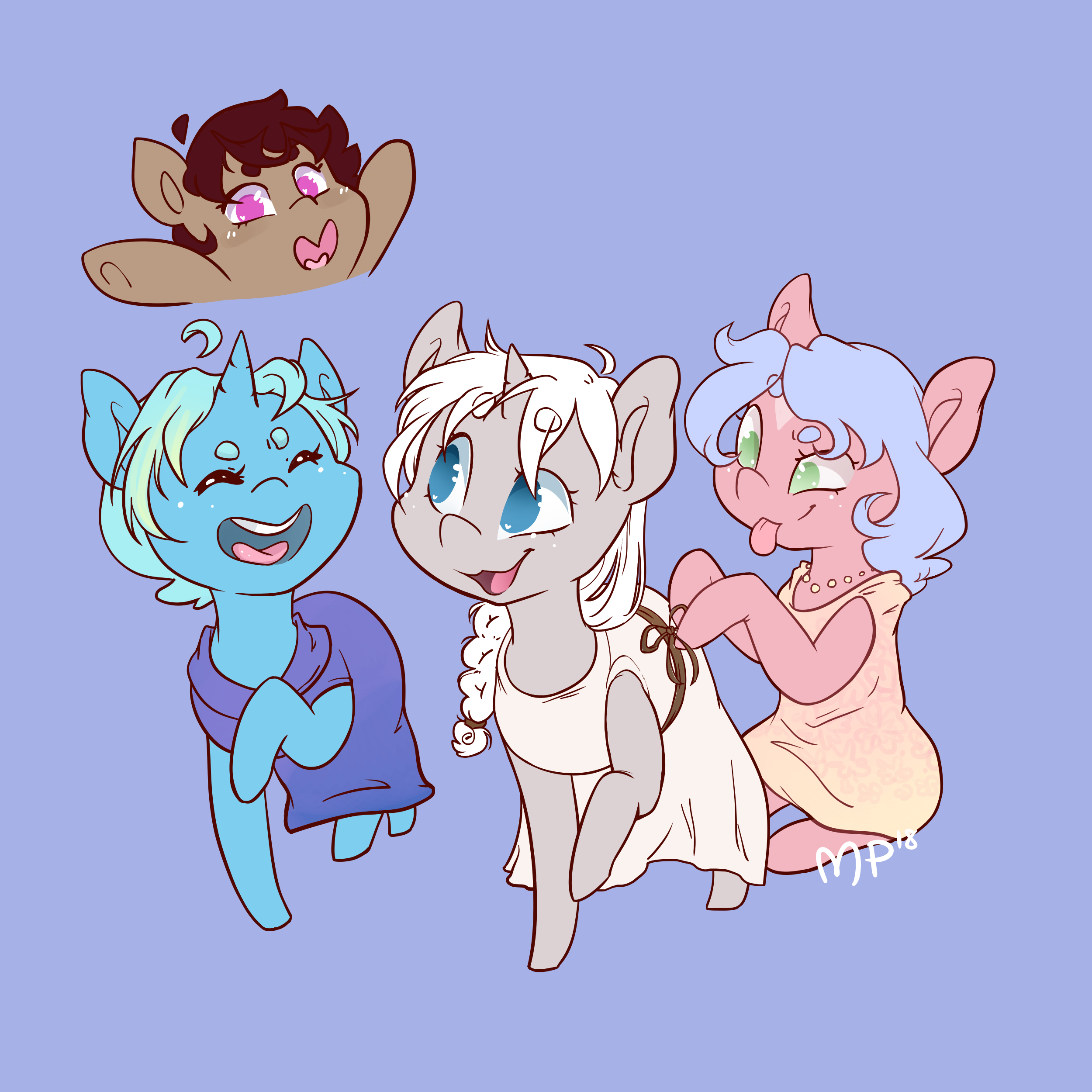
Flat colors added in, with some simpler shading added immediately to smaller areas such as the open mouths, teeth, and eyes. Thank goodness these color schemes seem to work together, because that bright blue had me worried.
More details added to the flat color: things like gradients and patterns in the hair, some light shading to Rose's dress (right), and that gorgeous butterfly pattern to Heaven (center). Reference was used from a matching dress. It's. So. Pretty!
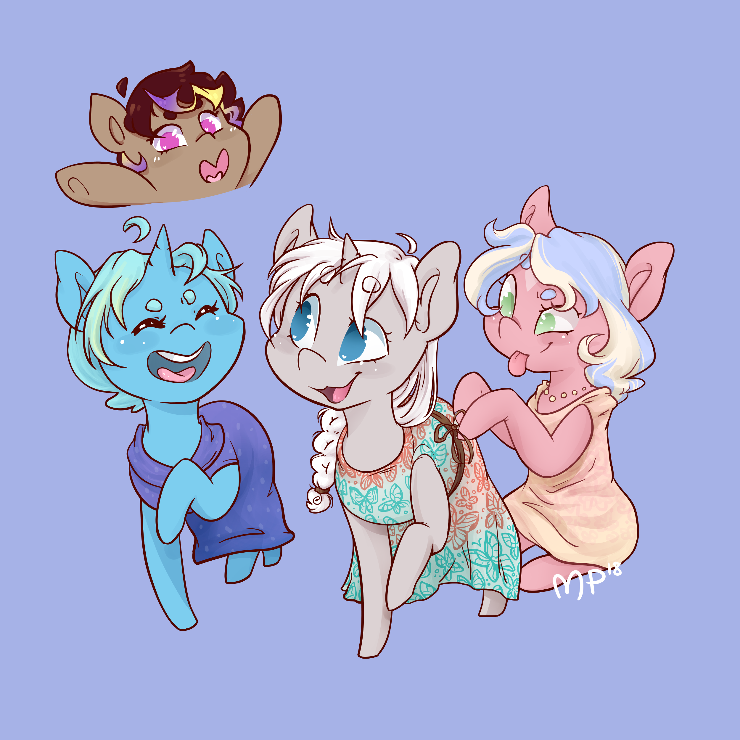
Shading added! I love Heaven's color scheme here; the mixture of brown/whites really add so much dimension. Sloppy's (bottom left) color scheme was mercifully cohesive as well, to my relief. While greys are some of the most fun and versatile colors to work with in my opinion, blues can be a hit-or-miss, from coming out very smooth and bubbly to just radioactive! (And don't even get me started on yellows, BLECH)
Finished! \o/
Files