Home

 Creators
 Search
 Recent
 Random
 Posts
 DMs
 Tags
 Random
 Importer
 Import
 FAQ
 Account
 Register
 Login
 Favorites
 Keys
 Logout
 Telegram

Bronycon Jam Space Banner [Process] (Patreon)
Content
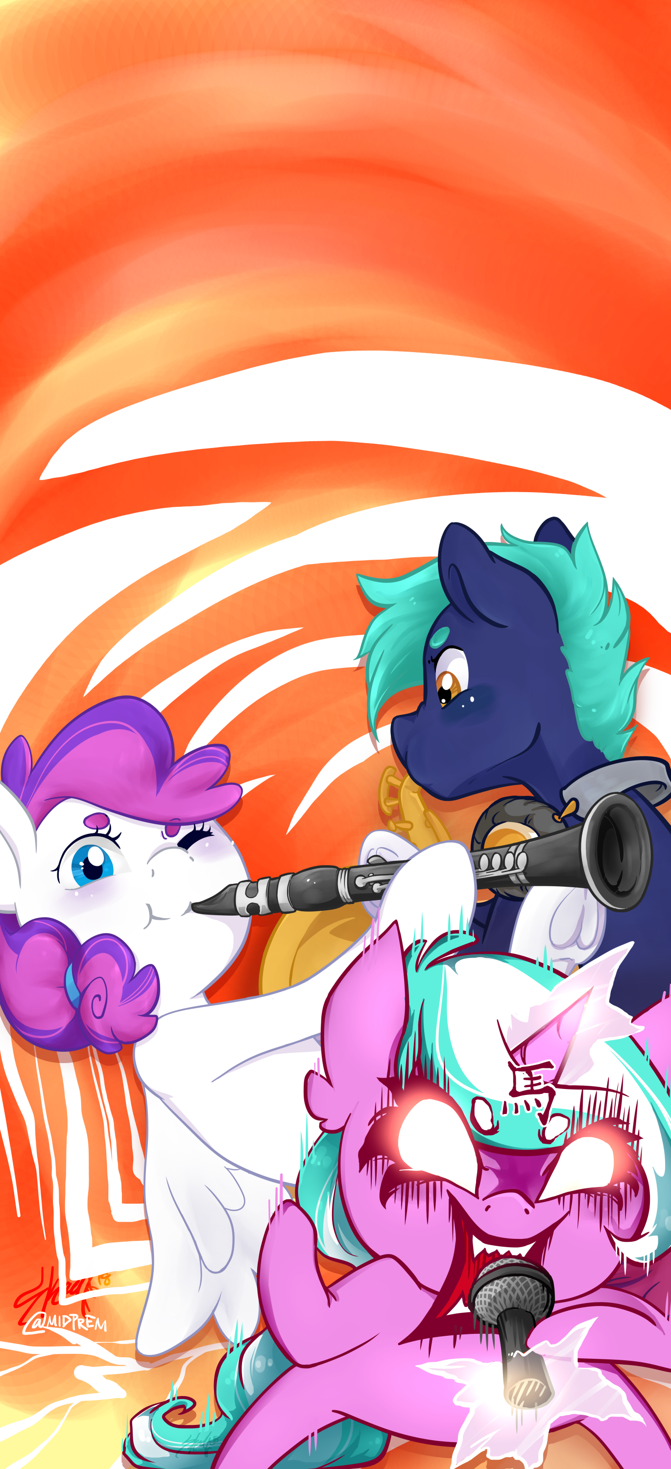
Hey everyone! For Bronycon I had the opportunity to design what is known as an "Evergreen Banner". Here is my process!!
Every year, people redo certain banners such as the "Marketplace" or "Mane Events" banners in whichever theme follows that year (in this case, the Road Trip theme). But Evergreen banners are made to last several years without sticking to a certain theme. Because of this, they are made in the normal Friendship is Magic show-style.
This Evergreen banner is called "Hoof Beatz's Jam Space", and the purpose is for a room where people can bring their instruments and hang out together.
Here is my process! I hope you enjoy!
First up, the initial sketches! I want to use an off-showstyle look for the main characters, with a simple but snazzy background, similar to the opening credit scene from Monster's, Inc. A friend suggested using Saul Bass as an inspiration as well! And during the staff meeting, I got permission to add in that Aggretsuko reference~! >:D
Filling in the lines here! I'm really digging Hoof Beatz (right), but Blank Canvas (left) isn't coming out how I'd like. Back to the drawing board!
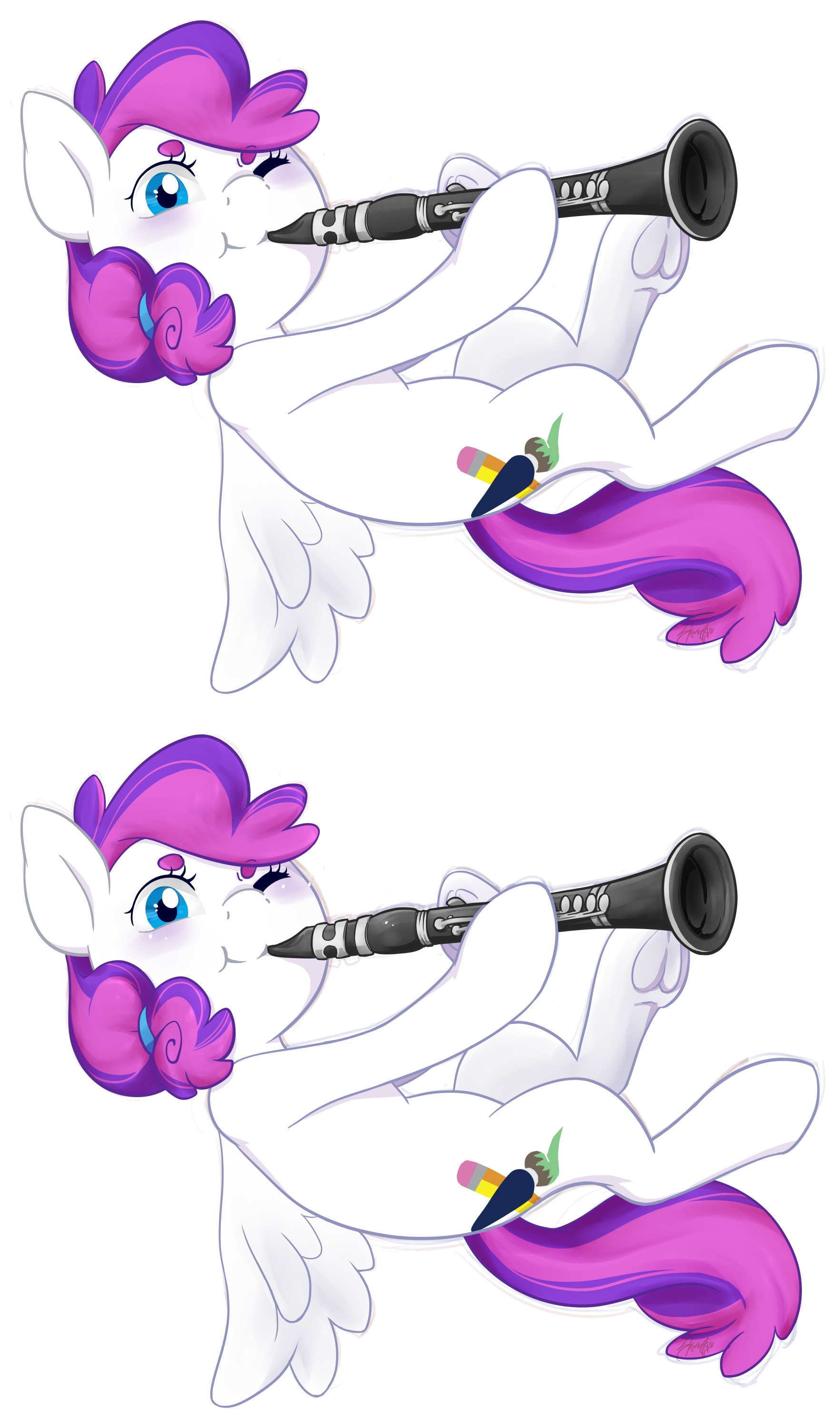
I didn't like the original sketch and wanted to conform a wee bit more to the showstyle, so I redid Blank Canvas! Went back and forth with a friend about the exact wing position especially, since the show is rather ungraceful when it comes to wings. I spent about 20 minutes studying bird flight patterns and wing poses. Do your homework! It feels empowering. But back to her later.
Hoof Beatz was really simple and easy to do - watercolor brush for some simple shading, on top of some simple but bolder shading to add that cartoony effect. At the end I just play with the transparency slider to see what looks nicest! That's...that's the trick guys, just play with the filter sliders.
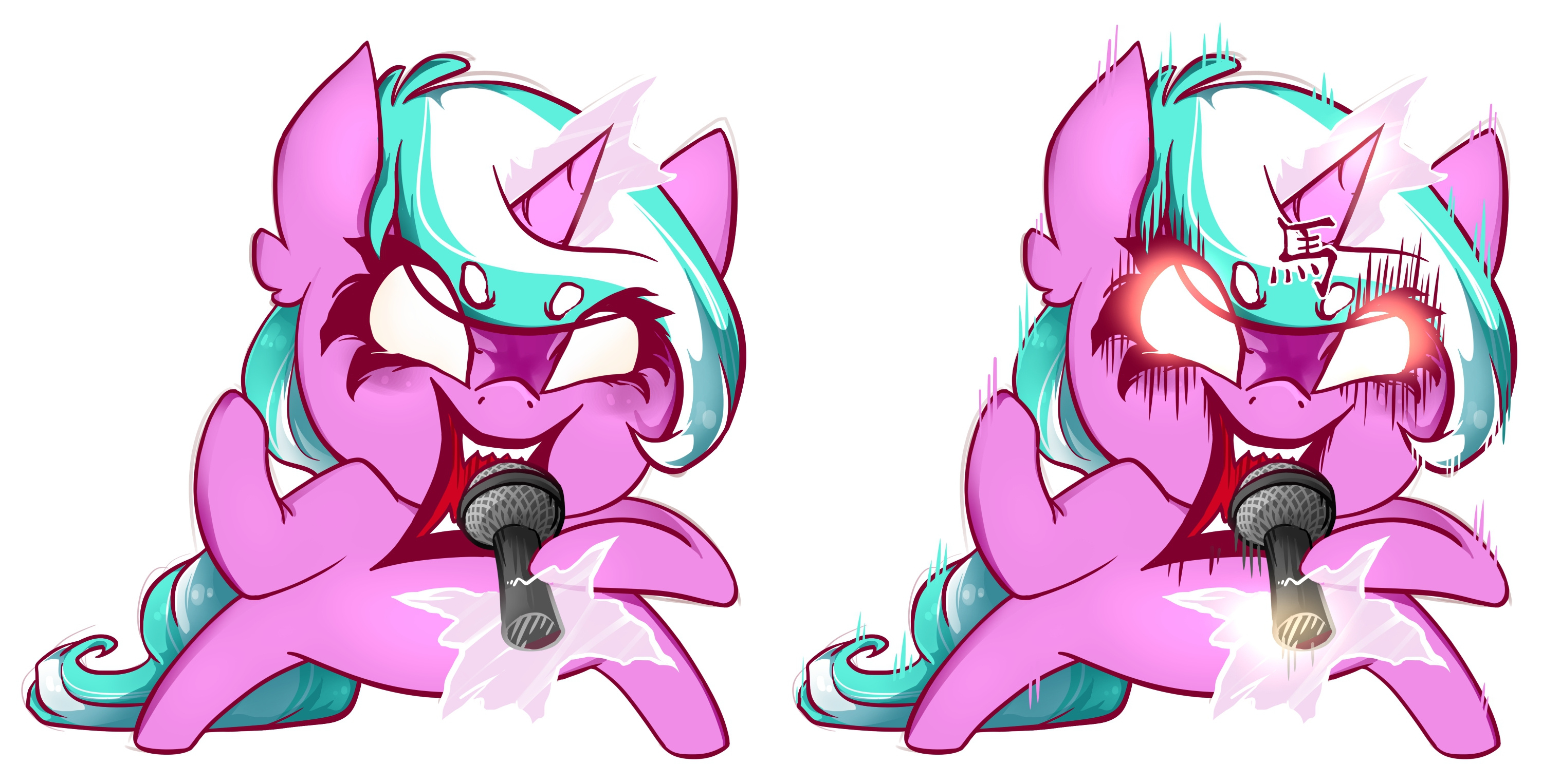
Because this piece is SO BIG (I have to supersize it to fit on a large banner), I took each character to a separate canvas and finished them individually to keep my computer from overloading. Here is Aggresuko/Mane Events! Sharp, bold lines with only two different line colors.
Color! Waaaaah! Even the magic lines are jagged and bold. The lines around the eyes and brows are drawn quickly to allow for mistakes.
YAAARGH! Heavier shading is added in, especially around the face. Effect lines are also added in all around the body.
((The kanji symbol over her horn means "Horse"!))
Redoing Blank Canvas! I borrowed my sister's clarinet and did some fieldwork, taking some reference photos to position everything properly. Especially with such a complicated object, it's better to use references at your disposal as much as possible. (Stock photos are unreliable! Those punks were holding it wrong!!)
Adding color and trying to make the clarinet look realistic enough in Blank's hooves... Don't question horse physics!
Adding shading and again messing with that transparency slider.
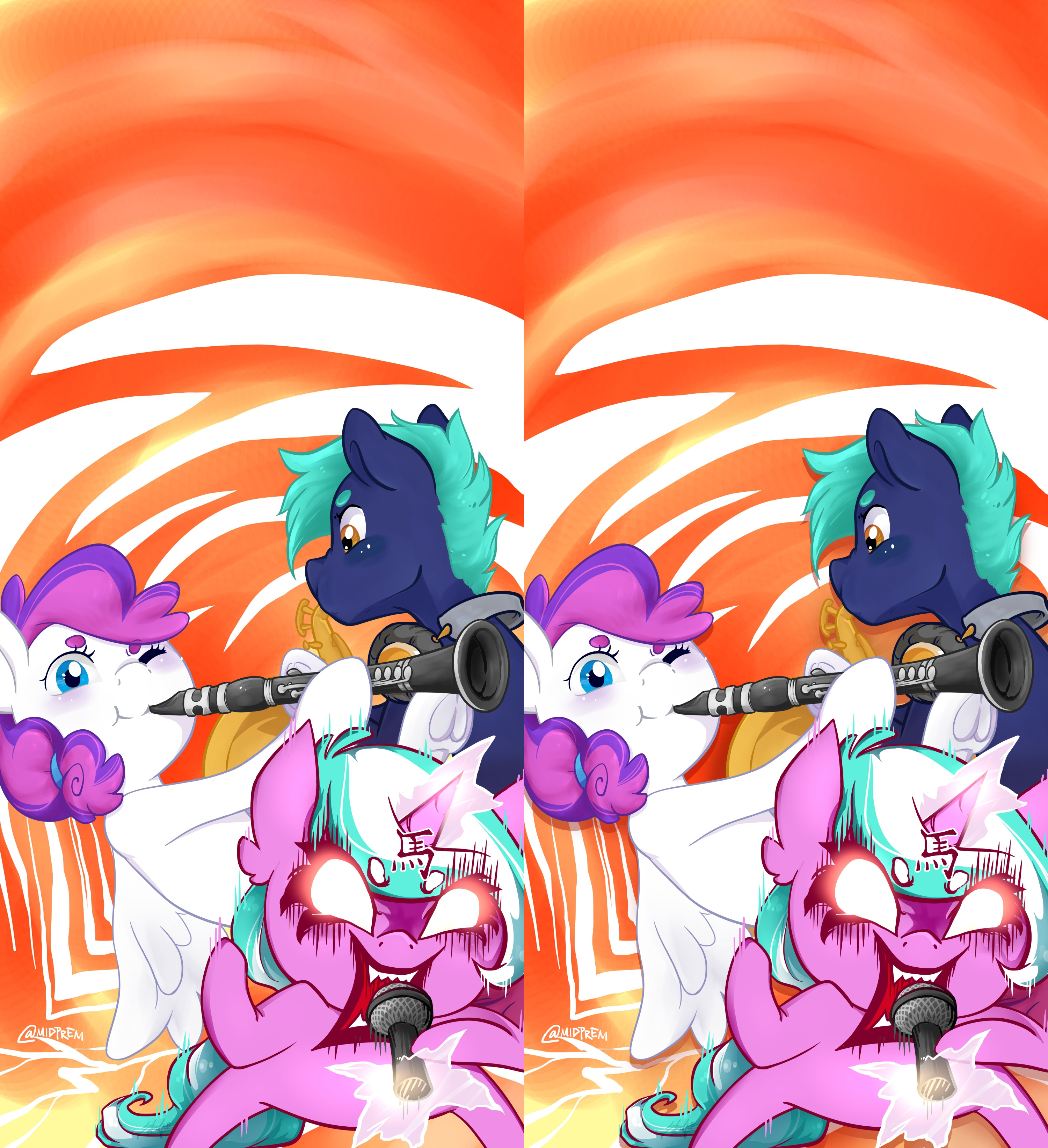
Everything is coming together! It's time for the background. Yellow and orange seem to work nicely, so I slop together an orange flowy texture around the mascots.
Adding motion lines! These are meant to provide texture and a background without being too distracting, and ideally to compliment the tone of the piece. Different textures/motion lines for each different mascot.
And voila! My camera phone didn't do it justice, but the colors came out deliciously spicy on the banner.
Files