 Home

 Creators
 Search
 Recent
 Random
 Posts
 DMs
 Tags
 Random
 Importer
 Import
 FAQ
 Account
 Register
 Login
 Favorites
 Keys
 Logout
 Telegram

did you know that the 'p' in '1080p' stands for pain? (Patreon)
Content
it was really an interesting choice of naming convention on their part but who am i to argue?
so the demo was made for 720p. i thought that would be enough. foolish fool. it is never enough. we gotta change that, and the sooner we do so, the better because monitors are only getting bigger, smaller computers are being phased out, and standards are going up.
for my part, i don't really mind... combat and summary screen have both been pretty cramped, and with large maps we can certainly use the extra space. reborn had a resolution jump after it's first episode too (from GBA screen size to DS size).
much better now than later when we'd have to remake/readjust a lot more systems and maps.
the actual process of doing it, however......................................
i really wasn't looking forward to it.
...it hasn't been that bad!!!! it was mainly disheartening at first. the actual act of updating the resolution is really easy-- just change a setting or two.
the problem is, then everything looks like, um...


...and the crown jewels:


...so lots of work to do there.
the actual process of fixing those things is not very remarkable. art assets are usually high quality enough to just re-export for a larger size, and then pixel coordinates can be fixed.
where it gets messier would be with text and sprites, since text can be resized but then things need to be proportioned around it, and sprites are immutable. if we weren't looking to benefit from the space as much it would be hellatious, no joke, but instead we can just accept the new sizing and make some different design decisions.
i won't be going everything in detail, but let's take the load screen per example since that was one of the most involved parts.
here it is in 720p:

and here it is immediately after resizing to 1080p

it's not the highest priority, but first up, the particles only go partway across the screen. that can just be adjusted right in the file used on all the title screen/options scenes. let's also restore a preview screen to help position that.

the idle prompts in the middle. are part of the screen, not the UI, because it was shot from being janked. just ignore those.
now we're going to re-export the images in the new resolution.

the only thing that does not change is the circle frame on the left. it can't-- because it's built to contain sprites which can't be upscaled. because we can't upscale the circle frame, this changes the proportions of the entire rest of the scene, which is why it looks like that. normally that black cut off would have been hidden under the frame.
we can scoot it over and extend it to fix. let's also fix the background.:

now we reposition the preview screen and text. this way is actually cleaner than 720p since we are masking the preview screen to exactly fit the shape of the UI instead of just Doing Our Best.

finally, let's space out the menu on the left a little more since we have more space.

i realized later what i should have done was scoot the circle's center down to reestablish vertical symmetry, and i do that on other UI piece updates. but i did not think of it here yet so this is what happened.
let's look at some other fixed views from the title scenes.


nice.
the next big hurdle has been the message system. after all, it was set to stretch across the entire screen for 720p, like in this screen:
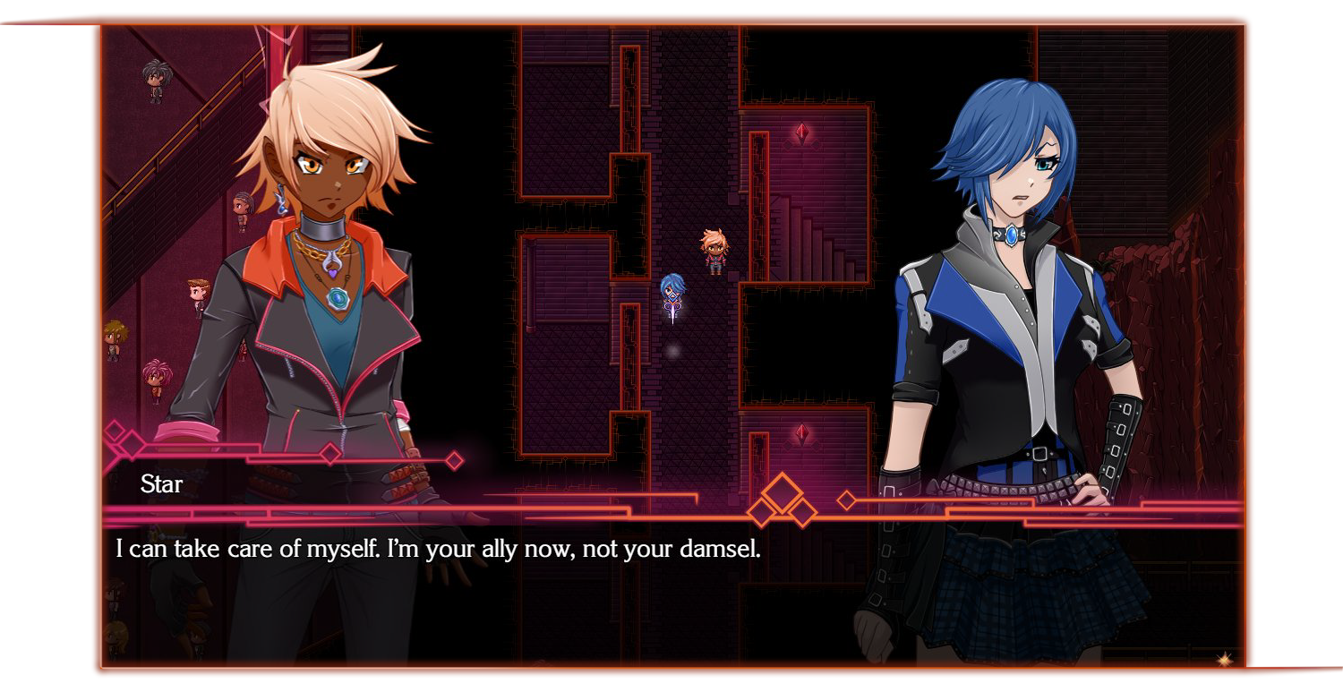
...but for 1080p, having it stretch the entire bottom of the screen is just too wide. it's a lot more distance for the eyes to travel, and most of our messages are not going to be that long because i find shorter ones pace better. that might just be habit from reborn's tiny textbox though...
...but it looks like this:

the message art doesn't matter btw, that can just be re-exported, dw about it
but the frame was drawn to look like it goes off the side, so there are no sides. and while i could just draw a similar style of frame down the left and right, (firstly, this style was a pain in the ass to make in the first place), it didn't feel right.
...so it took a couple days but i've remade the message frames now.
i'm pretty happy with them.
what do you think?

it's a bit hard to see but there's also a stylized fade out on the side of the background dimmer.
here's hell's style:

and versions without the nametag:


combat and summary are big endeavors yet to come, so we'll have more about that in coming posts. wish me luck ........................................................................
