Home Creators Posts Import Register Favorites Logout

Content

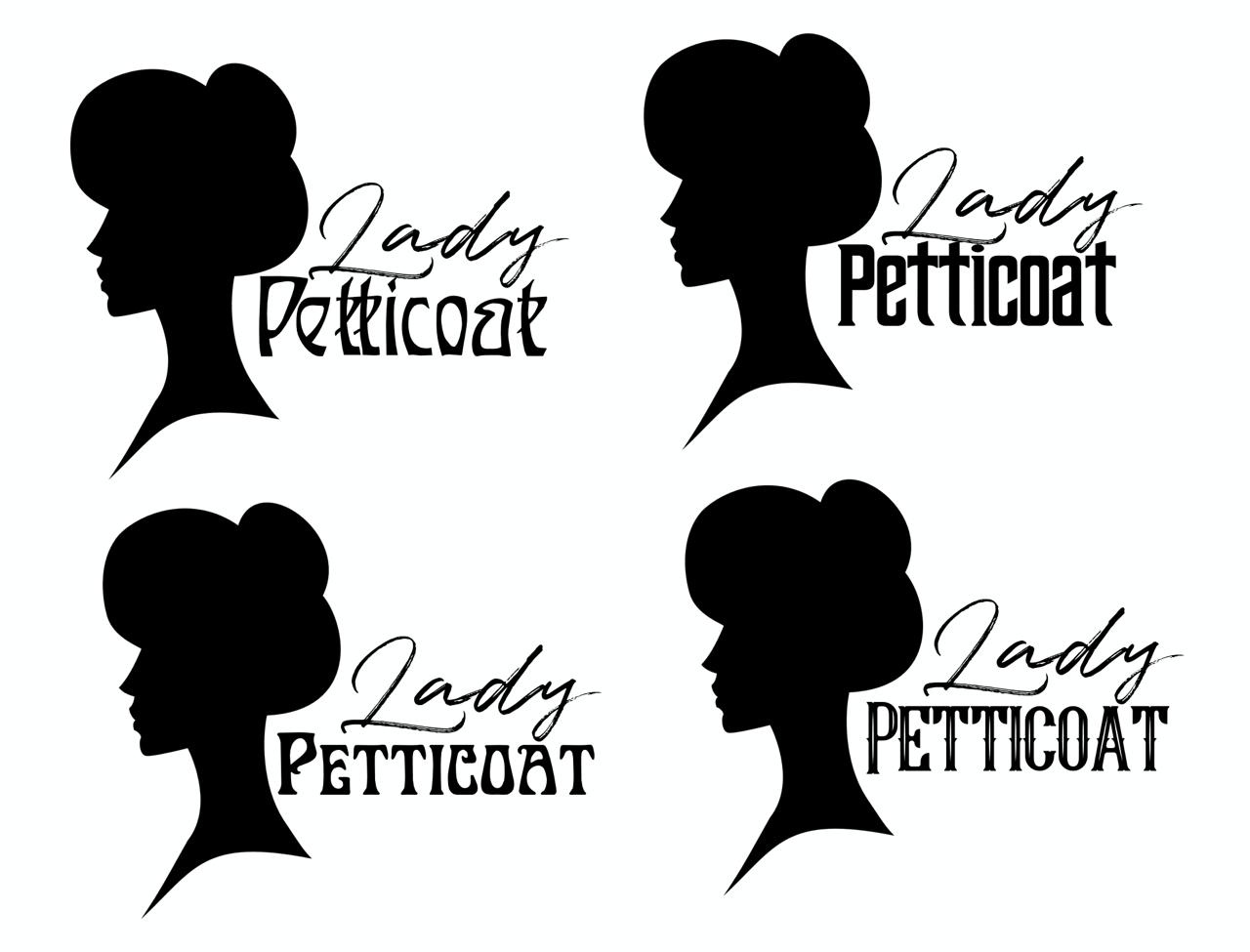
It has been a while since I've been thinking of making a logo. Tho I actually have a Graphic Design Degree that I've never used, and I'm sure you can tell *laughs*, making logos has never been one of my strongest point, as you can see.

I'd like to use it as a watermark, adding the socials and such and maybe creating a bit of trademark.

What do you think of it? Which one do you like best?Are there any graphic designers around?

Files

Comments

The Curious One

You are talented. And unfortunately no, I am not a graphic designer. I like the logo on the first image, left side, below the most. Much success and good you get your own logo!

Maleemon

I am no graphic designer, but to me left image, bottom right looks best, I think it would hold up well as a watermark. The top font is more legible than on the right image, and the bottom font both fits the top bc it's more delicate and flowy, and is solid enough to be easy to read and focus on

Lupe

I like the bottom two the best

Cardinal _ Cherry

I would go for top rights. The 'lady' is elegant and fits the victorian impression you specialise in whilst the 'Petticoat' remains a more standard font that allows easier reading. The others are good on their own, but I view them as being too busy in the sense you sacrifice either the Lady or Petticoat being missed at first glance.

CaitlynMasked

I've worked as a graphic designer years ago, though my degree was in photography. Lemme say that I love the concept you've got going here. The image of the 'lady' along with the dual font title works very well. I honestly think any of these would work fine though I think the lower right image on test-1.jpg works best. If I'm being nitpicky I have three issues with it (understand at this point, these are all just personal preferences). 1st, I think the 'lady' graphic should be looking AT the title instead of away. 2nd I think the fonts should be as simple as possible so they'll work at any size/color. Having the 'Petticoat' be solid black instead of the white inner portions would be better. 3rd, I think the 'Lady' and 'Petticoat' overlap a bit too much. It's legible at this size, but it might lose something when smaller. I made some examples and will message you directly to see how I can get them to you. Again, I think they're all great and fit you and your style. I'm just a classic nitpicker!

Datbop

Bottom left or bottom right is most striking to me!

Lady Petticoat

Thank you so much, your feedback is very much welcome!

Lady Petticoat

Thank you so much for your feedback. I've received your email and I'll take it into consideration, whenever I can I'll get back to you! Thank you so much again!.