Home Creators Posts Import Register Favorites Logout

Content

I've kept working on the logo, keeping in mind what you've all been telling me, I've done whatever I pleased *laughs*

While working on it, it's true I wanted the Lady to feel like a signature, but you all pointed out about readability, which is basic for a logo, so I asked myself: Do I really need two typographies for a logo? No, I don't, it's messy, distracting...

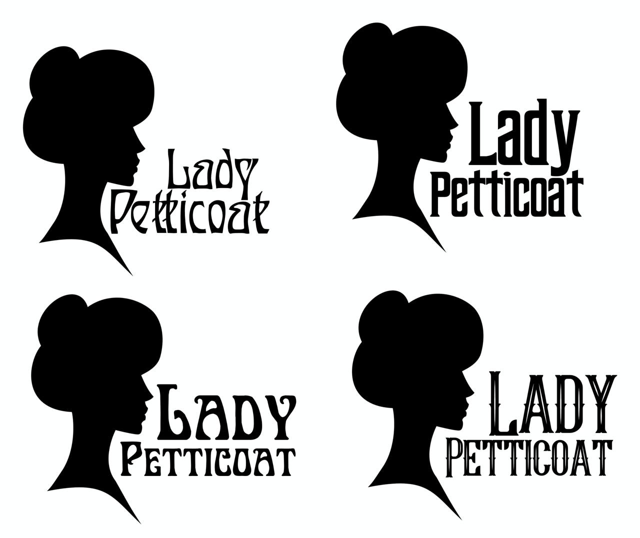
So, I tried to work with just one font. From the first picture, my favourite is the bottom left, and I'll tell you why. The first font is too messy, it has this Art Nouveau style I'm looking for, but it's hard to read. The second one, top right, has good readability but... it's too industrial for what I'm looking for. The last one, bottom right, could work, very 1890s but... I feel it too American/Wild West, which for Joey and Brian would be perfect, but still not convinced. The bottom left is my current favourite, it has this Art Nouveau vibe, and it's easy enough to read.

The thing is, when you scale a logo to the point you lose readability, the text disappears, and just the icon remains.

I kept working on that one and did the versions from the second image. So, what do you think?

Files
Comments

Lupe

Of the second images, I like the two on the right the best

Cardinal _ Cherry

Bottom left is also my favourite! It also displays the icons for the social media you are in. So it not only provides the vibe you want, you also provide that extra info on where fans can find you (could also point out that you are on those sites *only*, and thus if someone finds you elsewhere it means that person is copying you without credit etc)

CaitlynMasked

I like it! I like it a lot! I/m right in step with your reasoning and believe, on the first image, that the bottom left is the correct/best choice. As for the right side, I'm reminded of that Old El Paso commercial... Why Not Both? Or in this case, why not all of them? The lady silhouette would be your 'logo'. The logo with the text would be your expanded logo or your watermark or signature. Then depending on usage, you could add the lines below and/or above and even your socials. I wouldn't personally put your socials as a watermark on your images as it dates them (you might go on other socials or drop some at a later date). But it'd certainly be useful as a signature for a post or letter. Something else you could consider, since you're moving down to a single font, would be 'special' logos. You could change the font up for certain occasions. Have a 'scary' font for something like the Haunted Manner series. Have that western feeling font for Joey and Brian. Have a more modern font for your commissions (that are set in modern times). Just a thought.

Lady Petticoat

Yeah, that's a bit of the intention about the socials, tho I'm still not 100% sure about it, I might just keep adding the addresses as I do on the post on social media, bc for example, many people don't know Patreon's logo, the previous one was better and more recognizable but this one that looks like a bean... 😆

Lady Petticoat

Hmmm that's an interesting take, I might think about it, truly. Thank you so much for your feedback!

Datbop

I'd say bottom right in the second image. It has the right balance of flair and simplicity methinks.