Home Creators Posts Import Register Favorites Logout

Content

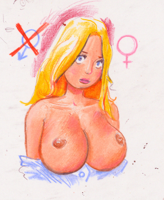
First, thanks for all the feedback I've been getting. It may be just trying to find that right style of coloring or trying a different medium but I want to bring my fine patrons more color pieces. I won't stop bringing you black and white art, though. I just want to expand.

How about a more toony style of drawing and coloring?

Files
Comments

Ziobrando

While it looks good, my personal preference would be for your more realistic style, I think that plus color really makes it pop

Renderdarg

Yeah I agreed with JB, you have really good realistic detailing which I prefer generally. It’s definitely still good, I just like your other style better. I’m not sure for input on the coloring itself, I’m not sure how but it feels like some of the detailing from your black and white style is lost with this coloring? But I don’t know enough about coloring styles to suggest anything.

Robert Louis Stoll

You have a wonderful way of being able to switch styles :) I like them all. My favorite is going to be your realistic style but I completely trust you. One thing that might be fun to try is some darker colored shading or keeping the B/W detailing with the coloring laid on top. But whatever works for you.

Shoji

Zoey actually no…I like your realistic female renderings more …meaning I like how your drawings present like real actual humans with realistic expressions…to change so it looks more like a cartoon would lose it’s uniqueness appeal IMHO…especially with the female renderings ..might lose the sex appeal …but I can’t stop you if you prefer to tackle in the toon medium of art

Zoe Crockett

I see what you're saying. I'm a sucker for realism, myself, so I really appreciate your comment. I won't be discarding my realistic style. I guess what I need to do is find a medium, possibly digital coloring, that can accommodate my realistic artwork. Out of curiosity, what do you think of this coloring with my style: https://www.deviantart.com/cluedog/art/Red-1153429278

Shoji

Ok Zoe…do me a favor go to the deviantart link you sent me and look up the post you did “ Shasta in Color “ reason is this is the style you should use for a color template…IDK how or what you used for this …but IMO it works …however it is really rough and messy in some the color areas…so if you can polish the medium and make more balanced using this color scheme , you really have something to work with and sure will be a hit with the other people who are Patreon members for you

Zoe Crockett

Thank you so much for your feedback! The Shasta in Color image wasn't done by me but a person named Tyremanguy (great person, too). I am seeing about doing more work with them in the future but it's uncertain how available they might be. The reason I asked you about the "Red" image was the colorist, by the name of Michael Woods, is more readily available. Do you feel they aren't that good or it doesn't work well with my style? They also did this piece: https://www.deviantart.com/cluedog/art/New-Comic-Tier-1068162895

Whiteeyes1989 Writing

Honestly this is going to be a more experimental phase anyway, so try it out. Try it with your realism style. Try it with heavy shading, light shading, thick outlines, thin ones too. Experience a variety and see which ones resonate with you.