Home Creators Posts Import Register Favorites Logout

Poll

Chapter 12 Status Report (4)

  • Option 1 654
  • Option 2 179
  • 2024-03-03
  • 833 votes
{'title': 'Chapter 12 Status Report (4)', 'choices': [{'text': 'Option 1', 'votes': 654}, {'text': 'Option 2', 'votes': 179}], 'closes_at': None, 'created_at': datetime.datetime(2024, 3, 3, 9, 43, tzinfo=datetime.timezone.utc), 'description': None, 'allow_multiple': False, 'total_votes': 833}

Content

Work continues, and I'm making progress on Chapter 12. This past week, I've focused more on the art, preparing tryouts for the search of freelance illustrators, drawing other illustrations myself to send to the colorist, and finalizing the files that were already colored. Right now I have around 40 illustrations and 6 animations fully completed, and around 30 more illustrations are being worked on. I think the final illustration count for this chapter will be close to 100. Also, I've been pushing the animations lately, and most consist of 3 to 5 frames instead of just 2, which makes them look more fluid and cool, but it's also quite time consuming, so I try to be rather selective with them. Hopefully the extra effort is worth it in the final product.

I've been working on the writing too, but the progress has been a bit slow due to the complexity of it. I'm trying to keep it slow and steady, dedicating my mornings to writing and the afternoons to art, while I figure out how to fit all the pieces together, orchestrating the structure and order of all the scenes, delving into character interactions, and integrating interactivity, in addition to considering all the possible permutations and how they intertwine properly so that all the decisions the player has made are adequately represented. 

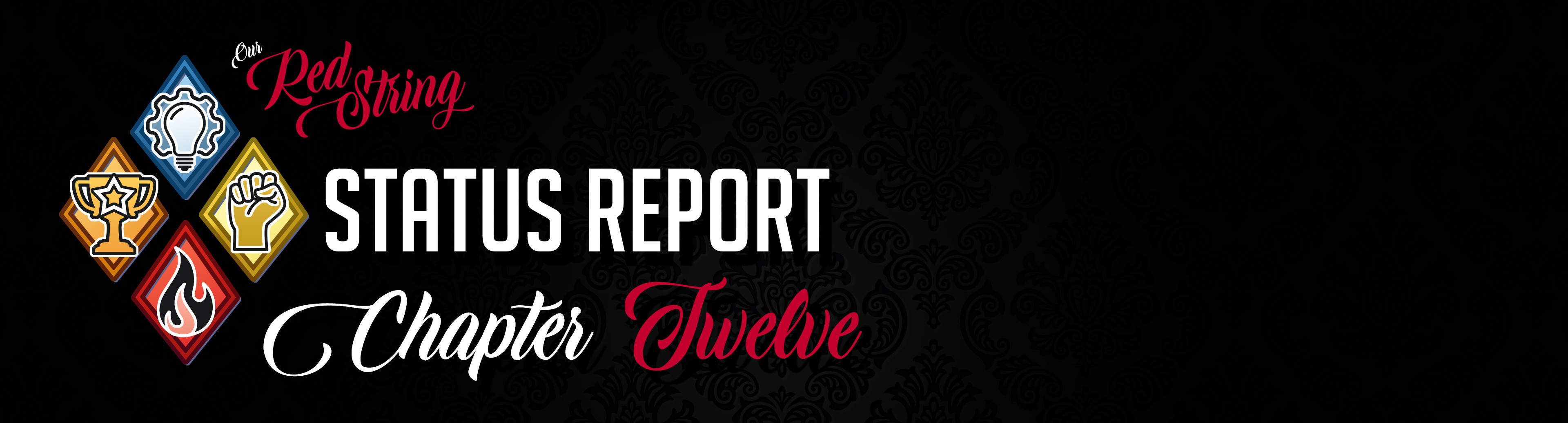
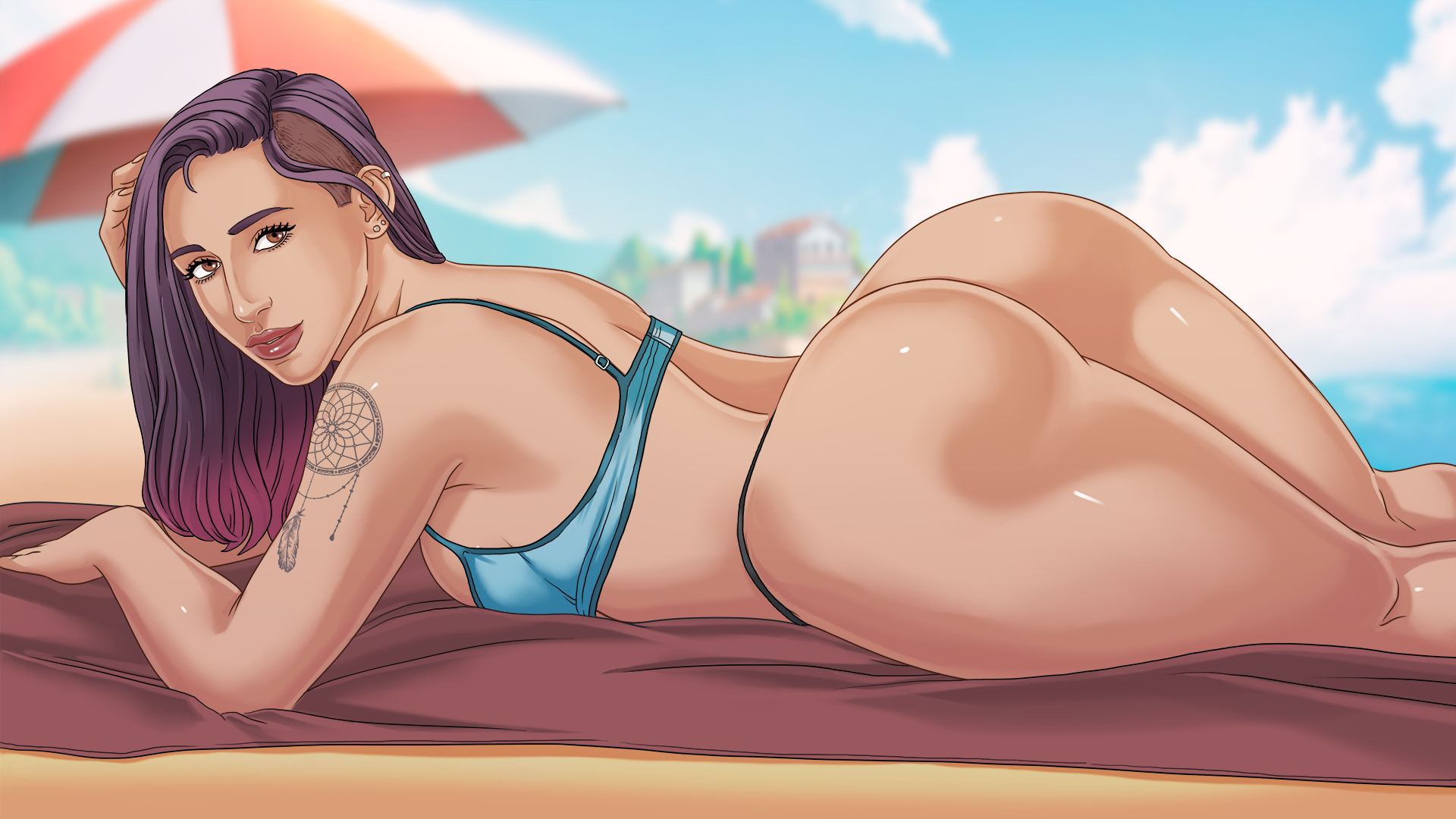
I'll talk more about the challenges of writing this chapter in my next report, but in the meantime, here's a picture of Emma enjoying the beach. I've tried two different finishes; the difference is subtle but gives the images a different feel. Which finish convinces you more? I think I lean towards the first one, which is more muted and natural, but maybe it looks better and less flat with brighter ambient light... What's your preference?
Files

Comments

VHO

I find Option 1 on the top better matches Emma's skin while I look through the game's gallery.

Icytoed

I think option 1 is warmer and brings out more of the warm tones of her skin better.

Christian Akacro

Pam from The Office meme for me (They're the same picture). I've always been terrible at seeing differences like this. Whatever you think is best works for me!

ZeroOne

Emma my best girl

Dennis

Both look good, so I think you should pick the one that fits more to your scene-setup: I think if you are going for a real hot (temperature), bright scene around noon, it should be picture 2. Looks likea HD-colouring-schema, where the colours appear brighter because of over-exposure. The first picture fits more to a setting at a later time of the day, maybe 15 or 16o'clock.

face oupile

I prefer the first one, but... it's odd. There is something strange with the picture, I've got the impression that it's two different bodies mixed in one, like there is a 'cut' right in the middle. I do understand the fact you want to put the focus on Emma's nice... asset, but the overall picture is a bit odd to me. Like if the bottom part was enlarged by 10% Can't wait to get the next chapter and continue to see the story unfold :)

TommyTheDude

I’ll echo other comments in saying that the first image feels less washed out, and therefore comparatively more vibrant. Definitely 1 for me

james moon

Yeah, the higher contrast of option one really helps to define her (and as a result other characters). Awesome work and really can't wait for the next update!

Christian Gudmundsson

I don't understand, to me option 2 looks the more muted and natural. Option 1 has brighter colours. They're both good though.

ZeroOne

Can we get a Louise Teaser next please :P

wei

i can't tell the difference XD