Home Creators Posts Import Register Favorites Logout

Content

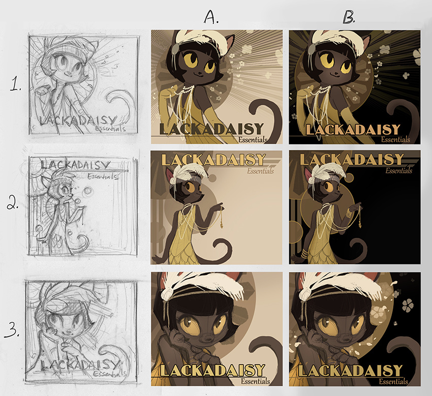
So, in conjunction with another project currently underway, I'm finally putting together that art book (art, mini-comics and tutorials collection).  I've got some things to show you all soon in relation to the other project, but I'm torn on the cover design for the art book and so I thought I'd ask your opinions.I'm aiming for something more lighthearted, simpler and classier than what I've done in the past with Lackadaisy book covers (I'm embarrassed by the ponderous designs of the Volume 1 and 2 covers, honestly) - something that makes better use of negative space and a limited palette.  The bronzy-beige background shapes in each of these represent semi-metallic art deco elements.Do you have any thoughts? Do any of these compositions stand out? Like or dislike the concept on the whole? If you feel up to sharing, I'd be grateful to have your input!---------------------------------------Wow - thank you all for the wonderful feedback! A large mix of opinions, but that seems natural for something as subjective as art. The B column seems to be the more favored one, and 1 & 2 seem to have more votes than 3, so I'll move ahead with that in mind (probably with some adjustments based on your suggestions). Thanks again for indulging me!

Files
Comments

Cashmere Sky

I think 1 A and B have the best balance of presence and negative space. 2 steps back a bit too much and also hides the subject, while 3 (while cute of course) is almost over compensating and putting full focus on one subject. I think the design of 1 has a balance of subject with the extra decor and aesthetics. White and black though... not sure which I prefer more, but I feel black is more pronounced. ;) 1B is my pick. EDIT: 1A might be better based on Ivy's colors so there isn't clash with the values. It's a hard choice for me. The black has a bolder punch though. Depends on how you push forward the definitions of Ivy's presence. (starting with the tail)

Insatiabear

In order for me: 2A, then 3A, then 1A. The B designs I feel are a bit too dark on the background and she doesn't stand out as well as she does with the lighter background. The 2 design is stark, elegant, and gives a nice sense of distance. 3 subverts that and brings us in for something more intimate, and 1 is a bit more flashy while still being classy. All three are great, I just prefer 2A. :)

GracieV

I don't have any "artsy" thoughts on why or anything, but 1A is the one that stands out to me the most and is my favorite. It's the one I'd be most likely to pick up and look inside. They all are beautiful though. :)

SoylentRamen

I think I prefer 1B, though I'd be hard-pressed to explain why in much detail. They're all great.

Birdy (edited)

Comment edits

2026-09-08 00:00 These are super cool, I love the colors! Personally I'm leaning towards 1B and 3B, I think they both make really good use of the negative space
2020-02-22 13:59

kaitou

To me, 2B seems more in-period. I also like 3B and 1A (even though I prefer the dark background, 1A looks better with the background "ray" motif).

Shir Blum

I love the 2 row, the line work is very elegant and flowing. personally I'm partial to 2B :)

Jessica Rockeman

They all look grand! But if you're going to force me to pick... 2B Or not 2B? Har.

Nancie

I love everything about the 2’s except her eye (she’s looking too far to the side, I think) and the legibility of “essentials” against the background of 2b.

Christopher Heiny

I like 2a and 2b, with 2b as the favorite except that 'Essentials' needs to be slightly lightened for better contrast against the background.

Amy ☣

I prefer the a column over the b column as a whole, and 1a is my favorite.

Christopher Heiny

Possible mod to 2x would be to rotate the title text 90 degrees counter-clockwise, and align to the right edge of the cover.

Katie Winchester

I'm sure all these opinions could lead you to being more confused and indecisive, not less! :D But for what it's worth, 2a has that 'light and breezy ' look you're going for, with the light palette being the more minimalist of the two. The dark palette is also beautiful though, and personally I'm leaning towards 2b because I just like black. In both 2a and 2b, the title is easier to read and more immediate than in the other images.

LaRiccia

Let us make you more indecisive by all having very different opinions! I think 3b looks most like an art book as opposed to a comic collection, and vote for it on those grounds.

Nelly

I really like 1a the light cover version, That one pulls me in the most. Theyre all great though

Leigh Legler

3 looks very flirty and probably not the vibe you're looking for on this? 1 has a lovely balanced and dynamic composition and is probably my favorite, but something about the flowers is throwing me off. I love the negative space and simplicity of 2, but with the way everything is pushed all the way to the left and top, it makes it look like something needs to be in that middle empty space.

Edward Boudreaux

3B speaks to me. It looks personal and enticing. She is looking out at the viewers inviting them in. 1 series is lovely, but looks more like a novel cover or a feel-good movie poster.

Garrett Simpson

Pretty Ivy! Fun contrast with other covers

Brormorc

I agree with Edward, I think 3B really stands out. But don't you dare say you are embarrassed by your last 2 cover arts. They are absolutely beautiful!

Brittany D

3b is my favorite. I prefer all of column B over the others.

Jayme

1B and 3B are most appealing to me

Annabelle

I really like the 3rd

Deb with the purple bike

B2 is the standout to me. it's clean, sophisticated, and still emanates "deco" -- but I love how the negative space on the right is like an invitation to fill in the blank by opening the book. It's also theatrical -- like Ivy is holding back the edge of a curtain in a black box theater, enticing you to see the show inside. Or she's at the door of a certain sumptuous speakeasy, drawing you in...

Falco

These are all beautiful, but 2B stands out to me the most. Looking forward to seeing the final result! <3

Noble_Bluejacket

B1 & B2 are the ones that I like best, I don’t know art terms so I can’t give the reasons why but I like em XD

Dave D

Comments from me: - I like the expression in 1A the best. - I like the composition in 1B the best. Especially if you're putting more text in. - I like the lighter backgrounds (column 1) better than the black ones (column 2). - I think all of them need a bit more color. The bit inside the ears is good, but I think it may need another pop or two of bright color. Perhaps the feather, or maybe the "swags" on her dress?

John Deemer

I like 3B the most and 1B 2nd.

coyohti

I really like 2A/B. However, since she seems to be gesturing toward the negative space it seems like there should be something there. I think this would be an excellent back cover with the book blurb down the side (if it were and old school album cover it would be the back with the song list :D ).

coyohti

Oops, hit enter too soon. For a cover I like 3B because she's look out and engaging the viewer. B because of contrast - it's very eye-catching.

Goodyear

2 in either colourway! By far the most deco-feeling, with the best font placement and use of negative space. Plus I just love Ivy's pose in it!

Yvonne Clapham

Adding my noise: I like the darker background. 1B.

Astra Crompton

I like the composition and flow of 1B, but if you're going to cleanliness and negative space, I also really love 2A.

Moe H.

Pretty sure B2 is my favorite

Delisle

They're ALL lovely, so thumbs-up on the concept, but if I had to choose one it would be 1-B..., the dark background makes Ivy's eyes glow and the pose and details are so great!

Black_Cat93

Well, while personally I was floored by the covers for volume 1 and 2, I can also see the appeal of something simpler and more stylised, and I’ve liked your previous experiments and work in this direction, so like on the concept as a whole! 3 jumped out at me, I def like Ivy’s pose and expression in that one the best. In 2 I feel like her body got cut off too soon, and there’s a bit too much background space, as others have mentioned (the title placement in that one looks good, though). I like the eye contact in 3, and she looks like she’s got secrets to tell, which I think works well - she’s got something to tell you, to show you... the art of Lackadaisy... the Lackadaisy Essentials. Initially I thought the contrast of the black background was too stark, but it’s more of an issue in 2B since there’s so much of it. The lighter background, while easy on the eyes, is maybe too nondescript... I also like how the background has a bit more going on with the flowers in 3B and 1. The Art Deco background in 2 also looks nice, though. 3 could work with a bit more background space, maybe? I think it’s fine now too, though, and I like the cropping of the picture and how the black background isn’t too overpowering. It’s maybe a bit cramped with the title, though, I feel like it gets lost a little (although the colour of the title in 1B makes it stand out more).

Mr D Sir

I'm more partial to column A as a whole and I think I like the layout of 2 the best, but I wonder if there's a touch too much negative space. The asymmetry is good, and I would change it, but being that far over suggests there's going to be additional text or something, BUT I think the solution is simple. I think if you moved Ivy (and some of the background elements) right by the width of the L that would be enough to keep the asymmetry while clearing any doubt that the negative space is supposed to be just that.

Lorien Inksong

I like 3A and 3C best. But to be fair the lighter background of column 2 might better suit a more casual atmosphere if that makes any sense?

JC Amberlyn

I really like 1B and 2B.

Dobbs Draws

I'm torn between 1B and 2B. Like others have suggested, I like the dark background. But I also like seeing more of Ivy's body. I think most people who are looking at this book will already be familiar with your comic, but if I was a new person, I think the full body tells me a little more. If there isn't much going to be in the space on the right in 2B, then my vote would be 1B.

Minzoku Bokumetsu

3 is the cutest, but I like 2b as a cover design most

David Azzageddi

3B is my fave. Love the sakura petals, and Ivy's expression. She's always been my favorite Lackadaisy.

Lynette

Wow. I really thought it was going to be a square shaped book and all nine illustrations would be on there. That would be a nice visual for the one looking for tutorials.

Emily Simmons

1B is the most pleasing to my eyes, but they're all lovely compositions! Happy to see that all the input has been helping you :D

DuxDelux

I think 3B looks best.

Mary Paplham

I realize I’m late to the feedback party, but if you’re still looking for additional thoughts, here are a few of mine! Like most of the other commentators, I lean towards the B column — the light on dark makes the images pop more — with the text especially; it gets lost a bit on the light background — and really brings a noir feel to the images. Of the three in the B column, I like 1B the best. 3B is cute, but I think 1B has a better balance in terms of space and composition, and I like seeing more of Ivy and her delightful clothing. I love Ivy’s pose in and the overall feel of 2B — it feels the most like a cover for this kind of book — and I love a good use of negative space; but as someone else mentioned, I think there’s a bit too much of it—it feels like something should be in that space, especially because she’s pointing to it. That much negative space I think would be fine I think on a back cover — actually, yeah, i think it’d be perfect for the back cover — but it’s a bit too much on the front given how the rest of the piece is composed. So I really like 2B for a back cover (or inside cover? maybe?) concept but I lean towards 1B for the front — but really, I don’t think you could go wrong developing anything from the B column!

Ferret Williams

B1. I like 1 & 2 because you see more of her clothes style, which tells you more about the character and the setting. 2 draws attention to a blank space, though. I felt like column A was easier on the eyes, but column B is striking, which is good for a book cover. It has great contrast and would look snazzy on glossy.

Anelise Horah

1a or 2b, but I did love the old covers, I liked the amount of detail and it was what attracted me to the original comic. That is just my 2 cents though.