Home Creators Posts Import Register Favorites Logout

Content

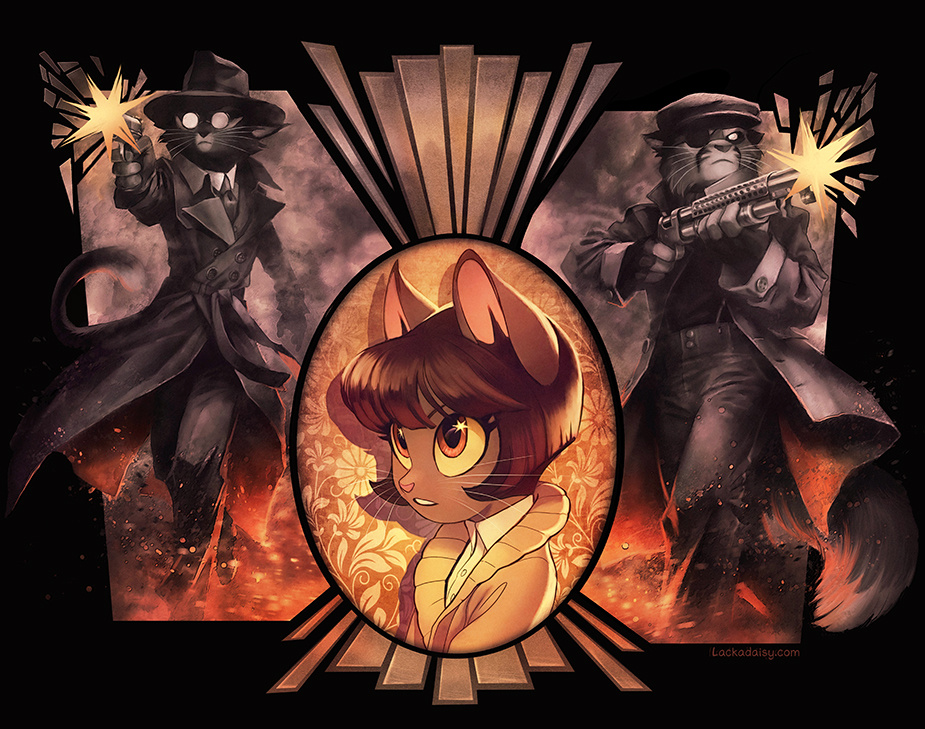
Some art I've been working on for the Volume 2 book reprint.Maybe you can help me pick which one works better. The cool-warm one (the top image) or the warm-warm one? I've stared at it for too long to be objective.

--------------------Seems like the cool-warm one already won out. Thanks for your feedback, everyone!Your remarks on color language are really thoughtful!

Files

Comments

Chris St

They're both great :-) but I think the cool/warm one points out how Ivy shouldn't be mixed up in all this...

EDA

I’d say the cooler-warm one, it has a nice contrast to it

Aimee

I like the cool one! It draws the eye to Ivy without washing out the rest of the piece

Voices Keri

I like the broader contrast in the cool/warm one. It pops more. My 2 cents ❤️

JT96

Brathtaking as always.

The Squonk

This is amazing!! And honestly, yeah, I’d say the warm/cool one

Cashmere Sky

cool-warm... the blue / orange color contrast is more striking (similar to the Moonshine pic). The warm-warm dulls it out too much.

Amy ☣

I definitely like the cool-warm one better. I feel that the cooler tones help offset that part of the composition from Ivy, but the flames/embers around Mordecai and Viktor's feet still tie the two parts together.

Sheryl Knowles

The cool "border characters" around the warm Ivy is the more dramatic image. It implies a strong character difference between the young female and the violent males. If that's the story you want to tell with this picture, I think it hits it on the button. The overall warmer tone of the other image seems to imply that the female might be the "heart" or the source of heat for the violent actions around her. The similar colours seem inclusive. That's a rather different story.

Dewclaw

I find myself staring for longer at the cool-warm image. The contrast is more visually interesting, and it fits with the flashbacks in volume 2 being in cooler colors than the sepia-toned "present". (Except for, ironically, Viktor and Mordecai's cabin shootout, which was not.)

Fanfiction

Great work as always, I agree with the others saying the cool/warm contrast is more interesting

NovaDoesArts

Definitely cool warm. Everyone pops more :)

Watts

The cool/warm one, for sure

Craig Davidson

Cool-warm. The other feels more “integrated “, but I reckon the contrast on the cool-warm is more interesting for longer

Meadowhaven

Aaaa, that's so awesome! I agree on the choice for the cool-warm one, just for the pretty color contrast!

Jeanie

My thoughts right here

akrasia

Well, it's partly cool. Other parts are warm. I know, I know...

Thirada fitzgerald

I mean Tracy is one of the best artists out there (at least in my opinion) so I’m sure whatever she makes is gonna be awesome

kaitou

Cool-warm (should have put up a poll). Ship it!

Nils Thingvall

cool warm. The contrast is very nice

Winni Wei

I actually like warm/warm since I see cool/warm everywhere else... but there's a good reason why cool/warm is so common

Gabriel Whitney

Cool warm looks really good but it Probably would depend on what the rest of the book looks like to fully decide. (If the book is cool the warm-warm might be better, for instance. )

Jacek Tomaszewski

Warm-warm: it's more like sepia color from the comic pages

kfrances

holy shit. this is lovely tracy

Maximilian Baranek

I am just devouring this there's so much wonderful design to unpack Also I think cool+warm because the contrast the two of them have between the muzzle flash and flames really sings

Mogo

I'm also in the Cool-Warm camp, the greater contrast is pleasing.

Rosenkavalier

I think the cool-warm version looks better, too - the contrast is really effective.

Christopher Jones

Cool-warm for me, too (but as GW said, it does depend a bit on what else is going on).

MaestroKat

Cool-warm, the contrast works perfectly!

Akiyo

Cool-warm

Isabella Shapiro

I would go with the cool-warm one! The contrast makes it more striking. Beautiful art!

ThirdKind

Ivy looks particularly lovely in this one💖

Paul (Chiron)

Normally I would go with the blue version, but I am drawn more to the warm version. But considering the two characters firing firearms, it shouldn’t be warm and cozy. I vote for the blue version. And I agree… fine work!

AltGrendel

Warm/warm. I like that it pulls the whole image together.

Leo G.

Cool Warm Crew!

Sauced-in-Space

I'd say the cool-warm crew - it makes Ivy's center portrait pop!

Cool Boy

"It makes the light in dead eyes" definitely the colder one this poster reminds me of ivy's dream