Home Creators Posts Import Register Favorites Logout

Content

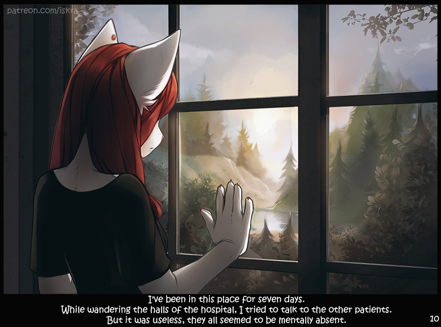
Here I repeated the artwork drawn back in 2015:

And I know what you're going to say: the old one was better! And yes, as a separate picture, it is indeed more pleasant. But here my goal was to create an unpleasant, oppressive atmosphere, and to maintain the style of the whole comic. However, if I save money for a background artist, we will make better backgrounds! xD

Files

Comments

Winter Season_EXE

Agree i miss the old dezines. Selena look more lovelier. But I still love this to.

Techbro

Pretty great and heartfelt. Congrats

Vinny L

Old look or new look, Selena is always beautiful

FortunePayback

Here's my thoughts: Although the new one absolutely paints this dark and cold, eerie solidtude and confinement, I feel like the bottom one is almost more haunting. A gorgeous landscape, but it's mysteries are locked behind these walls; a bird in a cage who cannot be set free. It sort of gives a false sense of security, hiding the sinister nature of what happens here, as opossed to the new, which is blatant. Not saying one is better than the other, but I think they convey separate moods and equally up to different interpretationa.

iamzid

the old one looks like you might go out and have a picnic on a nice day and the new one looks like you have no hope of going outside or ever leaving.

Zaiaku Kerohiko

Remove the wall and i think the new picture looks very pleasent. XD But i am a creature of the night and adore moonlit landscapes.