Home

 Creators
 Search
 Recent
 Random
 Posts
 DMs
 Tags
 Random
 Importer
 Import
 FAQ
 Account
 Register
 Login
 Favorites
 Keys
 Logout
 Telegram

Strielund Gazetteer Preview (Patreon)
Content
Hello all! One of the compilation stretch goals I'm planning is regional gazetteer spreads. A number of people have asked for more detail about the setting which the adventures are drawn from, and this is how I plan on approaching it for each region.
There will definitely be material on the history of the whole setting, but I'm keeping that short. As fun as that is to write, I'm going to favor present-day details and trends, to give context to the adventures rather than soak you in history with no use at the table.
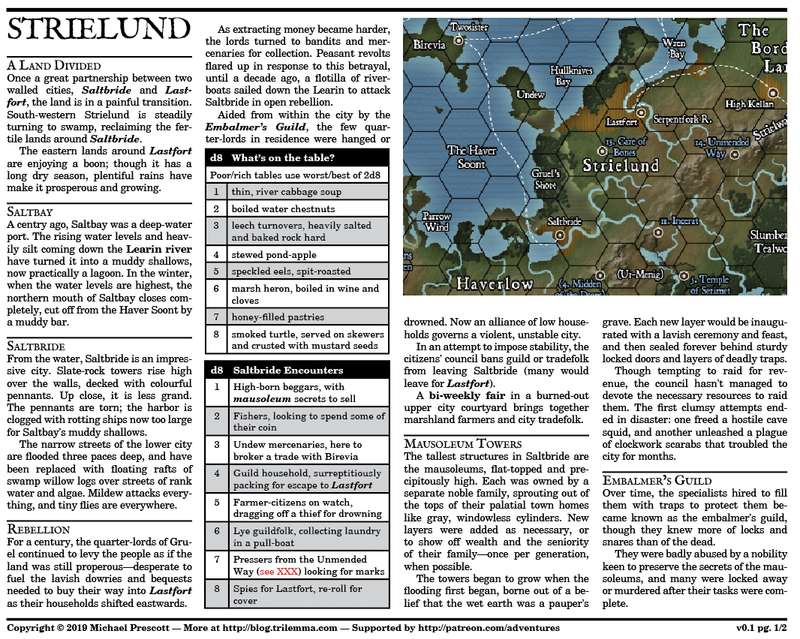
Here is the Strielund Gazetteer, a two-page prototype for the format. Bear in mind that this is a writing draft, so there are typos, layout and typography problems to fix, no need to comment on those as this is v0.1 grade preview stuff right here! But I'd love to hear your thoughts on format and the type of content.
Depending on how it does, the Kickstarter could have 5-8 of these in addition to the adventures.
Strielund is where you find such adventures as In The Care of Bones, The Shattered Gate, and (at its periphery) Though Flesh Be Vast.
http://trilemma.com/patreon_assets/posts/Gazetteer%2020190113.pdf
Files
Previews only