Home Creators Posts Import Register Favorites Logout

Content

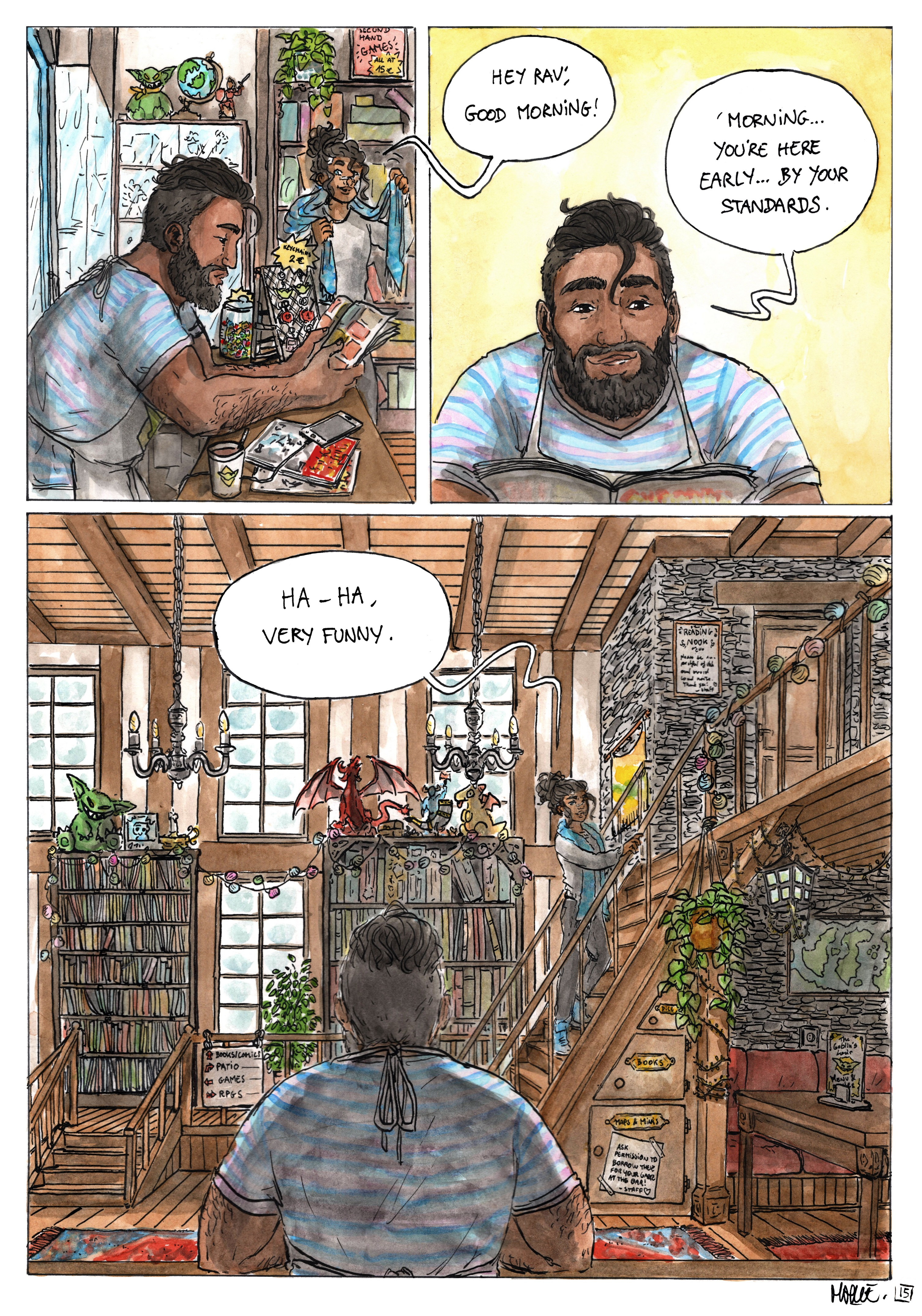
This time we're meeting Ravi and seeing a little bit of The Goblin's Lair! Next one is the last "character introduction", but probably the most important...  👀

_ 

If you feel like helping me out before I upload this page on the website tomorrow, I'm still trying to figure out the brightness of the colors for it. My laptop and phone screen show me wildly different colors all the time, so it's really hard to know what the pages actually look like for other people.Here's a "brighter" version of that page.

The 2nd one looks better than the 1st one on my laptop, but it's the opposite on my phone. 🤔 Which one looks best to y'all/looks best on your screen(s)?? (colors/brightness-wise, Patreon makes pictures blurry at time but they're both the same quality, so disregard that) 

Files

Comments

Monique Lautier

i think the first one looks best, but that might just be me

Lazarus0024

I actually find the second one to look better

Caroline J

I prefer the 2nd one

Tess Olsson

I prefer the 2nd one but I am also on a laptop!

Claire M.

I don't know which one look better, but is that Nott? Are these MULTIPLE stuffed Notts?

Aleks Ghost

Second one looks better - the details such as the books are clearer! (i'm on laptop tho)

PbPlaysInside

The 2nd one looks better on both my monitors and my phone!

Farla47

Yep, 2nd is all bright and shiny while the first is a little dimmed, and harder to see all the cool details in the shop. Which I want to go to and browse all the shelves.

Lu Teys

The 2nd one looks better for me.

Michaela

2nd one, and I'm on a laptop!

Azalais-Snow

Hey glad to see you back, hope you're doing better ! Love the new page as, the backgrounds are incredible 🤩. Also 2nd page looks best for me (phone). Take care, thank you for sharing your amazing work !

Maryne

lmao well TECHNICALLY no, but they ARE goblins, so.... in a way I guess they are :')

Nefarias Bredd

I cant really tell the difference on my phone lol. They both look good to me