Home

 Creators
 Search
 Recent
 Random
 Posts
 DMs
 Tags
 Random
 Importer
 Import
 FAQ
 Account
 Register
 Login
 Favorites
 Keys
 Logout
 Telegram

Whoa! Another Marionette issue 1 update!! (Patreon)
Content
I’m starting to figure out that having Friends on in the background helps pass the time when I work on linework for the pages. I should have done this from the beginning lol Hey, you learn!
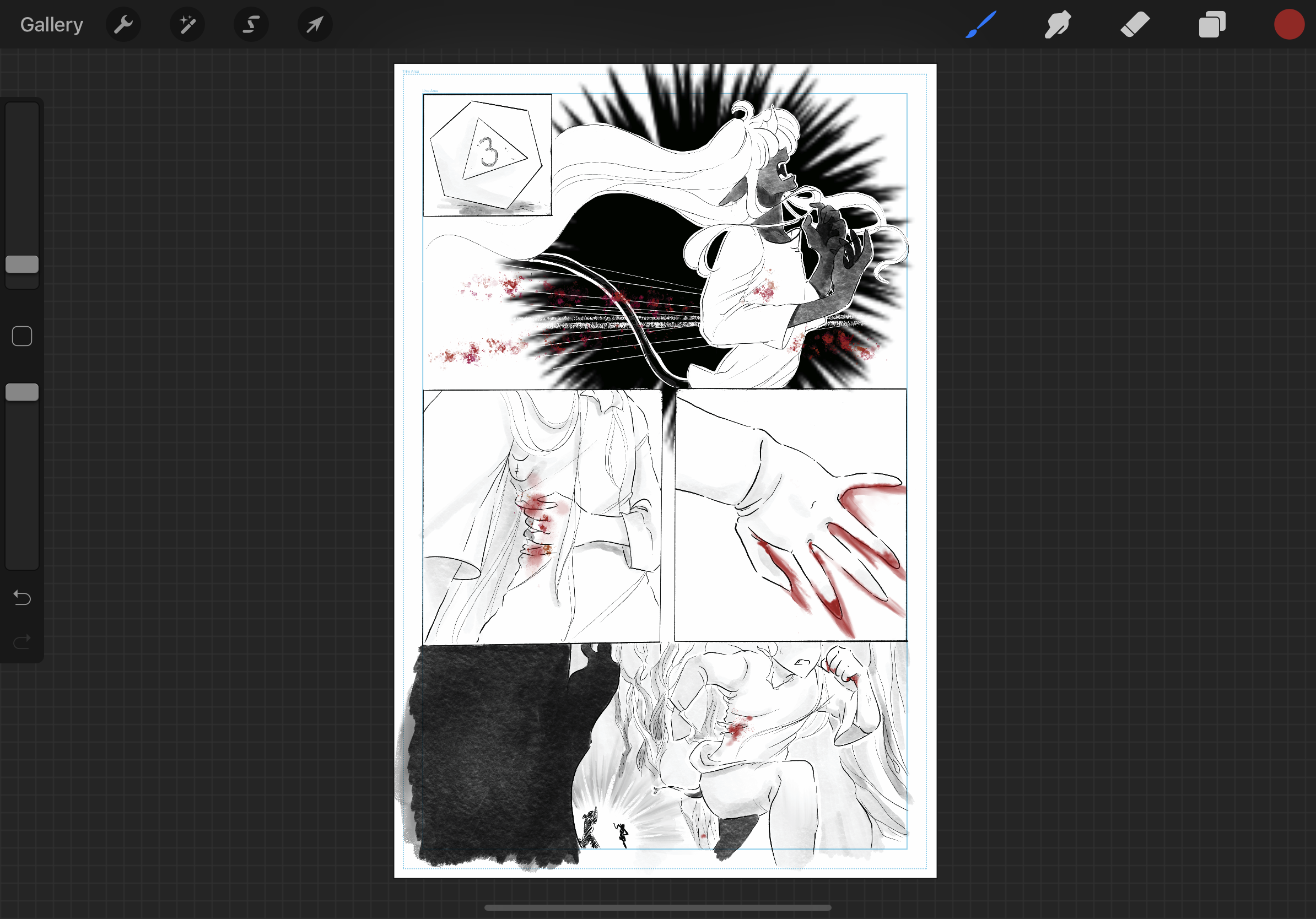
What do you lovelies think about the ink wash look instead of screen tones?
Every time I tried using screen tone brushes or I do cutouts or erasing, none of it looked right to me. Like, it REALLY made things look so amateurish even more than it already does. I mean look, this is my first time doing a big project like this so the first issue I’m giving myself some slack because I’m learning and seeing what works and what doesn’t. And the more I draw these characters, the easier it’s gonna be and will flow more.
Anyway, the screen tone look made things look smudgy, dirty, and poor quality. So I think I’m gonna stick with the ink wash look from here on out. It’s easier on me while also making my comic a little more unique that people will remember.
What do you lovelies think? Do you like the ink wash look I’m going for for shading and tones?
My goal right now is to get this first issue done and have printed copies available to purchase at my art table at Grand Con in Grand Island NE. For those who want to purchase digitally, do you think putting it up as a $10 tier on Patreon will suffice?
Don’t be afraid to drop a comment below!
Files