Home

 Creators
 Search
 Recent
 Random
 Posts
 DMs
 Tags
 Random
 Importer
 Import
 FAQ
 Account
 Register
 Login
 Favorites
 Keys
 Logout
 Telegram

Login Screen Update - Feedback Needed (Patreon)
Content
In case you missed it, I worked on a bunch of under the hood wordpress updates yesterday... and also fixed (hopefully) the reset your password and registration issues.
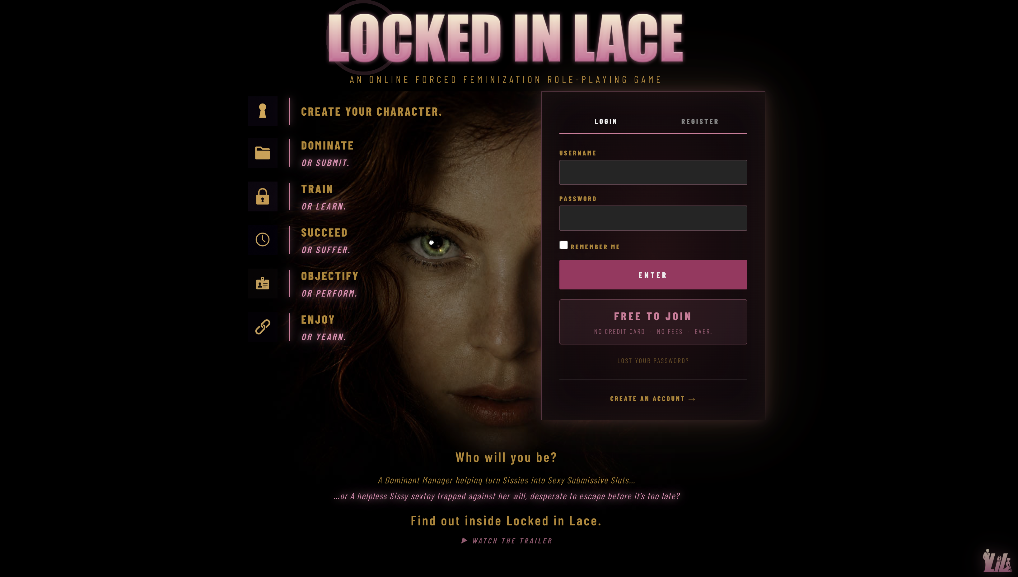
As part of the update, I almost uploaded the new login screen for the site revamp in the Fall... but decided against it... mainly because I don't want to overpromise what is inside of LIL until it's there... and it's coming...
But I really would like some feedback. So let's look at where we are and where we're going... and tell me if I'm on the right track... any notes... any thoughts...Again... this is just looking at the login screen... nothing super sexy here... but I have received a lot of feedback that you all like to see works in progress... iteration and process... so here we go.
WHERE WE ARE
This is our current login screen.
It's... fine.
My issue has always been that it looks like a wordpress site. It feels dated... old... (and I know I'm comparing against other sites in the genre that are very much products of the 90's), but this would not pull me in if I were a new user.
WHERE WE ARE GOING
This is the new login screen I'm working on. Dark, feminine... with a clear pull to those that want to play dominant and not just submissive... and it does NOT feel like wordpress. It feels like the start of a game...
What you can't see from the screenshot still is... the 'O' of Locked in Lace has the Sissylink vibes emanating from it. Look...
https://youtu.be/v5gCZY5NhOIThe video doesn't do it justice, but the O produces little sissylink concentric circles coming out from it. Took me forever to make it responsive, but I kind of love it.
YOUR FEEDBACK
So take a look. Does it make you want to join? Does it make you want to play? Am I on the right track or is there something that you feel would make it better? Constructive criticism is welcomed here if it's in Bimbo form.
Files