Home Creators Posts Import Register Favorites Logout

Content

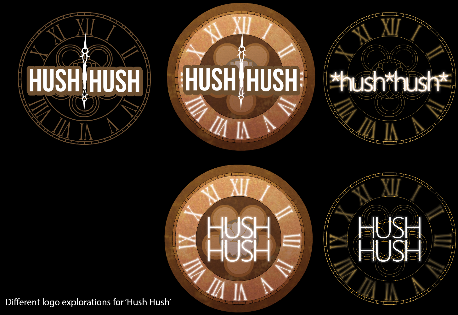
I'm no logo designer but I tried making some options for the VN's logo.... I thought 'time' would be a neat theme to carry through, plus some other more subtle things like the sub rosa design in the clock. All that aside, I'd love to know which version (if any) do you like the most?

Files
Comments

Bård

I like the top middle one ;3

Jon Bailey

My answer depends on if the plot is sinister ... if so then I'm liking the bottom right ... if it's lighthearted then I also like the top middle one's more readable font ... but maybe with the hands set to a different time than 6:00? :)

BeCrazed

Woah for a second i thought it was a transmutation circle i like the top left prob change the font to see the symbol on the clock

Daniel Lundberg

Kinda reminds me of the dial thingy in Rewrite (Key)

Ryagon

I like the second version as well, although I have to say that all of these look a teensy sinister to me. Clocks are fascinating. I'll have to say, though, that most clock dials don't have a IV, but rather write it as IIII. It's probably throwing me off more than it should.

Cyber Elite™

Awesome! The first on reminds a lot of Kingdom Hearts for some reason. But I'm curious, why are you guys using a clock for your logo?