Home

 Creators
 Search
 Recent
 Missing
 Random
 Posts
 DMs
 Tags
 Random
 Importer
 Import
 FAQ
 Account
 Register
 Login
 Favorites
 Keys
 Logout
 Telegram


Share Your Work Here
Glenn, that came out awesome! Love the colors!
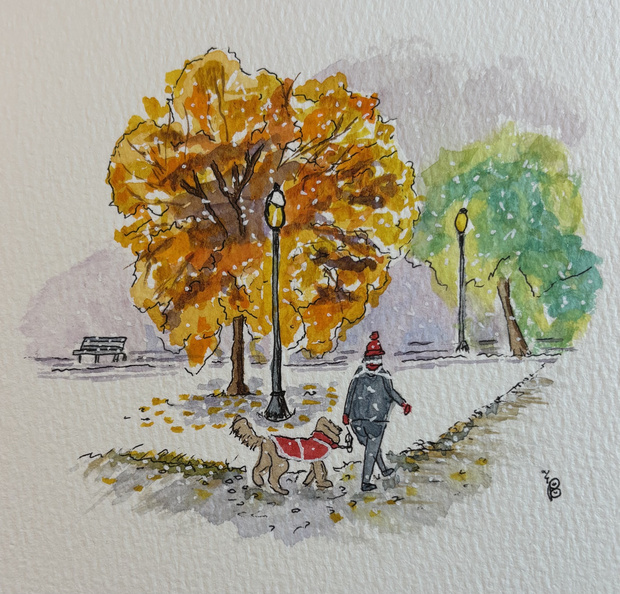
Lovely winter scene, Paul! 👏👏👏
Great work capturing the snow, both on the ground and falling through the air.
I love the simple color scheme, and the red is especially effective in drawing our attention toward the figures. Because it’s so saturated compared to the more neutral, muted colors surrounding it, it really helps them stand out.✨
I also love the narrative in this scene.
Thanks so much for sharing your work with us, Paul!
This one made me smile, Paul! ☃️
This would make a lovely greeting card design!
Really great work capturing the look of white snow while still developing a lovely sense of form and roundness in the snowman.
I also love the soft, glowing effect you’ve created with the lights.
Thanks so much for sharing this with us!
Thank you very much Erika! 😊
Thank you very much Erika! 😊
The mistake I made here, is that my background colors were the same as the leaves I wanted to paint, so I tried to change the colors of the leaves. I don’t think this turned out very well.
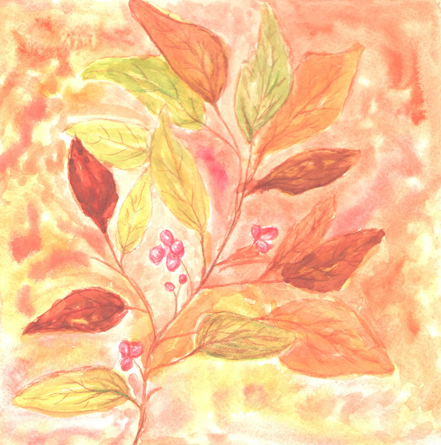
This one turned out better, but the light background is invisible.
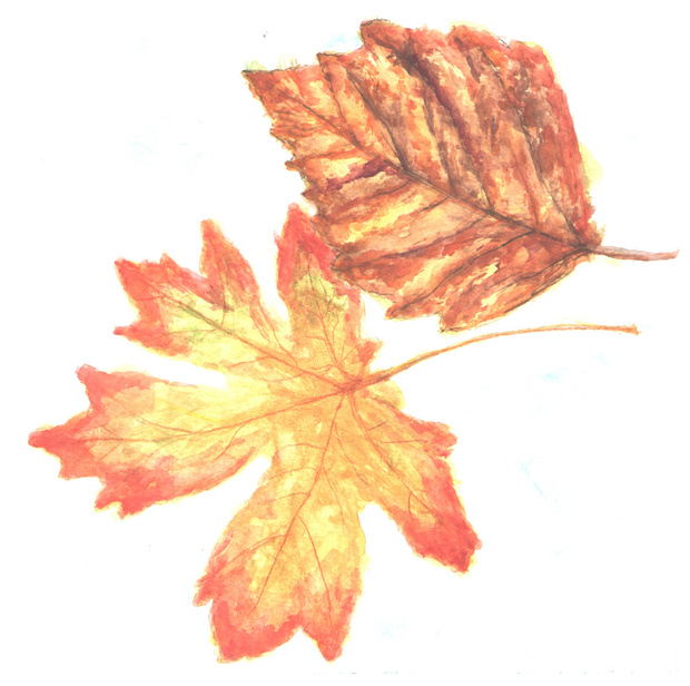
Good practice. My paper tore on the left side and my ink bled, among other issues.
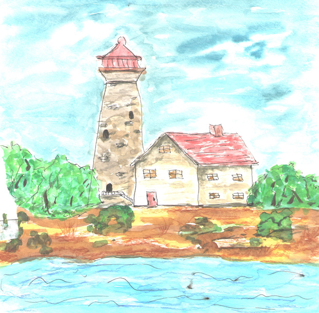
Love it. The snow makes it perfect
Fabulous Paul
Thank you Sue! 😊
Great work, Karla! 🙌✨
I really like how you’ve incorporated both softer and sharper effects throughout your painting. They create some lovely variety and visual interest!
I’m not sure whether you were following along with my tutorial for these leaves or whether you decided to use the reference photo and outline as a starting point while exploring your own approach. Either way is absolutely fine, of course! I always encourage you to make these projects your own and experiment with different ideas.✨
The reason I mention this is that, in the tutorial, I use the same colors in the background that I use within the leaves. However, the leaves still remain the clear focal point of the composition because the techniques I use to develop the background and foreground are quite different. It’s an interesting way of creating separation and depth, even when working with a relatively similar color palette.
This might be something worth exploring if you’re interested in experimenting with a few possible improvements! Just a little thought to consider.
Thank you so much for giving this project a go and sharing your work with us!
Gorgeous leaf studies, Karla! ✨
You’ve done a wonderful job capturing each leaf’s shape, vein patterns, and color variations.
I especially love the yellow-to-red gradient in the maple leaf! The veins are also beautifully defined while remaining subtle enough not to compete with the overall shapes and colors. Such a lovely balance!👏👏👏
Thank you so much for giving this challenge a go and sharing your work with us!
This message was deleted.
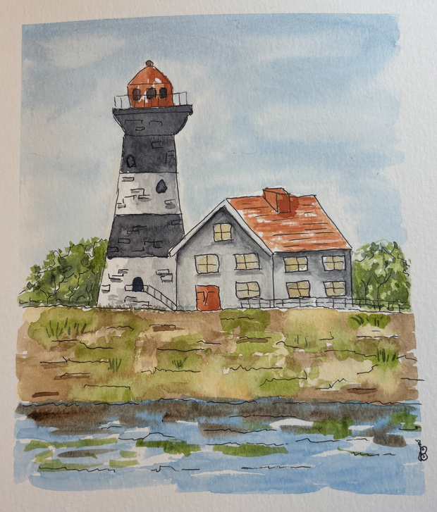
I’m so happy you gave this one a go, Karla! 👏👏👏
I can tell you created your sketch freehand, without tracing, which is always such valuable practice! The house has a lovely sense of form, and the perspective feels consistent throughout the scene. Well done!✨
I especially love how your sky turned out, with those soft effects and beautiful white-to-blue gradients. You’ve also done a great job incorporating subtle textures into the walls of both the house and the lighthouse. These little details really help bring the scene to life!
Thank you so much for taking the time to work on this project and share your results with us!
The Ligthouse
The First Snowflakes!
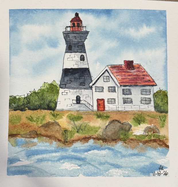
At first, I was unenthused about doing a lighthouse… but by the end I fell in love it was so much fun.
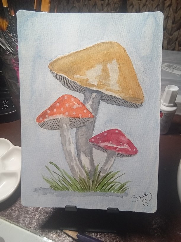
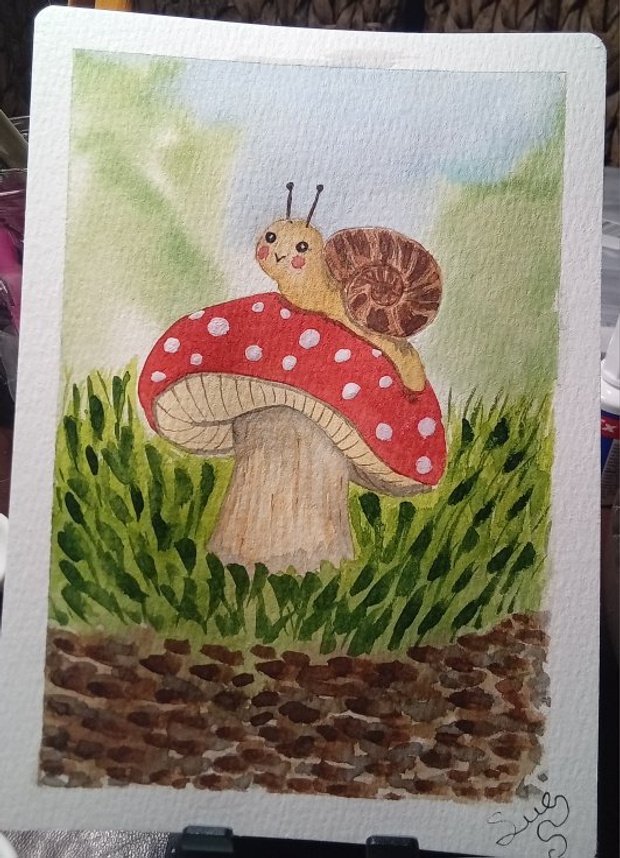
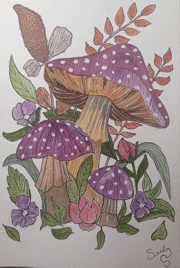
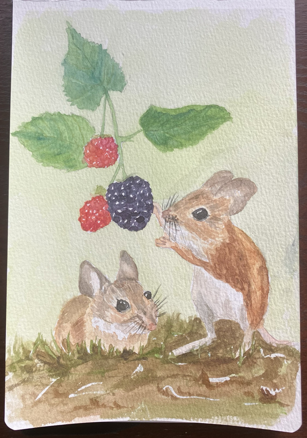
Toadstools and mushrooms was the theme at my art group this week. I have done 3. I will catch up with tasks in this group over the weekend!
I’m away at the moment but today found time for a little art practice
Christmas Train (Polychromos Pencils)
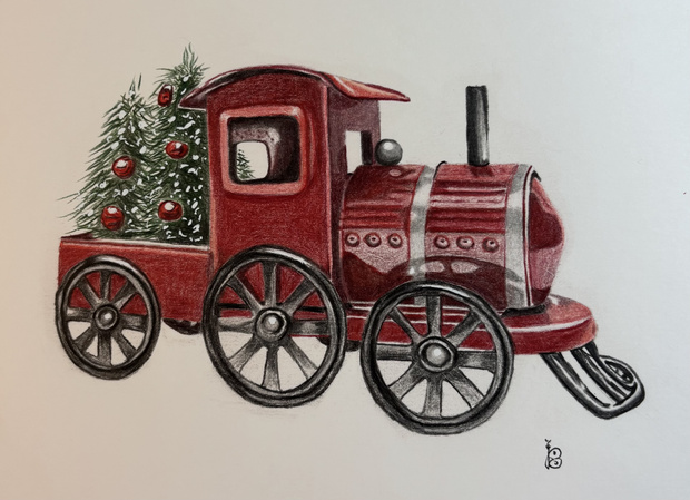
Wow Paul. Outstanding
I enjoyed your tutorial Erika. Thankyou 😊