Home

 Creators
 Search
 Recent
 Random
 Posts
 DMs
 Tags
 Random
 Importer
 Import
 FAQ
 Account
 Register
 Login
 Favorites
 Keys
 Logout
 Telegram

LifeBrick's MCU Moon Knight! (Patreon)
Content
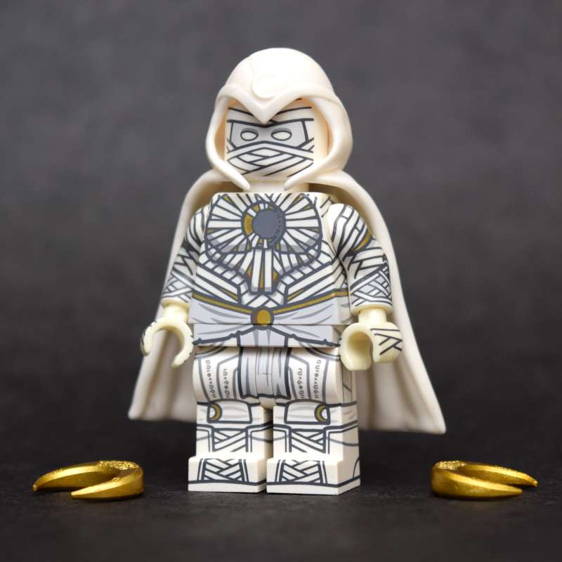
Well here’s the ol’Moon Man himself! (sure took my time with them, didn't I?) These two have been chillin’ on my desk for the better part of the holiday season and then some after arriving sometime around November… (yeah you know what I’m gonna just get right to it)
I don’t like this Moon Knight! I almost didn’t review it after sitting with it for so long! Sure, the Mr Knight fig is okaaay… but we’ll get into the details of that fig in it’s own post…
But this fig man… dude…it’s neat… but it’s bad and I don’t like it!
That damn hood/cape situation that doesn't fit onto the head correctly looks so kooky bananas that it just wrecks the whole look of the fig for me. That’s truly what kills the fig in my opinion.
Sure, it looks nice. The print is amazingly clean as ever for an LB fig… but even with a cape and hood swap there’s just something about it that I can’t get over…
Okay wait… let me just pivot here… I should start with the positives!
Right out of the tin, I was really impressed with the sheer amount of print on this fig! Other than the sides of his head, this dude is caked in ink right down to the double-sided hand print!
(mind you, the hands aren’t even lego… the white plastic doesn't even match- wait shit wait hold up I’m talking about the negatives again! Fine! We’re just gonna speak from the heart I guess!)
Now, depending on which side of the fence you fall, this might make or break your opinion of this fig all together. Other than, ya know… being a minifig, it looks nothing like Official Lego. It doesn't even fit in with traditional Official Lego figs.
Frankly it’s a bit over the top and I personally think the high contrast used for the linework on this guy could have been toned down. Other than the tunic and the mask, everything else on this fig uses a dark grey linework that just makes this fig look way too… busy.
Don’t get me wrong, the craftsmanship here is on another level coming from LifeBrick! Every lined mummy wrap aligns to another around the corners of the torso and legs, and the hyper-subtle gold print around the entire fig is absolutely fantastic!
But man, there’s too much to look at! Tone it down dude!
It also doesn’t help in the slightest that the molded cape included is completely unprinted! (this damn cape, I’m telling you) Why did LB just completely skip over the cape?! It doesn’t work with the rest of the fig at all man, what were they thinking?
Not to mention that it doesn't fit! (classic LifeBrick!)
It sort of continually pops up and off the head. Even after cramming the thing in place, after I’d have my camera primed to shoot him, the hood/cape would just slowly squeeze its way off again and it looks real goofy floating just above the shoulders.
Oh and the moonarangs (or whatever the hell you call them) we’re molded in a square-ish shape, so after about a month of leaving this fig in your display case holding those things, the custom hands will get warped because they don’t fit correctly into minifig hands.
So points to the impressive print work, but points off for the overdesign… and the parts… and basically everything else about it.
…It’s been a while since I’ve been this upset over a LifeBrick fig…
tbh I’m probably just gonna sell it when I find some time.
…ugh, what a shame
Files
Previews only