Home

 Creators
 Search
 Recent
 Random
 Posts
 DMs
 Tags
 Random
 Importer
 Import
 FAQ
 Account
 Register
 Login
 Favorites
 Keys
 Logout
 Telegram

Shading Tests | Development Sketch (Patreon)
Content
Testing out some different things for how I want to do things in the future. Let me know what you think. You may need to click and zoom in t
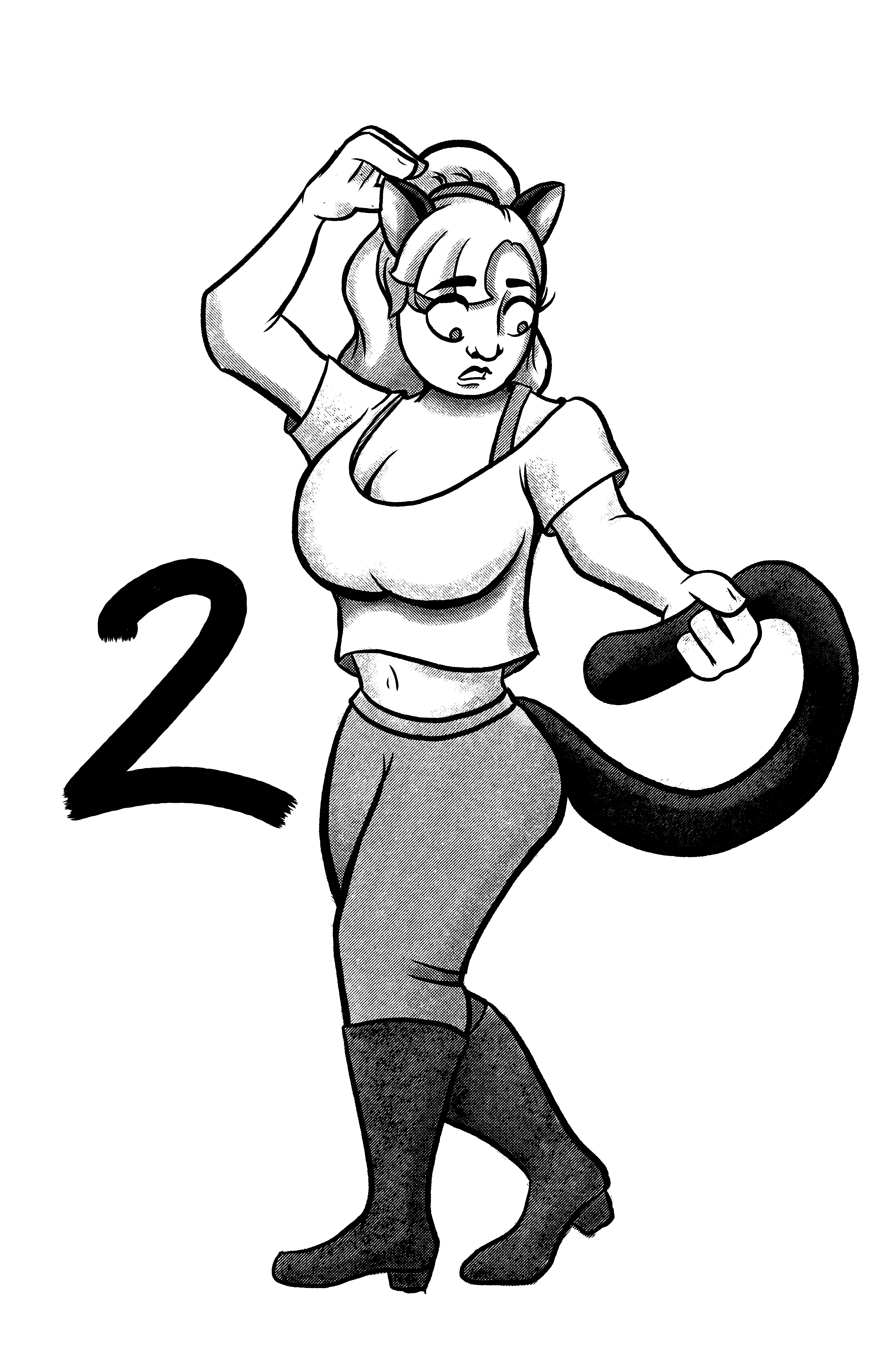
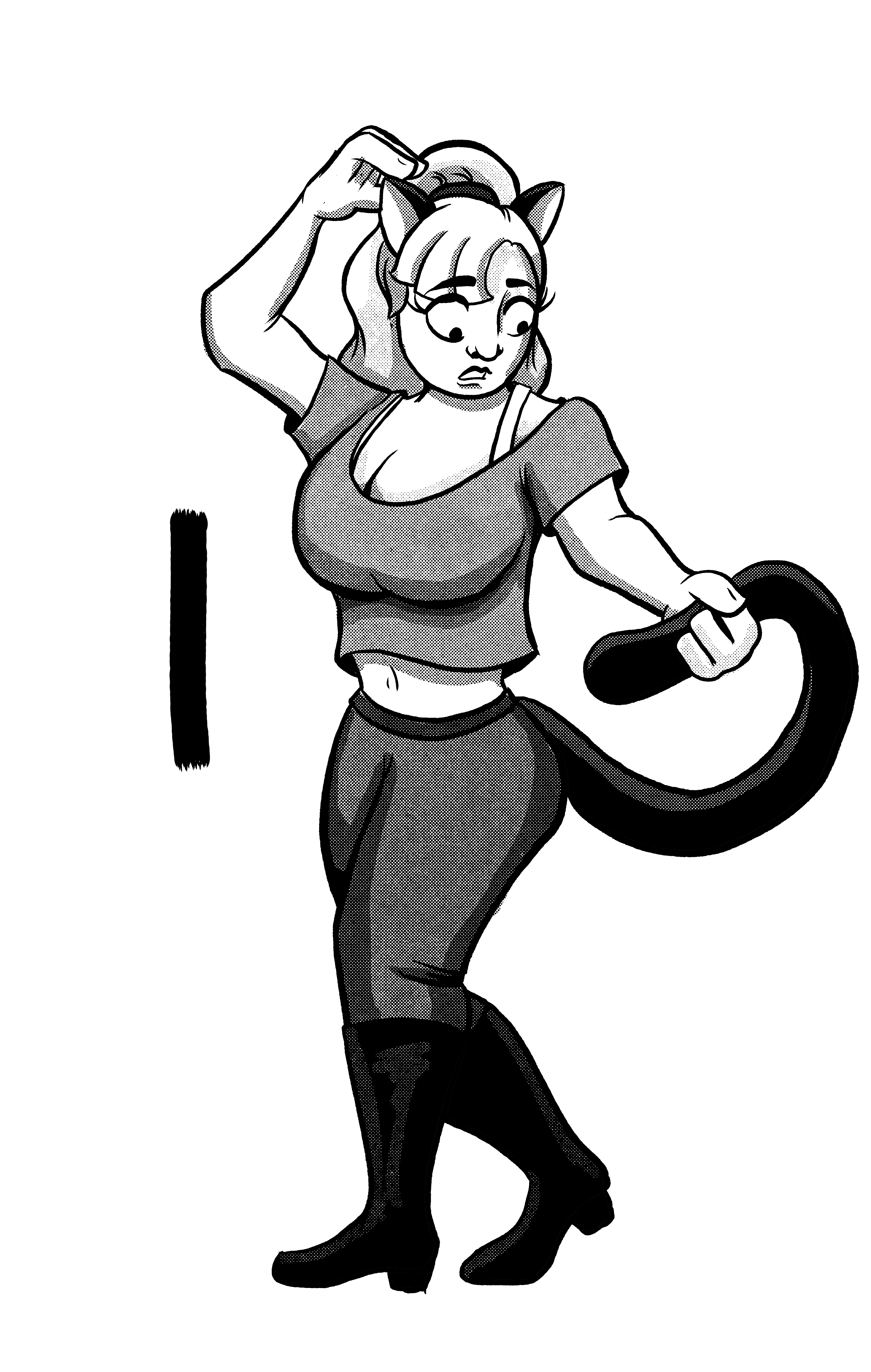
Testing out some different things for how I want to do things in the future. Let me know what you think. You may need to click and zoom in to see details, but the gut reaction is best.
1 - B/W Halftone : I use this one a lot, but not normally in black and white. This has a nice texture and feels old school. I have 5 levels of grey essentially. With another 5 in-between levels if needed.
2- B/W Pressure Horizontal : I feel like I dialed this one in with the levels. Three pressure brushes. Light/Mid/Heavy. Light is pretty pointless. But Med is a good baseline with Heavy with needed.
3 - Color Pressure Halftone : I haven't used the pressure halftones as much in stuff. I tend to default to the sold halftones. While I like the blend, there is a control issue with how heavy or light it is.
4 - Color Halftone : This one has no in-between the different shades. I tend to use this one lately.
5 - Color Shades : Traditional color shades.
6 - Color Pressure Halftone : I went real light on this one.
7 - Flats : This is alot of the comic pages. I didn't do any shading.
8 - B/W Halftone : Same 5 levels as before, just a lighter touch.
9 - B/W Pressure Halftone : Once again, taking a lighter tough and same approach I did on #2, but with dots.
Files