Home

 Creators
 Search
 Recent
 Random
 Posts
 DMs
 Tags
 Random
 Importer
 Import
 FAQ
 Account
 Register
 Login
 Favorites
 Keys
 Logout
 Telegram

AOoo it's a Snake (Patreon)
Content
Sorry about not posting recently. I've been actually working, almost like a normal person.
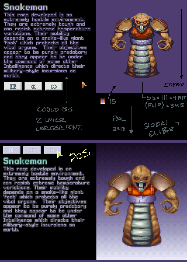
Anyways, I just looked at the Amiga OCS (500) version of UFO (X-COM) and got thinking about the GUI presentation. The DOS version probably runs in 320x200 VGA mode 13h or something. A PAL Amiga can easily do a higher vertical resolution, especially on static (retain mode) GUI screens as these lack moving action. The Amiga might run out of chipmem for the graphics though, but I don't think reducing portrait size and colour depth is really all that harmful. This Snakeman doesn't really need 256 colours and it's a bit blurry too.
Font sizes could be scaled up (an improvement over the claustrophobic DOS version) with big text blocks blitted on separate low-colour screens (e.g. 4 or 8 colours) .... these screens would have to go above or below graphics, unlike on my mockup here. Text can be rendered on a back screen then flipped to front with no further changes.
The OCS version didn't do the text outlines. Amigas were mostly hooked up to TVs over RF so that might have been a reason for not using the exact DOS font with the outlines and AA blur.
It might also have been too expensive on 16-32 colour screens, but I think it would've been doable with some font and layout changes. It is possible to blit only one or two bitplanes (2 or 4 colours) on a 5 bitplane screen. Possibly they already did that. If you set up palettes carefully you can do transparencies and gradients this way, something which some GUI screens could benefit from.
The Copper could do some of the background gradients (vertical at least) that X-COM likes so much. This would save chipmem too.
As for the pixel work here, I started by indexing to 16 colours in Photoshop. It looked awful, so I went back and handpicked 16 represented colours, then indexed using those. It looked quite bad still, but some cleanup, cluster-care and dither improved things. I kept the general pose and proportions, but included details from my earlier art here. If you squint it didn't really lose much, aside from the brown shoulder pad hue. I tried a dither hue but it didn't work out. Uncompressed my Snakeman is 1/6th the size in bytes.
Files