Home Creators Posts Import Register Favorites Logout

Poll

FilterBlade UI revamp sneak-peek & beta-test - feedback needed + poll

  • Very positive 77
  • Positive 43
  • Neutral 10
  • Negative 0
  • Very Negative 0
  • Show Results/Uncertain 10
  • 2026-06-27
  • 140 votes
{'title': 'FilterBlade UI revamp sneak-peek & beta-test - feedback needed + poll', 'choices': [{'text': 'Very positive', 'votes': 77}, {'text': 'Positive', 'votes': 43}, {'text': 'Neutral', 'votes': 10}, {'text': 'Negative', 'votes': 0}, {'text': 'Very Negative', 'votes': 0}, {'text': 'Show Results/Uncertain', 'votes': 10}], 'closes_at': None, 'created_at': datetime.datetime(2026, 6, 27, 11, 4, 22, tzinfo=datetime.timezone.utc), 'description': None, 'allow_multiple': False, 'total_votes': 140}

Content

Hello everyone,

Today I'd like to give you guys a sneak peek of something we've been working on:

An improved UI for FilterBlade.

FilterBlade has received hundreds of updates over the years, but we've mostly focused on functionality. More variations. More adjustments. Better integrations.

Today I'd like to focus on something more fundamental - the UI.

When redesigning FilterBlade we wanted to focus on a few important points:

Improve the user experience for new users

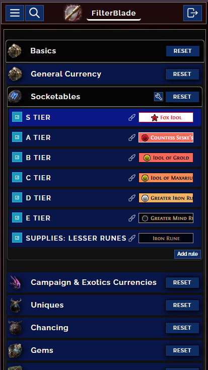
Improve the user experience for mobile and tablet users (PoE2 has a sizable console player base, which makes this necessary) without causing any trouble for PC users.

Use space more efficiently

Improve navigation, make finding important things faster.

Modernize the UI and remove artefacts like quadruple headers, but...

...Preserve our old values - a stylized look, a ton of in-depth customization.

Improve the customizer structure

Declutter some UIs, while giving experts options to return to the old UI (found in settings)

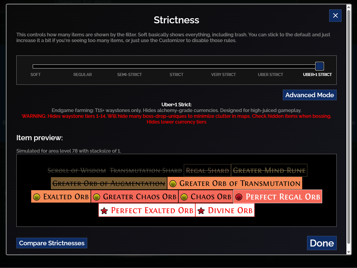
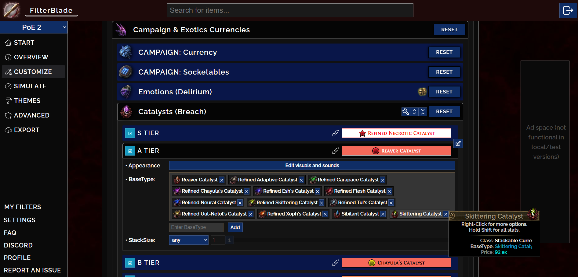
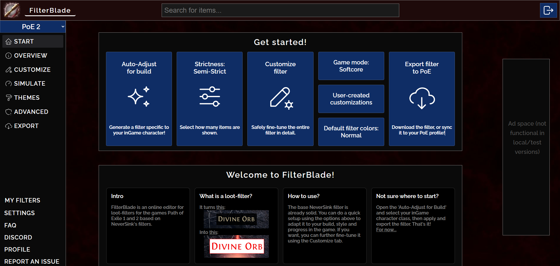
So how does the design actually look like?

You'll find screenshots below, but you can also just test it yourself:

You can test it yourself, we'd love to hear your feedback!

EXPECTED BUGS / KNOWN ISSUES:

Do NOT use the actual filters from the beta ingame yet. They're not economy-updated and a bit behind the main branch in terms of features.

Changing the 'Game Type' from SSF to Softcore will show an error message

The beta site is a quick-and-dirty setup. This may show as unsafe in some browsers.

The beta is slower in terms of backend performance (this is due to cold starts in our serverless infrastructure)

Not a bug, but the beta has separate saves from prod to avoid issues. As said before, don't use filters from beta ingame

How to test: BETA TEST LINK

Come back and tell us about your feedback later! (Poll below + Comment!)

You can test it yourself, we'd love to hear your feedback!

EXPECTED BUGS / KNOWN ISSUES:

Do NOT use the actual filters from the beta ingame yet. They're not economy-updated and a bit behind the main branch in terms of features.

Changing the 'Game Type' from SSF to Softcore will show an error message

The beta site is a quick-and-dirty setup. This may show as unsafe in some browsers.

The beta is slower in terms of backend performance (this is due to cold starts in our serverless infrastructure)

Not a bug, but the beta has separate saves from prod to avoid issues. As said before, don't use filters from beta ingame

How to test: BETA TEST LINK

I'd appreciate if you could answer the following questions

What are your first impressions? What do you think of the new layout?

Do you like the new start screen? Anything you'd like improved?

We added the 'Edit visuals and sounds' buttons in the customizer, what do you think about them?

One consequence of the new design is that the wallpapers we previously created for FilterBlade will likely not fit well onto the site. We will still create them anyway and post them here for anyone to grab, but will likely only show them on-site them for Patrons, because we intend to disable the Ad-Space for the Patrons in the future update. Is this an acceptable compromise?

Anything else you'd like see improved or added?

This is not the final version and we intend to do MANY MORE improvements in the future. This is the framework rework necessary for many things to come.

Thanks for reading and for your support.

You can post feedback and reactions here on in the #inner-circle discord channel!

Best Regards,

NeverSink

PS: I'd like to thank you all for the support, feedback and appreciative replies to my announcement of going fulltime.

PS2: I'd like to shoutout Zoey (and Luna) of our FilterBlade Team. The rework is overwhelmingly their work.

Small poll:
Files

Comments

Chris Heib

Thanks for the filter, looking forward to improvements! A few things I think can be improved in the current live version: Integrate Simulate better: It's my main point to look for which rules I customize in endgame. Having a oneclick 'paste, analyse, show rules' button without having to click through the entire simulate menu would be great. Empty rules can't be disabled: When I disable e.g. 'Curreny E', I also want to disable 'Currency F'. But if F is currently empty due to economy, I can't disable the rule. So if later in the league something were to be put into F, it would still show for me and i'd have to go through the customisation again. Better sync: I love the 'Sync to game' and also the 'Save to File', but this league the auto update function doesn't seem to work correctly. Also I think it would be great to add baryas depending on level to the auto econonmy analysis, theres a lot of currency to be had here.

Erik Pfalzer

I like the new UI. I think my biggest pain point as a new player was understanding the strictness levels. Maybe a quick chart that has strictness one axis and categories & tiers on another to quickly visualize what is included?

Bazkur

Wasn't sure where you wanted answer to your questions: 1) I do like the overall layout as a returning user. I'd darken the hover color of the buttons on the start screen, they are pretty bright when not using a night light filter. I typically use FilterBlade in 1080x1920 (Portrait monitor) and the new design works much better for that use case. 2) Again, as a returning user, yes. But if I was a new user, I might see more benefit if the "Welcome to FilterBlade" section was on top. Perhaps the welcome section should be at the top when you are not logged in and hidden or moved when you are? Maybe it is fine the way it is too. 3) I like this, I don't get too into that level of customization myself but I could see others using it a lot. 4) I think the wallpapers, while really cool in the current layout, get a bit lost and don't really add much to the application. Having them as Patron benefit would is a good idea. Perhaps if you have a splash screen of some sort in the future you could use them there. 5) Note a necessity, but to help with visually impaired users, I've had success with providing a feature to give applications preset color themes. Generally easy to create the features with CSS but sometimes can be difficult to get them right and manage as the design changes. Just food for thought.

Gisbert 12843

I don't like the sidebar menu all too much. The menus on the top were quite intuitive in the past ^^

Gisbert 12843

I know this would be probably be an insane indepth feature request but if I could add one thing to filterblade it would be the ability to generally hide drops below a different price point but in general. I know that this kind of tiering exists but setting it up for every group is annoying. Make it be based on naive poeninja prices, as our patreon filters are updated automatically I don't see a reason to not enable this, not priceable items e.g. bases will be shown as filtered anyway. Currently in PoE2 it is very common to get a t2 drop sound on stuff that is not even 1ex worth.

Jeff Pitsch

Looks good. Much easier to read and take in. Great start. I think a very basic wizard-style option for new users would be good. The start here is fine but can be a bit overwhelming when you click on the various options because there is no "back" to the homescreen. Yes you can click on the left side menu, but, honestly, I missed that at first myself. I'm thinking wizard that has the first do auto-adjust, then strictness, game mode, then export. Essentially, next, next, next. or maybe a 'would you like to customize further' before export. Essentially something that steps the user through their first, basic filter. The auto-sizing is much better and I noticed the left menu does hide when ti gets to a certain point, so my above suggestion of 'back' would be especially helpful there. I do like the 'Get Started' above the 'Welcome to filterblade' section because that is what people will be looking for to dig immediately into their filter. If you have to scroll down to get that section, since the 'Welcome' is so long, people will miss it entirely, I think. Going to keep digging but definitely a great start.

Zandarim

It's simple and useful, something that I have been thinking today, it's a "overlay" tool that can be used to add a item to "ignore" with a simple click. I don't know if this is possible. But I wanted to offer this suggestion.

Lyn Gardner Hoff

I like the new look and lay out. Since I am "old lady not good with computer" a little more newbie hand holding would be great in terms of explaining how to customize the filter a bit more. Love your product and sing it's praises all the time to my guild .

Mason Taylor

First impressions on my phone through safari and DuckDuckGo browser on iPhone 12 Pro Max: 1. I appreciate the tile selection in the new UI. it nice that the tiles have icons and clean choices for what you want to do. The UI feels clean and responsive on startup. 2. I’d like something else/more documentation or other useful info below the tiles on mobile UI like quick selecting a filter to edit. 3. Good! No notes, I think you nailed this. 4. Getting the wallpapers would be cool, I wouldn’t mind the ads on mobile as long as they’re not too intrusive. 5. My only pain point is on the desktop and mobile beta, both have an issue where if I try and change a custom filter for highlighting base items, tapping the X to remove existing items from the filter rule doesn’t really work/respond properly, and if you try to search with the text box for a base type it crashes the entire browser app. This behavior happened both on the regular desktop and beta mobile app, on chrome, Patreon in-browser safari and DuckDuckGo browser. Not sure if this issue is known, but my use case is I was playing PoE on my tv using GeForce Now, and I wanted to change a highlighted base in my filter on my phone since I didn’t have my pc turned on (I normally change the filter on my gaming pc). If this issue of the search box in the highlight bases can be resolved, that would be awesome! Great work, I’ve been following your filter since you would post it in the forums with your tornado shot build :)

Tuy

1. What are your first impressions? The first place my eyes gravitated towards was the "Auto-Adjust for build" button (in the row of buttons under "Get started!"), and my first impression from that was confusion as to why the first thing to do is to adjust something that doesn't exist yet, or which I don't have yet. I understand that's a stupid first impression, which I was subsequently reasoned past, and I'm not sure if it's suggestive of any UX problem, but that's really what my first impression was. What do you think of the new layout? I can see myself getting used to it. One thing which initially did not work the way I expected, was that the sidebar buttons and the buttons under "Get started" were really just doing the same kind of thing (i.e. making changes to a filter), whereas I expected them to be different kinds of things. Since I'm an experienced FilterBlade user, I already know what most of the things are in both areas. But if I were a new user, I could see myself not knowing whether to start with the "Auto-Adjust for build" button in the main content view and go left-to-right from that, or start in the sidebar and go top-to-bottom. Something I really was confused about at first, despite being an experienced FilterBlade user, was that everything on the page applies to whatever filter you are currently editing. (I did not initially see "My Filters" at the bottom of the sidebar. I'm not sure if it was there at first.) Things became more clear when I did save a filter, and saw the filter name appear at the top of the sidebar, and I think I'd be fine with this on subsequent uses, but it didn't feel intuitive at first. 2. Do you like the new start screen? Anything you'd like improved? Despite the things I wrote above, I think it's probably a big improvement over the current landing page. I think some of the cards in the "Welcome to FilterBlade" section could be improved. * The "Divine Orb" visuals under "What is a loot-filter" are nice and direct. But the more salient thing about a loot filter from the perspective of someone who hasn't used it before is probably that it hides the trash. (At least, that's what I most appreciated when I started using loot filters. I can see how highlighting the Divine Orbs might be considered the most important feature. But in all my noobishness on the day I first got a loot filter, I didn't even at that point know that Divine Orbs were anything special.) * I'd expect more links or buttons. If I was unsure where to start, I'd hope the "Not sure where to start?" card would have a link or button that pulled me by the nose to the exact place I should start. Same with "Download/Export" and "How to update?". I'd want buttons/links there to the place where I Download/Export/Update (or a button that just downloads/exports/updates immediately right here on the start page). 3. We added the 'Edit visuals and sounds' buttons in the customizer, what do you think about them? This I don't like. Usually when I click into this level of the filter customization, it's to remove sounds or make things more/less prominent, so from my standpoint this will mostly amount to an extra click. But if your analytics tells you the other things are used more often, fair enough. 4. The proposal regarding the wallpaper sounds fine. 5. Anything else you'd like see improved or added? Regarding the current (pre-revamp) FilterBlade UI, I have a browser tab for it which I never close. Every day when the tab loads for the first time, it switches back to PoE1. (Currently I'm using it for PoE2.) This is despite it having `game=Poe2` in the address bar. I don't know if this is an issue with the revamp, but I'd rather it be better about remembering what the game was in the previous session, or respecting the address bar, or whatever the issue may be. Thank you, Zoey, and Luna. This was great to see.

Dianshi

1. What are your first impressions? What do you think of the new layout? ---- First impression is really nice I like the new design a lot it seems far more intuitive. 2. Do you like the new start screen? Anything you'd like improved? ---- Start screen seems good it is a bit weird for me that I dont see the effects of a chosen style directly but since you can see it in the overview or strictness I think that is good enough. Also probably for new users it would be nice if the 'Welcome to FilterBlade' section is above the 'Get Started'. But than for returning users it probably is exactly the other way around :D 3. We added the 'Edit visuals and sounds' buttons in the customizer, what do you think about them? ---- I like it a lot. Even though it means an extra click for me since I often heavily customize my filter with different sounds especially I think this is a good thing. From what I personal heard most people do not customize sounds/looks so it is nice to not have your screen "cluttered" with that while you just want to customize the items or stuff like that. So overall I like that change and think it is good for most people :) 4. One consequence of the new design is that the wallpapers we previously created for FilterBlade will likely not fit well onto the site. We will still create them anyway and post them here for anyone to grab, but will likely only show them on-site them for Patrons, because we intend to disable the Ad-Space for the Patrons in the future update. Is this an acceptable compromise? ---- As a Patreon this is completly fine for me :D. But for real I think that is completly fine you give so much so you need to get some compensation and to have that extra for patreons seems nice :) Can not wait to see how FilterBlade develops further :) And also big thanks to Zoey and Luna :)

Christian Olesen

I do like the new UI changes but i got way more information just looking at the "old" (Current) version of filterblade than i get from the new site. Now i have to click strictness levels to get information about that. Id rather have more information as a returning player than information about what filterblade is. It just feels weird that i now have to click a button to get information where i had the information readily available before.