Home

 Creators
 Search
 Recent
 Random
 Posts
 DMs
 Tags
 Random
 Importer
 Import
 FAQ
 Account
 Register
 Login
 Favorites
 Keys
 Logout
 Telegram

[ Aventio ] The Greatest Show HD (+ process + PSD) (Patreon)
Downloads
Content
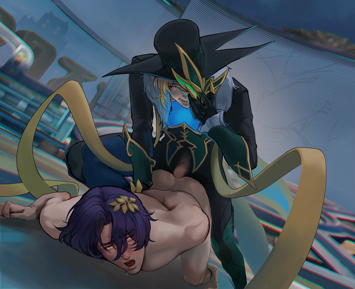
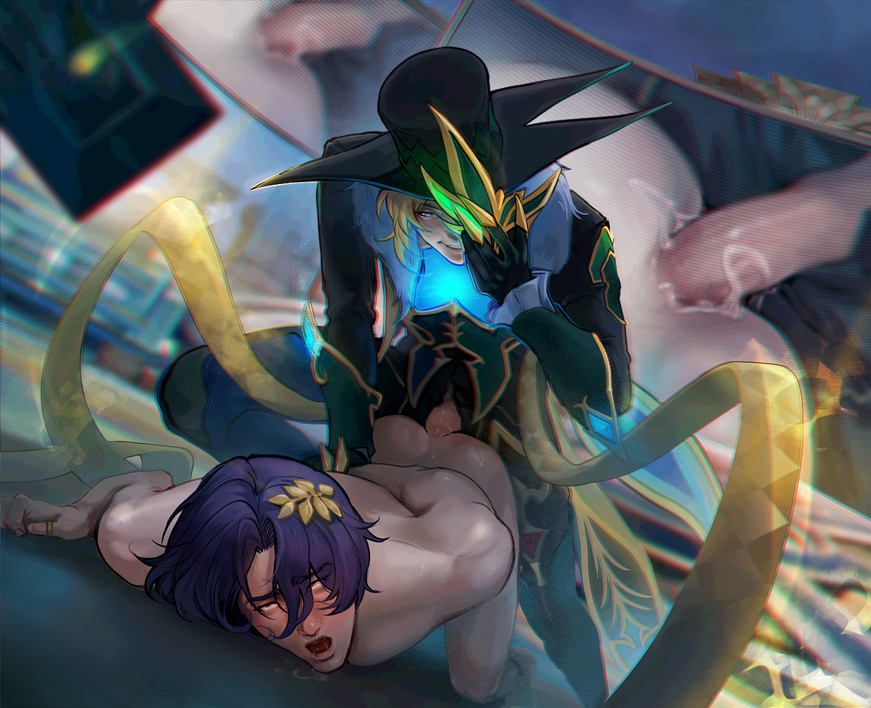
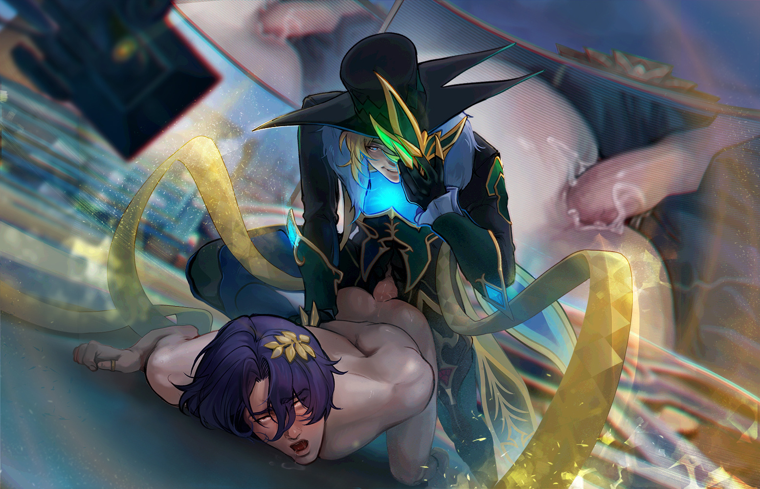
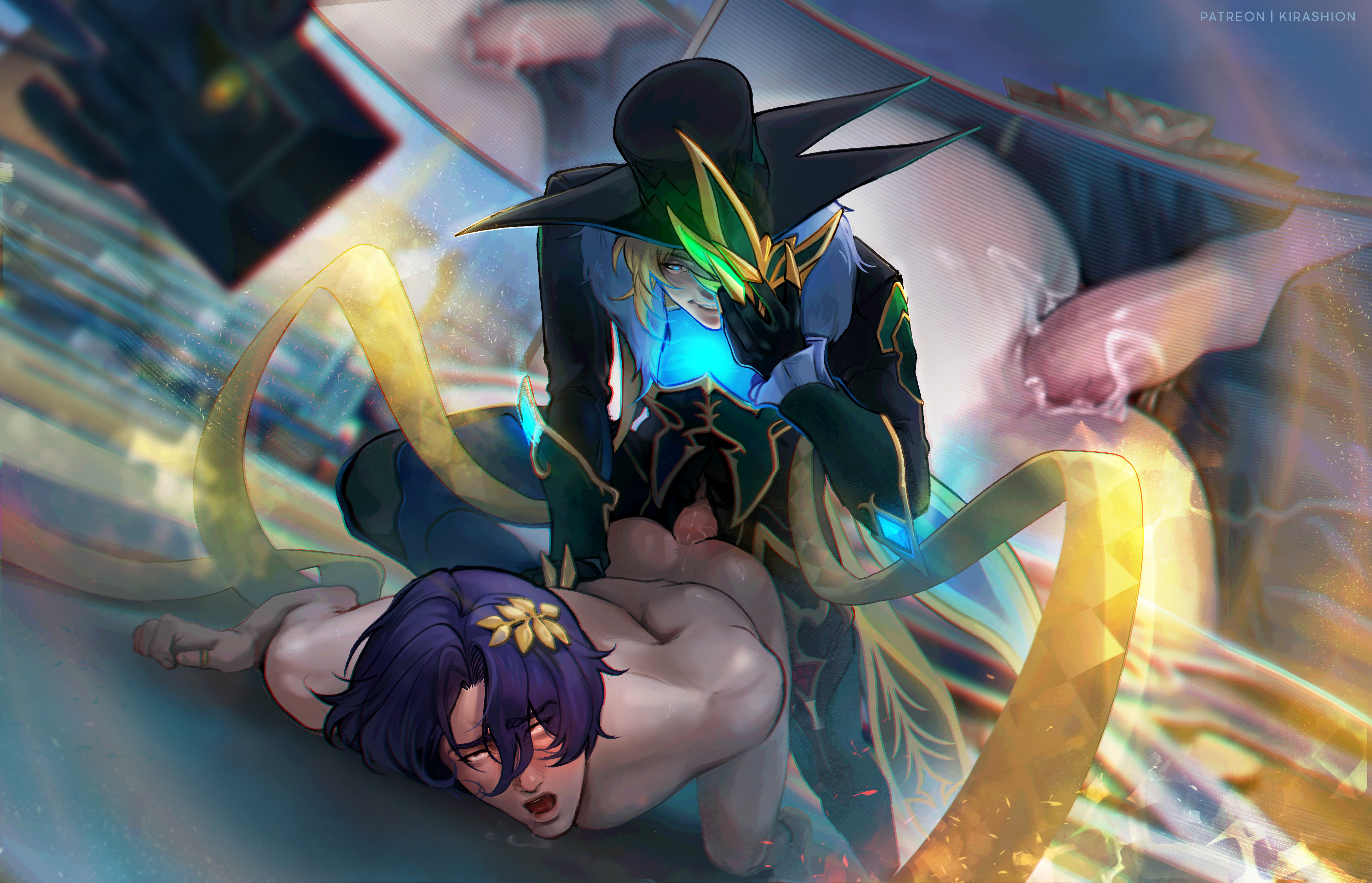
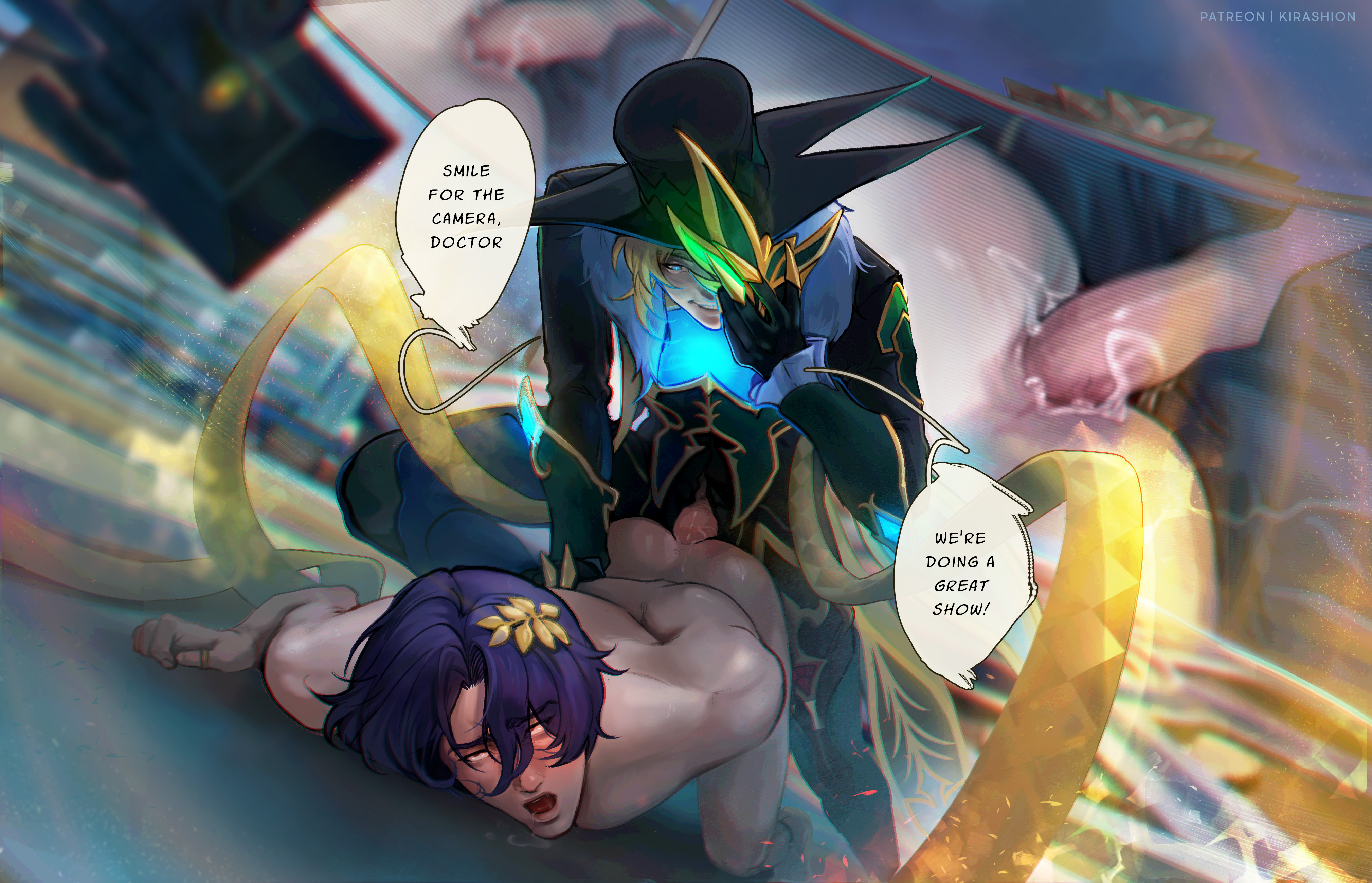
I must say, I feel like I dared too much with this, colors wise. I was eager to see it come to life so I rushed the base colors into to the rendering phase, only to obviously realized I hadn't chosen the proper values to create enough contrast between characters and background...
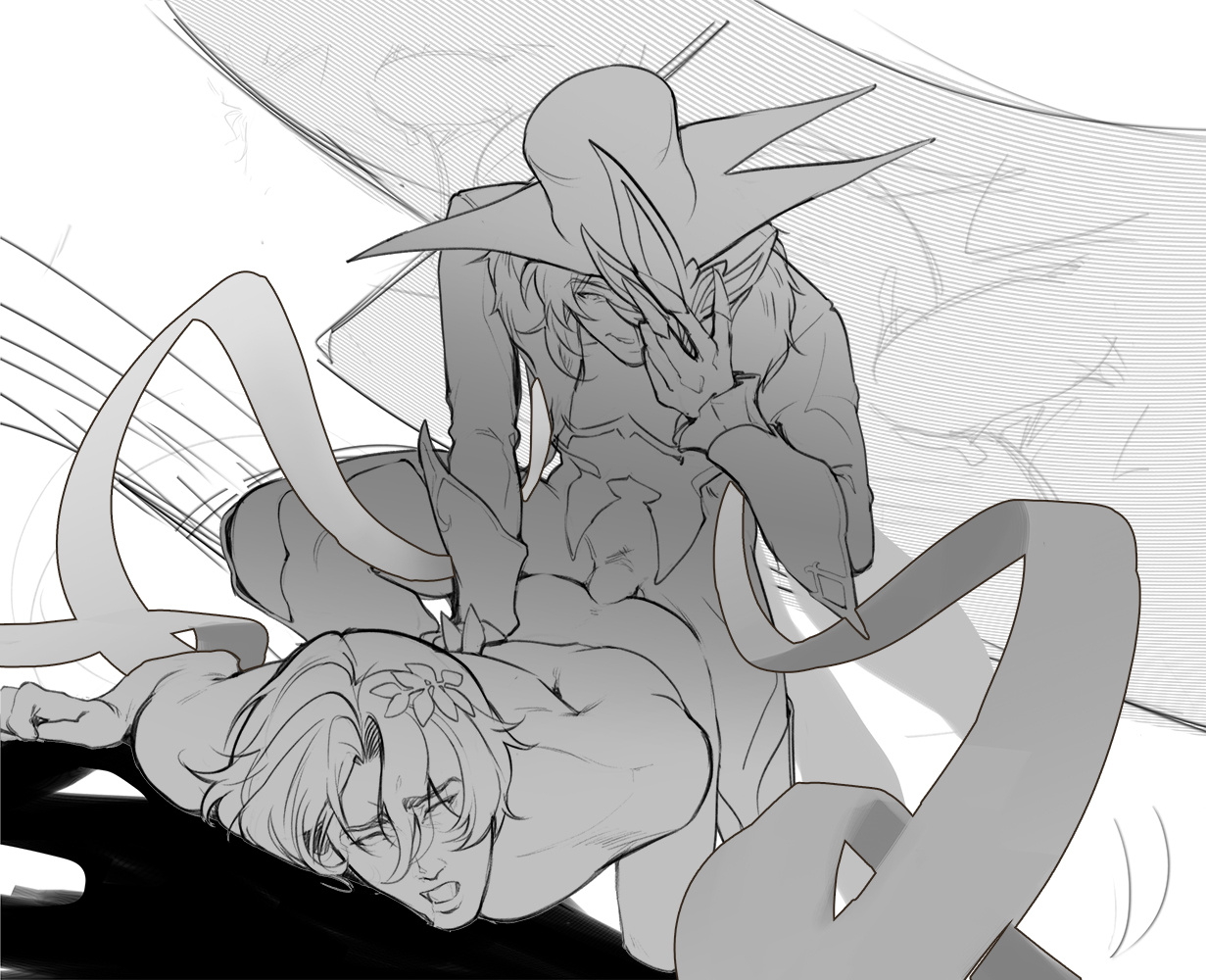
In order to show you my attempts at improving the readability and the composition, I didn't save the process images layer-after-layer, but simply over time (which means it's more chaotic but more true to how I actually worked)!
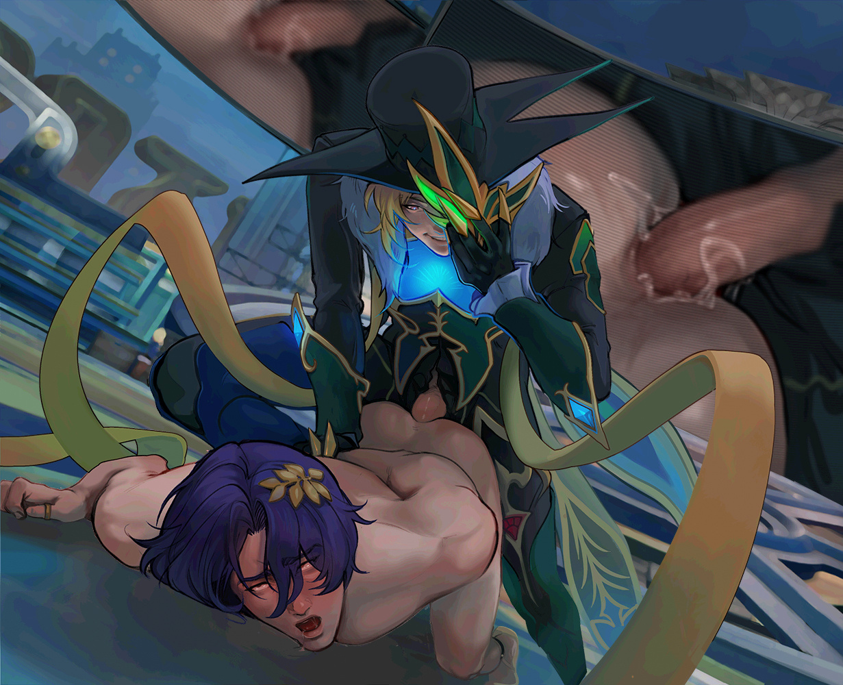
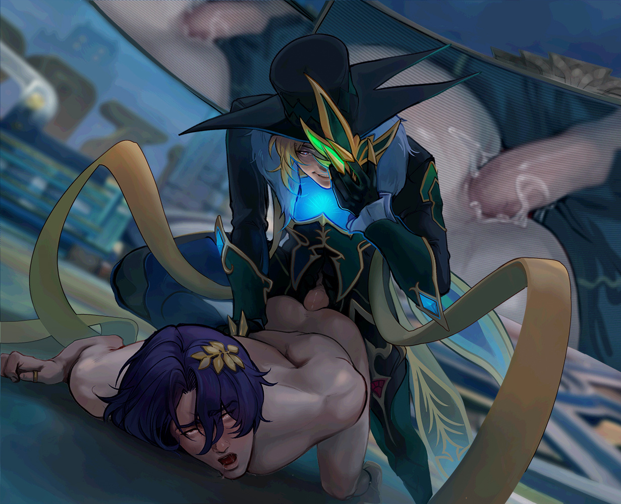
You can see my experimentations with saturations, tones and values... as well as the final improvement, composition wise, with the larger canvas!
💌 HD + PSD in attachments!
⪧ Aventio_2_BossAven (WIP from beginning until the image stays small)⪧ Aventio_2_BossAven_B (larger image + final edits)If your software doesn't read my PSD correctly and you do not have Photoshop, you can open my files on the free online tool https://www.photopea.com !!
Files